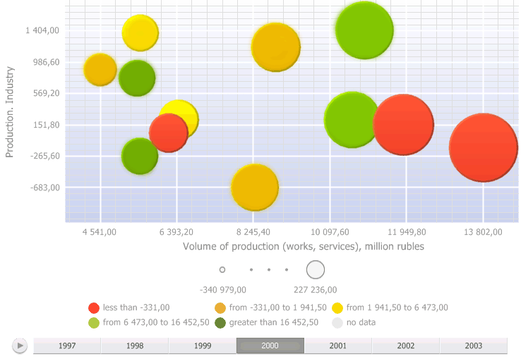
A bubble chart is a scatter chart where data points are replaced with bubbles and its color and sizes serve as additional data dimensions. A bubble chart does not have the category axis. The horizontal and vertical axes are value axes. In addition, a bubble chart contains an animated timeline, which displays the frequency of values.
To display express report data as a bubble chart, click the ![]() Bubble Chart button on the View ribbon tab. The
Bubble Chart button on the View ribbon tab. The ![]() Bubble Chart button appears in the top right corner of the working area, and clicking the button presents the report data as a bubble chart.
Bubble Chart button appears in the top right corner of the working area, and clicking the button presents the report data as a bubble chart.
To hide a bubble chart, release the ![]() Bubble Chart button in the working area.
Bubble Chart button in the working area.
Example of bubble chart:

To start timeline animation, click the ![]() button, to pause animation, click the
button, to pause animation, click the ![]() button. To move along the timeline, use the
button. To move along the timeline, use the ![]() slider.
slider.
To zoom in the bubble chart scroll up, to zoom out scroll down.
The user can move along the plot area of the zoomed in bubble chart by clicking the left mouse button while holding down the CTRL key.
Get started with a bubble chart by setting up dimensions.
In the web and desktop applications the user can work with bubble charts. In the mobile application based on Foresight Mobile Platform the user can only view bubble charts. Depending on the application in use, there are the following differences in bubble chart functionality:
| Functionality | Desktop application | Web application | Mobile application |
| Setting up bubble chart |  |
 |
 |
| Data drill down and drill up |  |
 |
 |
| Excluding data |  |
 |
 |
NOTE. The table displays only the functionalities that differ depending on the application version. The identical functionalities are not displayed.
Designations:
 - functionality is fully available.
 - functionality is unavailable.
 - functionality is available with features of use.
See also: