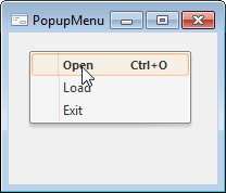
The PopupMenu component is a context menu that is displayed when the user clicks right mouse button in the workspace of a form or a component.
To create a context menu, add the PopupMenu component to the form and set it as the PopupMenu property value of a form or a component.
The list of context menu elements is created in the same way as the list for the MainMenu component.
After the menu has been created, it is available to reorder menu items using Drag&Drop mechanism.
If there are no items in the PopupMenu component, it is not displayed.

| Property name | Brief description | |
| Alignment | The Alignment property determines where the context menu is displayed relative to the mouse cursor. | |
| AutoPopup | The AutoPopup property determines automatic displaying of the context menu on right-click. | |
| ComponentCount | The ComponentCount property returns the number of child components. | |
| Components | The Components property returns the child component. | |
| Data | The Data property is used to store any custom data. | |
| Images | The Images property determines a name of the ImageList component, which image is used in the component. | |
| Items | The Items property returns the menu items collection. | |
| Name | The Name property determines a component name. | |
| Tag | The Tag property is not used by the compiler. The user can change the value of the Tag property and use it as he wishes. |
| Method name | Brief description | |
| Popup | The Popup method displays the context menu in the specified position. |
| Event name | Brief description | |
| OnClose | The OnClose event occurs after closing the context menu. | |
| OnPopup | The OnPopup event occurs right before the context menu is displayed. |
See also: