Text: String;
The Text property determines the row identifying a component for the user. It connects some string of the text that explains the user the purpose of this component, with the component.
By default, Text corresponds to the component name. The quick access character can be specified in the Text property for the control components (buttons, checkboxes, radio buttons, and so on). The ampersand character (&) should be set before the appropriate character to do it. The character that follows the ampersand is displayed underlined and it is a quick access character: pressing this character or pressing the combination ALT+ the character is equal to selection of appropriate control component during form execution. The OnClick event is also generated for the component.
If the ampersand character is entered in the text of Text string, it must be entered twice: &&.
If the Resources property is set in the form that houses the component, the ResourcesID additional attribute is added to the object inspector for the Text property, which enables the user to determine the resources element, from which the values for the property will be taken:
![]()
The change of the value of the Text property causes the change of the value of the appropriate element of for the default language.
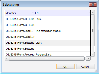
When the value of the ResourcesID property is changed, the identifier of the appropriate element is changed in the connected to the form resources. It is necessary to press the ![]() button in the ResourcesID field to compare the text property of the component with another string element of the resource. The Select String dialog box opens:
button in the ResourcesID field to compare the text property of the component with another string element of the resource. The Select String dialog box opens:

All string elements of the resources connected to the form are contained in this dialog box. The value of identifier and the value for default language are displayed for each element of resources. Click the OK button after selection of new string element.
See also: