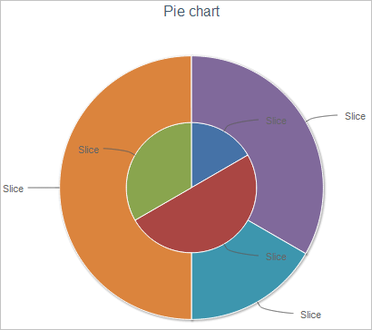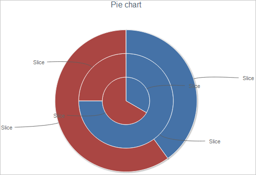
In HighCharts the user can now switch between displaying pie chart data series as sectors and as rings.
To enable this option, use the seriesAsRings attribute of the chart element.
To execute the example, create an HTML page and perform the following operations:
1. Add links to the following libraries: PP.js, jquery.js and highcharts.src.js.
2. Within the <body> tag place a block with the "container" identifier:
<div id="container"></div>
3. Then within the <body> tag on the page add a script that creates a pie chart, that shows data series named A and B as rings:
<script type="text/javascript">
$(function () {
    highChart = new Highcharts.Chart({
        chart: {
            renderTo: 'container',
            defaultSeriesType: 'pie', // Pie chart
            zoomType: 'none',
            // Show data series as rings
            seriesAsRings: true
        },
        title: {
            text: 'Pie chart'
        },
        xAxis: {
            "categories": [1, 2, 3]
        },
        // Determine two data series
        series: [{
            name: 'A',
            data: [1, 3, 2]
        }, {
            name: 'B',
            data: [2, 1, 3]
        }]
    });
});
</script>
After executing the example a pie chart is placed on the HTML page, data series named A and B in this chart are shown as rings:

Change value of the seriesAsRings parameter to false and execute the example once again. As a result, the chart series are shown as sectors:

See also:
The HighCharts Chart Allocation on HTML Page | chart Element | HighCharts Improvements | Examples