The TreeMap component is a 2D tree map.
The TreeMap component is implemented by the TreeMap class.
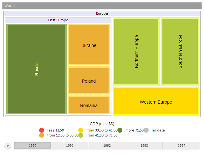
The TreeMap component looks like follows:
Example of Creating the TreeMap Component.
| Constructor name | Overview | |
 |
TreeMap | The TreeMap constructor creates an instance of the TreeMap class. |
| Property name | Brief description | |
 |
AreHeadersVisible | The AreHeadersVisible property determines whether to show headers for groups of elements. |
|
BranchesOverflow | The BranchesOverflow property determines the method of text shortening in tree map branch titles when text size is larger than title size. |
|
BranchSpacing | The BranchSpacing property determines a distance between tree map branches. |
|
BranchItemsTooltipStyle | The BranchTooltipStyle property determines style of tooltip displayed for tree map branches. |
|
Circular | The Circular property determines whether circular displaying of elements is used. |
|
ColorVisual | The ColorVisual property determines description of the factor, which data is used to fill tree map elements. |
|
EndHeaderStyle | The EndHeaderStyle property determines end style for header of tree map elements. |
|
HeatMap | The HeatMap property determines whether to show tree map as a heat map. |
|
HeightVisual | The HeightVisual property determines description of the factor, which data is used to set height of tree map elements in heat map mode. |
|
HierarchyDepth | The HierarchyDepth property determines level of tree map elements hierarchy to show. |
|
ItemsTooltipStyle | The ItemsTooltipStyle property determines style of a tooltip displayed for tree map elements. |
|
LabelAutoColor | The LabelAutoColor property determines whether the color of tree map elements text is calculated automatically or set from predefined settings. |
|
LabelsStyle | The LabelsStyle property determines style of chart element labels. |
|
LeafBorderWidth | The LeafBorderWidth property determines width of tree map element borders. |
|
LeafPadding | The LeafPadding property determines a distance between tree map element text and element border. |
|
LeavesOverflow | The LeavesOverflow property determines how to show text of a tree map element, when text size is larger that the element size. |
|
LeavesSpacing | The LeavesSpacing property determines a distance between tree map elements. |
|
MaxFont | The MaxFont property determines maximum font size for tree map elements' text. |
|
MinFont | The MinFont property determines minimum font size for tree map elements' text. |
|
SizeBasedOnChildren | The SizeBasedOnChildren property determines whether the parent branch size depends on the sum of children. |
|
SizeVisual | The SizeVisual property determines description of the factor, which data is used to calculate size of tree map elements. |
|
StartHeaderStyle | The StartHeaderStyle property determines start style for headers of tree map elements. |
|
ToolTipDelay | The ToolTipDelay property determines delay before a tooltip is displayed on mouse hovering. |
|
UseDrillOnClick | The UseDrillOnClick property determines whether drill down is used on the single mouse click. |
|
VerticalContent | The VerticalContent property determines whether text of tree map element is displayed vertically if element height is larger than element width. |
|
Visualizer | The Visualizer property determines visualizer of a tree map element. |
| Method name | Brief description | |
|
fireItemsHovered | The fireItemsHovered method generates the event of hovering on the specified tree map element. |
|
getBranchBackColor | The getBranchBackColor method returns background color for title of tree map elements group by level. |
|
getBranchFontColor | The getBranchFontColor method returns font color for title of tree map elements group by level. |
|
getBranchFontSize | The getBranchFontSize method returns font size for title of tree map elements group by level. |
|
getBranchStyle | The getBranchStyle method returns branch title style considering hierarchy. |
|
getCanvasContext | The getCanvasContext method returns the context of canvas rendering. |
|
getColorOptions | The getColorOptions method returns color panel settings in wizard settings format. |
|
getColorVisualTitle | The getColorVisualTitle method returns name of the attribute for tree map elements color factor. |
|
getHeightVisualTitle | The getHeightVisualTitle method returns name of the attribute for tree map elements height factor. |
|
getItemOnCoords | The getItemOnCoords method returns a tree map element by the coordinate included into it. |
|
getLeafMargin | The getLeafMargin method returns value of tree map elements margin. |
|
getLegendOptions | The getLegendOptions method returns legend panel settings in wizard settings format. |
|
getSceneItems | The getSceneItems method returns the array of elements currently displayed in the tree map. |
|
getSizeLegendOptions | The getSizeLegendOptions method returns settings for size legend panel settings in the wizard settings format. |
|
getSizeOptions | The getSizeOptions method returns settings for the size panel in wizard settings format. |
|
getSizeVisualTitle | The getSizeVisualTitle method returns name of the attribute for the tree map elements size factor. |
|
getState | The getState method returns tree map settings in wizard settings format. |
|
getTextVisualTitle | The getTextVisualTitle method returns name of the attribute for tree map elements text factor. |
|
hoverItems | The hoverItems method sets hovering on the tree map element. |
|
selectItem | The selectItem method selects the specified tree map element. |
|
selectItems | The selectItems method selects the specified tree map elements. |
| Property name | Brief description | |
|
ItemsNames | The ItemsNames property determines chart elements' names. |
|
Model | The Model property determines a chart data model. |
|
UseItemColorForToolTipBorder | The UseItemColorForToolTipBorder property determines whether the element color is used to select the tooltip border when pointing the mouse cursor on it. |
| Method name | Brief description | |
|
animationStop | The animationStop method stops chart animation. |
|
drillTo | The drillTo method drills chart to the specified element. |
|
getAnimationDuration | The getAnimationDuration method returns chart animation duration. |
|
getBreadcrumb | The getBreadcrumb method returns breadcrumb for chart element levels. |
|
getInstance | The getInstance method returns instance of the current chart. |
|
getPaperNode | The getPaperNode method returns SVG element where the chart is rendered. |
|
getRootNode | The getRootNode method returns a container that contains the chart. |
|
isAnimating | The isAnimating method determines whether chart animation is playing. |
|
refreshView | The refreshView method refreshes chart view. |
|
setAnimationStep | The setAnimationStep method executes animation step. |
|
setupVisuals | The setupVisual method applies settings of visualizers. |
| Event name | Brief description | |
 |
ActiveItemChanged | The ActiveItemChanged event occurs on changing active chart element. |
|
ItemClick | The ItemClick event occurs when a chart element is clicked. |
|
Refreshed | The Refreshed event occurs after refreshing the chart view. |
| Property name | Brief description | |
|
ActiveMappingItems | The ActiveMappingItems property determines an array of active values of a bubble chart. |
|
AreaSelection | The AreaSelection property sets selection area for charts. |
|
AreaSelectionAction | The AreaSelectionAction property determines the action on selecting visualizer area. |
|
CustomData | The CustomData property is used to store custom data. |
|
DataSources | The DataSources property sets and returns an object that contains data sources for charts. |
|
EnableBatchData | The EnableBatchData property controls availability of batch data in a chart source. |
|
EnableSelection | The EnableSelection property determines whether visualizer elements can be selected. |
|
GlobalItemsIds | The GlobalItemsIds method determines a dictionary of global identifiers of elements. |
|
HoverActiveEffects | The HoverActiveEffects property determines effects applied to objects on hovering the cursor on them. |
|
HoveredItems | The HoveredItems property determines an array of elements, which can be hovered. |
|
HoverInactiveEffects | The HoverInactiveEffects property determines effects applied to the objects, which are not hovered. |
|
ItemHoverness | The ItemHoverness property determines whether a chart element can be hovered. |
|
ItemSelection | The ItemSelection property determines element selection. |
|
LegendMapping | The LegendMapping property determines a dictionary of connection of legends with data bindings. |
|
Legends | The Legends property sets and returns array of chart legends. |
|
LegendsPackingMaxPart | The LegendsPackingMaxPart property sets and returns maximum part of chart legends from their packing. |
|
MappingActiveEffects | The MappingActiveEffects property compares effects for active elements. |
|
MappingInactiveEffects | The MappingInactiveEffects property compares effects for inactive elements. |
|
MappingItemActiveness | The MappingItemActiveness property determines whether effect comparison is active for visualizer element. |
|
Scales | The Scales property sets and returns chart scales. |
|
SelectActiveEffects | The SelectActiveEffects property determines an array of effects applied to the selected bubble chart elements. |
|
SelectedItems | The SelectedItems property determines an array of selected bubble chart elements. |
|
SelectInactiveEffects | The SelectInactiveEffects property determines an array of effects applied to non-selected bubble chart elements. |
|
SettingsProvider | The SettingsProvider property determines a basic class for specified settings. |
|
Timeline | The Timeline property returns and sets a chart timeline. |
|
UseLegendsPacking | The UseLegendsPacking property allows and prohibits using chart legend packing. |
|
UseSelectOnClick | The UseSelectOnClick property determines whether an element can be selected by means of the mouse cursor. |
|
UseSelectOnRightClick | The UseSelectOnRightClick property determines whether an element can be selected by means of the right mouse button. |
|
Visuals | The Visuals property sets and returns settings of mapping data series values with chart axes, color and size of chart elements. |
| Method name | Brief description | |
|
addVisual | The addVisual method compares visualizer data with the specified identifier. |
|
animate | The animate method plays chart animation. |
|
beginUpdate | The beginUpdate method starts data update mode that disables component rerendering until exiting from this mode. |
|
clearAreaSelection | The clearAreaSelection method clears chart selection. |
|
disposeData | The disposeData method deletes complex properties of visualizer. |
|
draw | The draw method completely rerenders a chart. |
|
endUpdate | The endUpdate method disables data update mode that disables component rerendering until exiting from this mode. |
|
getBackwardGlobalItemsIds | The getBackwardGlobalItemsIds method returns backward dictionary of global identifiers of elements. |
|
getBackwardLegendMapping | The getBackwardLegendMapping method returns backward dictionary of connection of legends with data bindings. |
|
getEnableHover | The getEnableHover method returns whether effects are used on hovering the cursor on bubble chart bubbles. |
|
getFirstDataSource | The getFirstDataSource method returns the first data source for chart data visualizer. |
|
getFirstLegend | The getFirstLegend method returns the chart first legend. |
|
getFirstScale | The getFirstScale method returns the first scale in a chart. |
|
getGlobalItemId | The getGlobalItemId method returns global identifier of element. |
|
getItemsByAreaRect | The getItemsByAreaRect method returns elements within the specified chart area. |
|
getLegendByDataMapping | The getLegendByDataMapping method returns visualizer legend by data comparison identifier. |
|
getLegendById | The getLegendById method returns bubble chart legend by its identifier. |
|
getLocalItemId | The getLocalItemId method returns internal identifier of element. |
|
getTimelineStepName | The getTimeLineStepName method returns the current timeline step. |
|
getVisualById | The getVisualById method returns comparison of visualizer data by its identifier. |
|
loadData | The loadData method uploads specified data to a chart. |
|
refresh | The refresh method refreshes a chart. |
|
setTimelineStep | The setTimelineStep method sets a timeline step. |
|
updateData | The updateData method assigns new index value to parameters of chart series data values mapping. |
| Event name | Brief description | |
|
AreaSelected | The AreaSelected event occurs after a chart area is selected. |
|
AreaSelecting | The AreaSelecting event occurs in the process of chart area selection. |
|
ItemsSelected | The ItemSelected event occurs after visualizer elements are selected. |
|
ItemsSelecting | The ItemSelecting event occurs before selecting visualizer elements. |
|
LegendHeaderClicked | The LegendHeaderClicked event occurs on clicking the chart legend title. |
|
LegendItemSelected | The LegendItemSelected event occurs after selecting a legend element. |
|
LegendItemSelecting | The LegendItemSelecting event occurs on selecting a legend element. |
|
RequestData | The RequestData event occurs when it is necessary to load data to a data source. |
|
TimelineStep | The TimelineStep event occurs on changing the current step of the chart timeline. |
| Property name | Brief description | |
|
Anchors | The Anchors property determines position of the component placed within container. |
|
Animation | The Animation property sets animation parameters for component. |
|
Bottom | The Bottom property sets bottom offset on placing the component within the LayoutPanel. |
|
Content | The Content property sets the component contents. |
|
ContextMenu | The ContextMenu property sets the context menu for the component. |
|
Data | The Data property is used to store any custom data. |
|
DataContext | The DataContext property contains an object with data. |
|
Enabled | The Enabled property sets whether the component is enabled. |
|
Height | The Height property determines the component height. |
|
IsResizable | The IsResizable property determines whether the component can be resized. |
|
IsRTL | The lsRTL property sets right to left text direction. |
|
IsVisible | The IsVisible property determines whether the component is displayed. |
|
Left | The Left property sets left offset on placing the component within the GridPanel. |
|
Offset | The Offset property determines coordinates of root DOM node of a control. |
|
Opacity | The Opacity property determines component transparency. |
|
Parent | The Parent property determines a parent component of a control. |
|
ParentNode | The ParentNode property sets parent DOM node. |
|
ResourceKey | The ResourceKey property sets the resource key for the component. |
|
Right | The Right property sets right offset on placing the component within the LayoutPanel. |
|
Rotate | The Rotate property sets component rotation angle. |
|
ShowToolTip | The ShowToolTip property determines whether the tooltip of the component can be displayed. |
|
Style | The Style property sets component style. |
|
TabIndex | The TabIndex property sets the order of the control element passing inside the container. |
|
Tag | The Tag property sets JSON object associated with the component. |
|
ToolTip | The ToolTip property determines text of component tooltip. |
|
Top | The Top property sets top offset on placing the component within the GridPanel. |
|
Value | The Value property sets the value to the component. |
|
Width | The Width property sets the component width. |
| Method name | Brief description | |
|
The addClass method adds a CSS class to the component. | |
|
addEvent | The addEvent method adds an event handler to a DOM node. |
|
addEventHandler | The addEventHandler method adds an event handler to a DOM node. |
|
addEvents | The addEvents method adds an array of event handlers to a DOM node. |
|
The addStateClass method adds a CSS class to the component and removes the previous CSS class. | |
|
addStyleBySelector | The addStyleBySelector method creates a block that contains a style with the specified CSS selector. |
|
The addToNode method adds a component to the specified node. | |
|
bindEvents | The bindEvents method subscribes an element to all available events. |
|
The clearStylesCache method clears cache of component styles. | |
|
The getAnchorFlags method returns JSON object that contains settings of the current component's position. | |
|
The getClass method returns the current CSS classes of the component. | |
|
The getCssStyle method returns style for the specified node. | |
|
The getDomNode method returns main DOM node of the component. | |
|
The getFocused method determines whether the component is focused. | |
|
getFunctionByName | The getFunctionByName method returns function by name. |
|
getIsBinded | The getIsBinded method returns whether an element is subscribed to all DOM node events. |
|
The hasClass method determines whether the specified CSS class is set for root DOM node of the control. | |
|
The hide method hides a control. | |
|
The hideToolTip method clears tooltip timeout and hides the tooltip if it is displayed. | |
|
The isResingNow method determines whether the component is being resized. | |
|
refreshBindingProperty | The refreshBindingProperty method refreshes the bound property by name. |
|
refreshItemsStyle | The refreshItemsStyle method refreshes CSS styles of child elements. |
|
refreshStyle | The refreshStyle method refreshes element CSS styles. |
|
The removeClass method removes CSS class from the component. | |
|
The removeEvent method removes event handler from DOM node. | |
|
removeEventHandler | The removeEventHandler method removes event handler from DOM node. |
|
removeFromDOM | The removeFromDOM method removes node from the DOM structure. |
|
The removeStateClasses method removes CSS classes of the component. | |
|
The setDraggable method determines whether it is possible to drag component on the HTML page. | |
|
The setFocus method sets the component focus. | |
|
The setIsHovered method displays the component as on hover. | |
|
The setIsPressed method displays the component as if clicked upon. | |
|
The setOpacityIE8 method sets component transparency value in Internet Explorer 8. | |
|
The setSize method establishes the sizes of the component. | |
|
The show method displays a control. | |
|
unBindEvents | The unBindEvents method unsubscribes an element from all standard events. |
|
The updatePosition method updates size and position when absolute positioning based on the current parameters is used. | |
|
The updateSize method updates the component size on changing the size of the container that contains the component. |
| Event name | Brief description | |
|
Drag | The Drag event occurs on clicking and holding the left mouse button. |
|
DragEnd | The DragEnd event occurs when dragging the component finishes. |
|
DragStart | The DragStart event occurs when dragging the component starts. |
|
OnContextMenu | The OnContextMenu event occurs on calling context menu of the component. |
|
SizeChanged | The SizeChanged event occurs after the component is resized. |
|
SizeChanging | The SizeChanging event occurs during component resize. |
| Property name | Brief description | |
|
Data | The Data property associates a random object with this component. |
|
Id | The Id property sets component identifier. |
|
Settings | The Settings property sets the component parameters. |
| Method name | Brief description | |
|
clone | The clone method creates a copy of object. It is not implemented in PP.Ui.Control. |
|
dispose | The dispose method deletes the component. |
|
getTypeName | The getTypeName method returns the name of the object type without the namespace, to which it belongs. |
Seebsp;also: