Tap the  button at the top right corner of the express report page. The Table dialog box opens.
In the Table dialog box that opens move the Sparklines switch button to the required position.
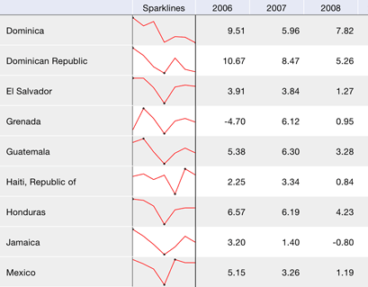
Sparklines are small line charts inside single cells. Sparklines display data series trends.
Use sparklines for more visual presentation of large data sets.
To show or hide sparklines:
Tap the  button at the top right corner of the express report page. The Table dialog box opens.
In the Table dialog box that opens move the Sparklines switch button to the required position.
The Sparklines column is added before the first table column, this column cells will contain charts displaying data series trends:

The black dots on the chart show the minimum and maximum values.
See also: