Source data
To select a data source for a chart, use the Source Data group of parameters on the side panel.
The Source Data group of parameters opens automatically when creating a chart.
Select data source type by selecting the radio button:
From Data Sheet. A chart will be based on the selected cell range.
Object. A chart will be based on the selected object.
Further setup depends on the selected data source type.
From Data Sheet
An area located on report sheet will be used as the chart data source:
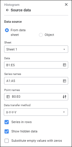
Determine the following parameters after selecting the radio button:
Select the sheet with source data in the drop-down list.
Specify the cell range that contains chart data.
To select a range:
Enter the range manually.
Select the cell range in the working area.
Click the
 Select Data button. The Select Data dialog box opens:
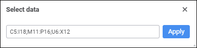
Enter manually or select the cell range in the working area and click the Apply button.
To resize the dialog box, hover the cursor over the right bottom corner and drag it, the cursor will be displayed as a two-headed arrow.
To select a range on another sheet:
Open the Select Data dialog box, go to the required sheet and select the range.
Enter sheet name as follows: <sheet name>!, then enter the required range manually.
A cell range may be set as a combined or rectangular area. When several ranges are used, chart series are displayed in the order of ranges selection.
Specify the cell range that contains series names. The specified names appear in the legend.
To select a range:
Enter the range manually.
Select the cell range in the working area.
Click the
Select Data button. The Select Data dialog box opens:
Enter manually or select the cell range in the working area and click the Apply button.
To resize the dialog box, hover the cursor over the right bottom corner and drag it, the cursor will be displayed as a two-headed arrow.
To select a range on another sheet:
Open the Select Data dialog box, go to the required sheet and select the range.
Enter sheet name as follows: <sheet name>!, then enter the required range manually.
If the range of names is set as an open range (entire column or row), the value of the cell located at intersection of the data range and the series names range is used as the series name. If multiple ranges are used to build a chart, the ranges of series names should be specified in the same order as the data selection.
NOTE. For waterfall charts, the legend displays predefined names: Increase, Decrease, and Totals.
When setting a cell range with legend entries (series), consider the following:
Chart legend is not shown if at least one value is omitted in the specified range of series names.
Specify the cell range that contains point names. The specified names will be displayed on horizontal chart axis if there is any.
To select a range:
Enter the range manually.
Select the cell range in the working area.
Click the
Select Data button. The Select Data dialog box opens:
Enter manually or select the cell range in the working area and click the Apply button.
To resize the dialog box, hover the cursor over the right bottom corner and drag it, the cursor will be displayed as a two-headed arrow.
To select a range on another sheet:
Open the Select Data dialog box, go to the required sheet and select the range.
Enter sheet name as follows: <sheet name>!, then enter the required range manually.
If a names range is specified as an open range (entire column or row), the value of the cell located at the intersection of data range and point names range is selected as a point name.
When setting a cell range with category axis labels, consider the following:
Point label is not shown in the chart if the corresponding cell in the point names range does not contain any value (is empty).
When a waterfall chart is used, the Point Names box is used to specify the columns that are located on the category axis (X).
To set up displaying of point labels, click the  Set Up button. The Show Labels panel opens:
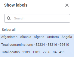
NOTE. The Set Up button is available if the Point Names invalid cell range is entered.
The list on the panel contains point names accounting for the parameters specified in the Source Data group of parameters.
Select point names, which labels must be displayed on the category axis. To select all, click the Select All button, after which the button becomes selected. To deselect all, deselect the Select All button.
One can set up tooltips and data labels for selected point names.
To quickly search for a point, enter part of its name or a full name to the search string at the top of the Show Labels panel.
The Data Transfer Method box is available only for scatter and bubble charts.
Set the data transfer method for a scatter chart:
X-Y-Y-Y. Default option. When this option is selected, all series have the same values along the X axis. These values are stored either in the top row (when series are displayed in rows) or in the first column (when series are displayed in columns). Other rows or columns contain values of the series along the Y axis.
X-Y-X-Y. If this option is selected, values along the Y and X axes alternate in rows or columns (depending on the series layout). If the series are arranged in rows, the values alternate from top to bottom. If the series are arranged in columns, the values alternate from left to right.
Y-X-X-X. When this option is selected, all series have the same values along the X axis. These values are stored either in the top row (when series are displayed in rows) or in the first column (when series are displayed in columns). Other rows or columns contain values of the series along the Y axis.
Y-X-Y-X. If this option is selected, values along the Y and X axes alternate in rows or columns (depending on the series layout). If the series are arranged in rows, the values alternate from top to bottom. If the series are arranged in columns, the values alternate from left to right.
Set the data transfer method for a bubble chart:
XYZYZ. Default option. When this option is selected, all series have the same values along the X axis. These values are stored either in the top row (when series are displayed in rows) or in the first column (when series are displayed in columns). Values by the Y and Z axes alternate in the rows or columns (depending on the series location). If the series are displayed in rows, the values alternate from top to bottom. If the series are displayed in columns, the values alternate from left to right. Where Z - bubble size.
XYZXYZ. If this option is selected, values along the Y, X and Z axes alternate in rows or columns (depending on the series layout). If the series are displayed in rows, the values alternate from top to bottom. If the series are displayed in columns, the values alternate from left to right. Where Z - bubble size.
YXZYXZ. When this option is selected, all series have the same values along the Y axis. These values are stored either in the top row (when series are displayed in rows) or in the first column (when series are displayed in columns). Values by the X and Z axes alternate in the rows or columns (depending on the series location). If the series are displayed in rows, the values alternate from top to bottom. If the series are displayed in columns, the values alternate from left to right. Where Z - bubble size.
YXZYXZ. If this option is selected, values along the Y, X and Z axes alternate in rows or columns (depending on the series layout). If the series are displayed in rows, the values alternate from top to bottom. If the series are displayed in columns, the values alternate from left to right. Where Z - bubble size.
To set up series layout in columns or in rows, use the Series in Rows checkbox.
Object
If the radio button is selected, the existing table is used as a chart data source:
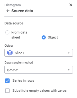
Determine the following parameters after selecting the radio button:
Select a slice to use as the chart data source in the drop-down list.
The Data Transfer Method box is available only for scatter charts and bubble charts.
Set data transfer method for a scatter or bubble chart.
Chart Data Parameters
After setting parameters related to data source, set chart data parameters:
Indicate how to interpret numeric series for the specified data area.
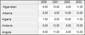
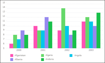
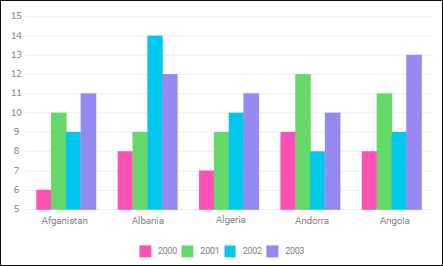
Select the Series in Rows checkbox for creation of value array for data series on the chart by rows. When the checkbox is deselected, an array is created from values by columns.
For example, let us plot a chart to illustrate the use of the Series in Rows checkbox. As a data source use Volume of Production by Regions, mln. rub:
Histogram appearance if series are located in rows:
Histogram appearance if series are located in columns:
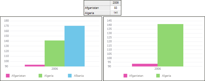
When the Show Hidden Data checkbox is selected, the chart can show all data area values, including data contained in hidden rows or columns and data of the rows or columns with zero height or width. If the checkbox is deselected, the chart is built using only the visible part of the data area. The checkbox is selected by default. The checkbox is not available if a slice is used as the chart source.
Below is the example of a data area chart with some of the rows hidden with the checkbox selected (left) and deselected (right):

 Substitute empty values with zeros
If the Substitute Empty Values with Zeros checkbox is selected, empty values are automatically substituted with zeros. If the checkbox is deselected, the intervals containing empty values are displayed as a dashed line and connect two nearest present values.