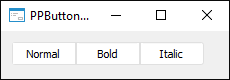
The PPButtonGroup component implements a button group.
The component is a group of buttons that are used as radio buttons. Toggling between buttons is made by displaying one of the buttons as pressed. When working only one of the buttons can be pressed when toggling the other buttons are automatically released. The AllowAllUp property can be used to set the mode for the component when all buttons can be released.
To add a button into a group, select the Add a Button context menu item. In this case a button is created that is implemented by the PPSwitchButton class. On working of the form, buttons can be added dynamically from the application code; to do this, use the Add or Insert method. When a button is added to the group, the current PPButtonGroup component is automatically set for it as a parent component. All buttons sizes are calculated automatically relative to the PPButtonGroup component size and number of added buttons. Farthest buttons have rounded edges.
| Property name | Brief description | |
 |
Align |
The Align property determines behavior of the component when its parent component is resized. |
|
AllowAllUp |
The AllowAllUp property determines whether all buttons included into the group can be released at the same time. |
|
AllowDrag |
The AllowDrag property determines whether an object can be dragged from the component. |
|
AllowDrop |
The AllowDrop property determines whether the component can accept a dragged object. |
|
Anchors |
The Anchors property returns settings that determine the percentage of the size change for the current component when the parent component is resized. |
|
Brush |
The Brush property determines the brush that is used to fill component area. |
|
ClientHeight |
The ClientHeight property is used to receive or specify the height of the component’s client area. |
|
ClientWidth |
The ClientWidth property is used to receive or specify the width of the component’s client area. |
|
Color |
The Color property determines a component background color. |
|
ComponentCount |
The ComponentCount property returns the number of child components. |
|
Components |
The Components property returns the child component. |
|
Count |
The Count property returns the number of buttons, added to the group. |
|
Cursor |
The Cursor property determines the look of the cursor over the component. |
|
Data |
The Data property is used to store any custom data. |
|
Enabled |
The Enabled property determines whether the component is available for the user. |
|
Focused |
The Focused property returns True if the focus is set on the component. |
|
Font |
The Font property determines the set of characteristics describing the font that is used to display text. |
|
Height |
The Height property determines component height. |
|
HelpContext |
The HelpContext property determines a unique index for the context help section for this component. |
|
Hint |
The Hint property determines a component tooltip text. |
|
Item |
The Item property returns button parameters by index. |
|
Left |
The Left property determines the coordinate of the left border of the component. |
|
Name |
The Name property determines a component name. |
|
Parent |
The Parent property determines a parent component. |
|
ParentColor |
The ParentColor property determines whether the component inherits the color of the parent component. |
|
ParentFont |
The ParentFont property determines whether the component uses the font of the parent component. |
|
ParentShowHint |
The ParentShowHint property determines whether a tooltip is displayed. |
|
PopupMenu |
The PopupMenu property determines the context menu opened by clicking the component with the additional mouse button. |
|
ShowHint |
The ShowHint property enables and disables showing a component tooltip. |
|
TabOrder |
The TabOrder property determines the component position in the tab order. |
|
TabStop |
The TabStop property determines whether the component is focused when the Tab key is pressed. |
|
Tag |
The Tag property is not used by the compiler. The user can change the value of the Tag property and use it as he wishes. |
|
Text |
The Text property determines the row identifying a component for the user. |
|
Top |
The Top property determines the coordinate of the top border of the component. |
|
Visible |
The Visible property determines visibility of the component during execution. |
|
Width |
The Width property determines component width. |
| Method name | Brief description | |
 |
Add |
The Add method adds selected button to the group. |
|
BringToFront |
The BringToFront method brings a component to front. |
|
Clear |
The Clear method deletes all buttons from the group. |
|
ClientToScreen |
The ClientToScreen method converts the coordinates of a point specified relative to the component coordinate system into screen coordinates. |
|
DoDragDrop |
The DoDragDrop method enables the user to start dragging operation. |
|
GetImage |
The GetImage method returns the image of the component with all the child components. |
|
Insert |
The Insert method insert the button into the specified position in the group. |
|
Remove |
The Remove method removes selected button from the group. |
|
RemoveByIndex |
The RemoveByIndex method removes the button from the group by index. |
|
ScreenToClient |
The ScreenToClient method converts screen coordinates of a point into coordinates specified relative to the component coordinate system. |
|
SendToBack |
The SendToBack method sends a component to back. |
|
SetFocus |
The SetFocus method sets focus to this component. |
| Event name | Brief description | |
 |
OnBeginDrag |
The OnBeginDrag event occurs for a component when the user starts to drag an object from the component. |
|
OnClick |
The OnClick event occurs if the user clicks the component area. |
|
OnDblClick |
The OnDblClick event occurs if the user double-clicks the component area. |
|
OnDragDrop |
The OnDragDrop event occurs for the component if the user drops a dragged object over it. |
|
OnDragEnter |
The OnDragEnter event occurs when a dragged object crosses the borders of this component. |
|
OnDragLeave |
The OnDragLeave event occurs when a dragged object leaves the borders of this component. |
|
OnDragOver |
The OnDragOver event occurs for the component when the user drags an object over it. |
|
OnEnter |
The OnEnter event occurs when the component receives focus. |
|
OnExit |
The OnExit event occurs when the component loses focus. |
|
OnKeyDown |
The OnKeyDown event occurs if the component is focused and a keyboard key is pressed. |
|
OnKeyPress |
The OnKeyPress event occurs if the component is focused when the user presses a character key. |
|
OnKeyUp |
The OnKeyUp event occurs if the component is focused and the user releases any button previously pressed. |
|
OnMouseDown |
The OnMouseDown event occurs if the component is focused and any of the mouse buttons is pressed. |
|
OnMouseMove |
The OnMouseMove event occurs when a user moves the cursor over the component. |
|
OnMouseUp |
The OnMouseUp event occurs if the component is focused, and any of the previously pressed mouse buttons is released. |
|
OnMouseWheel |
The OnMouseWheel event occurs if the component is focused when the mouse wheel is rotated. |
See also: