The Wizard component is used to create a multiple-page wizard.
A wizard consists of pages implemented by the WizardPage class and the splashscreen of the WizardSplash component. The wizard splashscreen shows all links to wizard pages.
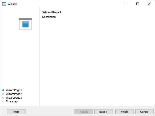
The development environment enables the user to quickly create a wizard with an interface similar to interface of repository object (cubes, tables, and so on) wizards. To do this, select the File > New > Other > Wizard menu item. The interface of a wizard created in such a way is shown in the example. The property of the Buttons component can be used to select custom buttons for navigating wizard pages.
| Property name | Brief description | |
 |
ActivePage | The ActivePage property determines a wizard active page |
|
Align | The Align property determines behavior of the component when its parent component is resized |
|
AllowDrag | The AllowDrag property determines whether an object can be dragged from the component |
|
AllowDrop | The AllowDrop property determines whether the component can receive a dragged object |
|
Anchors | The Anchors property returns settings determining % of the size change for the current component when the parent component is resized. |
|
Brush | The Brush property determines the brush that is used to fill component area |
|
Buttons | The Buttons property returns the wizard pages navigation buttons collection |
|
ClientHeight | The ClientHeight property is used to get or to set the height of the component’s client area |
|
ClientWidth | The ClientWidth property is used to get or to set the width of the component’s client area |
|
Color | The Color property determines a component background color |
|
ComponentCount | The ComponentCount property returns the number of child components |
|
Components | The Components property returns the child component |
|
Cursor | The Cursor property determines the look of the cursor over the component |
|
Data | The Data property is used to store custom data |
|
Enabled | The Enabled property determines whether the component is available for the user |
|
Focused | The Focused property returns True if the focus is set on this component. |
|
Font | The Font property determines the collection of characteristics, which describe the font that is used to display text |
|
Height | The Height property determines component height |
|
HelpContext | The HelpContext property determines the unique index for a section of a context help for this component |
|
Hint | The Hint property determines a component tooltip text |
|
Left | The Left property determines the coordinate of the left border of the component |
|
Name | The Name property determines a component name |
|
Pages | The Pages property returns the wizard pages collection |
|
Parent | The Parent property determines a parent component |
|
ParentColor | The ParentColor property determines whether the component inherits color of the parent component |
|
ParentFont | The ParentFont property determines whether the component inherits font of the parent component |
|
ParentShowHint | The ParentShowHint property determines whether a tooltip is displayed |
|
PopupMenu | The PopupMenu property determines the context menu opened by clicking the component with the additional mouse button. |
|
Scrolls | The Scrolls property returns parameters of component's scrollbars. |
|
ShowHint | The ShowHint property enables and disables showing a component tooltip |
|
Splash | The Splash property returns wizard's splash screen |
|
TabOrder | The TabOrder property determines the component's position in tab order |
|
TabStop | The TabStop property determines whether the component must be focused on pressing the TAB key |
|
Tag | The Tag property is not used by compiler. The user can change value of the Tag property and use it as he wishes. |
|
Text | The Text property determines the row identifying component for the user |
|
Top | The Top property determines the coordinate of the top border of the component |
|
Visible | The Visible property determines whether a component is displayed at the runtime |
|
Width | The Width property determines component width |
| Method name | Brief description | |
 |
BringToFront | The BringToFront method brings a component to front |
|
ClientToScreen | The ClientToScreen method converts the point coordinates specified relative to the component coordinate system to screen coordinates |
|
DoDragDrop | The DoDragDrop method enables the user to start dragging. |
|
GetImage | The GetImage method returns image of the component with all its child components |
|
ScreenToClient | The ScreenToClient method converts the screen point coordinates to coordinates specified relative to the component coordinate system |
|
SendToBack | The SendToBack method sends a component to back |
|
SetFocus | The SetFocus method sets focus to this component |
| Event name | Brief description | |
 |
OnBeginDrag | The OnBeginDrag event occurs for a component when the user starts to drag an object from the component |
|
OnCancel | The OnCancel event occurs after clicking the Cancel button |
|
OnClick | The OnClick event occurs if the user clicks in the component area with the main mouse button |
|
OnDblClick | The OnDblClick event occurs if the user double-clicks the component area. |
|
OnDragDrop | The OnDragDrop event occurs when the user drops the dragged object over the component |
|
OnDragEnter | The OnDragEnter event occurs when a dragged object crosses the component borders |
|
OnDragLeave | The OnDragLeave event occurs when a dragged object leaves the component borders |
|
OnDragOver | The OnDragOver event occurs for a component when the user drags an object over it. |
|
OnEnter | The OnEnter event occurs when a component receives focus |
|
OnExit | The OnExit event occurs when a component loses focus |
|
OnFinish | The OnFinish event occurs on clicking the Finish button |
|
OnHScroll | The OnHScroll event occurs when horizontal scrollbar slider changes its position. |
|
OnKeyDown | The OnKeyDown event occurs if the component is focused and a keyboard button is pressed. |
|
OnKeyPress | The OnKeyPress event occurs if the component is focused when the user presses a character key |
|
OnKeyPreview | The OnKeyPreview event occurs prior to each event related to clicking mouse buttons. |
|
OnKeyUp | The OnKeyUp event occurs if the component is focused and the user releases any button previously pressed |
|
OnMouseDown | The OnMouseDown event occurs if the pointer is in component's area and a mouse key is pressed. |
|
OnMouseEnter | The OnMouseEnter event occurs when mouse cursor enters the component area. |
|
OnMouseHover | The OnMouseHover event occurs when mouse cursor is held in the component area. |
|
OnMouseLeave | The OnMouseLeave event occurs when mouse cursor leaves the component area. |
|
OnMouseMove | The OnMouseMove event occurs on moving the cursor over component. |
|
OnMouseUp | The OnMouseUp event occurs on releasing mouse button when the cursor is in component area. |
|
OnMouseWheel | The OnMouseWheel event occurs if the component is focused when the mouse wheel is rotated. |
|
OnVScroll | The OnVScroll event occurs when vertical scrollbar slider changes its position. |
See also: