The ImageList component is used to store the images collection.
All images have the same size. The size is found using the Height and Width properties or using the component editor.
Each image loaded to the component has its index, which is used to address this component.
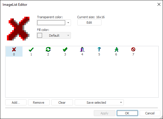
The ImageList Editor dialog box is used to load images. To open this dialog box, double-click the required component on the form or select appropriate item in the component's context menu:
Images are loaded using a standard file open dialog box, which is opened by clicking the Add button. If height of the loaded image exceeds the component height, it is requested to change current settings of the component. Answer Yes to resize the component; otherwise the component is positioned with original size. Images with lesser size are zoomed in. The added area is filled with the selected fill color. If the list contains earlier added images, the new ones are added to the end of the list.
Images in the list can be moved using Drag&Drop. When images are rearranged, indexes of all moved images are changed.
The selected image is removed using the Delete button. The Clear button deletes all loaded images.
The Save Selected button can be used to save selected icons to a hard drive as a single file or as separate images. When images are saved as separate images, file names are generated as follows: <ImageList component name>_<image index>.bmp.
Fill color and transparent color can be set for each of the images. To do this, use respective drop-down lists for color selection. These colors will be used to form final version of images displayed in the components.
The ImageList component can load images in the following formats: bmp, jpg, gif, tiff, jpeg, png, ico. It also supports images with alpha channel: in the GIF format with a simple binary transparency and in the PNG format with partial transparency.
NOTE. All loaded BMP files must have the TrueColor format.
The Modify button enables the user to resize images and re-break up all loaded images.
| Property name | Brief description | |
 |
ComponentCount | The ComponentCount property returns the number of child components. |
|
Components | The Components property returns the child component. |
|
Count | The Count property returns the number of images, loaded to the component collection. |
|
Data | The Data property is used to store any custom data. |
|
Height | The Height property determines the height of images, stored in the component collection. |
|
Icon | The Icon property returns the graphic image of the specified icon. |
|
Item | The Item property returns specified graphic image. |
|
Name | The Name property determines a component name. |
|
Tag | The Tag property is not used by the compiler. The user can change the value of the Tag property and use it as he wishes. |
|
Width | The Width property determines the width of images, stored in the component collection. |
| Method name | Brief description | |
 |
Add | The Add method adds an image to the component collection. |
|
AddIcon | The AddIcon method adds an icon to the component collection. |
|
Clear | The Clear method clears the component image collection. |
|
LoadFromFile | The LoadFromFile method loads an image from file to the component. |
|
LoadFromStream | The LoadFromStream method loads an image from stream to the component. |
|
LoadFromStream2 | The LoadFromStream2 method loads images from the stream and recovers the information about translucency. |
|
Remove | The Remove method removes an image from the collection. |
|
SaveToDoc | The SaveToDoc method saves all the images from the component to file. |
|
SaveToStream | The SaveToStream method saves all the images from the component to stream. |
|
SaveToStream2 | The SaveToStream2 method saves the images to the stream with the information about translucency. |
|
SetOverlay | The SetOverlay method identifies an image in the list as an image, which can be used as an overlay. |
See also: