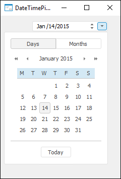
The DateTimePickerEx component implements a drop-down calendar, which enables the user to edit date and time values with additional settings to change calendar appearance. The calendar supports dates within the range between 01.01.1601 and 31.12.9999.
Different Show* properties enable the user to set up component appearance. These properties enable the user to determine the following settings:
Whether to display the checkbox, managing access to editor (ShowCheckbox).
Whether to display fields for editing time component (ShowTime).
Whether to display buttons responsible for the mode of setting date in the calendar (different ShowMode* properties).
Data setting mode can also be set using the Mode property. Data can be set by selecting one of the periods corresponding to the mode. Value of the CurrentDate property will correspond to beginning of the selected period.
The MinDate and MaxDate properties can be used to limit a range of dates, in which the user can select value.
A language used for displaying text of various component elements depends on the interface language, with which the application is running.
| Property name | Brief description | |
 |
Align |
The Align property determines behavior of the component when its parent component is resized. |
|
Alignment |
The Alignment property determines the type of alignment of the drop-down calendar relative to the component borders. |
|
AllowDrag |
The AllowDrag property determines whether an object can be dragged from the component. |
|
AllowDrop |
The AllowDrop property determines whether the component can accept a dragged object. |
|
Anchors |
The Anchors property returns settings that determine the percentage of the size change for the current component when the parent component is resized. |
|
AutoResize |
The AutoResize property determines the attribute of automatic resizing of the component. |
|
Brush |
The Brush property determines the brush that is used to fill component area. |
|
Checked |
The Checked property determines component checkbox state. |
|
ClientHeight |
The ClientHeight property is used to receive or specify the height of the component’s client area. |
|
ClientWidth |
The ClientWidth property is used to receive or specify the width of the component’s client area. |
|
Color |
The Color property determines a component background color. |
|
ColorBackground |
The ColorBackground property determines the background color of the component edit box. |
|
ColorText |
The ColorText property determines text color in the component edit box. |
|
ComponentCount |
The ComponentCount property returns the number of child components. |
|
Components |
The Components property returns the child component. |
|
CurrentDate |
The CurrentDate property determines date and time, which are displayed in the component on form startup. |
|
Cursor |
The Cursor property determines the look of the cursor over the component. |
|
Data |
The Data property is used to store any custom data. |
|
DropCalendar |
The DropCalendar property determines whether a drop-down calendar can be opened in the component. |
|
DroppedDown |
The DroppedDown property returns whether component drop-down calendar is displayed. |
|
Enabled |
The Enabled property determines whether the component is available for the user. |
|
EnableTodayButton |
The EnableTodayButton property determines whether a button to set current date and time is displayed in the drop-down calendar. |
|
EnableWeekNumbers |
The EnableWeekNumbers property determines whether week numbers are displayed in the drop-down calendar. |
|
FirstDayOfWeek |
The FirstDayOfWeek property determines the first day of the week in the drop-down calendar. |
|
Focused |
The Focused property returns True if the focus is set on the component. |
|
Font |
The Font property determines the set of characteristics describing the font that is used to display text. |
|
Height |
The Height property determines component height. |
|
HelpContext |
The HelpContext property determines a unique index for the context help section for this component. |
|
Hint |
The Hint property determines a component tooltip text. |
|
IsValidDate |
The IsValidDate property determines whether the specified value can be set as a component value. |
|
Left |
The Left property determines the coordinate of the left border of the component. |
|
MaxDate |
The MaxDate property determines the maximum value of the date, with which the user can work. |
|
MinDate |
The MinDate property determines the minimum value of the date, with which the user can work. |
|
Mode |
The Mode property determines a mode of date setting in the calendar. |
|
MonthFormat |
The MonthFormat property determines the display style of month name in the component edit box. |
|
Name |
The Name property determines a component name. |
|
Parent |
The Parent property determines a parent component. |
|
ParentColor |
The ParentColor property determines whether the component inherits the color of the parent component. |
|
ParentFont |
The ParentFont property determines whether the component uses the font of the parent component. |
|
ParentShowHint |
The ParentShowHint property determines whether a tooltip is displayed. |
|
PopupMenu |
The PopupMenu property determines the context menu opened by clicking the component with the additional mouse button. |
|
Scrolls |
The Scrolls property returns parameters of component's scrollbars. |
|
ShowCheckbox |
The ShowCheckbox property determines whether a checkbox that determines access to the component is displayed. |
|
ShowDate |
The ShowDate property determines whether date is displayed in the component. |
|
ShowHint |
The ShowHint property enables and disables showing a component tooltip. |
|
ShowModeDays |
The ShowModeDays property determines whether the button to enable data setting mode by selecting day of month is displayed in the component area. |
|
ShowModeHalfYears |
The ShowModeHalfYears property determines whether the button to enable date setting mode by selecting a half-year is displayed in the component area. |
|
ShowModeMonths |
The ShowModeMonths property determines whether the button to enable data setting mode by selecting month of the year is displayed in the component area. |
|
ShowModeQuarters |
The ShowModeQuarters property determines whether the button to enable data setting mode by selecting quarter of the year is displayed in the component area. |
|
ShowModeWeeks |
The ShowModeWeeks property determines whether the button to enable data setting mode by selecting week of the half-year is displayed in the component area. |
|
ShowSpinButton |
The ShowSpinButton property determines whether the SpinUp, SpinDown buttons that are used to change date and time values are displayed. |
|
ShowTime |
The ShowTime property determines whether time is displayed in the component. |
|
SingleMonthMode |
The SingleMonthMode property determines whether month numbers are separated from week numbers. |
|
TabOrder |
The TabOrder property determines the component position in the tab order. |
|
TabStop |
The TabStop property determines whether the component is focused when the TAB key is pressed. |
|
Tag |
The Tag property is not used by the compiler. The user can change the value of the Tag property and use it as he wishes. |
|
Text |
The Text property determines the row identifying a component for the user. |
|
Top |
The Top property determines the coordinate of the top border of the component. |
|
Visible |
The Visible property determines visibility of the component during execution. |
|
Width |
The Width property determines component width. |
| Method name | Brief description | |
 |
BringToFront |
The BringToFront method brings a component to front. |
|
ClientToScreen |
The ClientToScreen method converts the coordinates of a point specified relative to the component coordinate system into screen coordinates. |
|
DoDragDrop |
The DoDragDrop method enables to start dragging operation. |
|
GetImage |
The GetImage method returns the image of the component with all the child components. |
|
ScreenToClient |
The ScreenToClient method converts screen coordinates of a point into coordinates specified relative to the component coordinate system. |
|
SendToBack |
The SendToBack method sends a component to back. |
|
SetFocus |
The SetFocus method sets focus to this component. |
| Event name | Brief description | |
 |
OnBeginDrag |
The OnBeginDrag event occurs for a component when the user starts to drag an object from the component. |
|
OnChange |
The OnChange event occurs when date/time is changed in the component. |
|
OnClick |
The OnClick event occurs if the user clicks the component area. |
|
OnCloseUp |
The OnCloseUp event occurs after collapsing the drop-down calendar. |
|
OnDblClick |
The OnDblClick event occurs if the user double-clicks the component area. |
|
OnDragDrop |
The OnDragDrop event occurs for the component if the user drops a dragged object over it. |
|
OnDragEnter |
The OnDragEnter event occurs when a dragged object crosses the borders of this component. |
|
OnDragLeave |
The OnDragLeave event occurs when a dragged object leaves the borders of this component. |
|
OnDragOver |
The OnDragOver event occurs for the component when the user drags an object over it. |
|
OnDropDown |
The OnDropDown event occurs right after expanding the calendar. |
|
OnEnter |
The OnEnter event occurs when the component receives focus. |
|
OnExit |
The OnExit event occurs when the component loses focus. |
|
OnHScroll |
The OnHScroll event occurs when horizontal scrollbar slider changes its position. |
|
OnKeyDown |
The OnKeyDown event occurs if the component is focused and a keyboard key is pressed. |
|
OnKeyPress |
The OnKeyPress event occurs if the component is focused when the user presses a character key. |
|
OnKeyPreview |
The OnKeyPreview event occurs prior to each event related to key pressing. |
|
OnKeyUp |
The OnKeyUp event occurs if the component is focused and the user releases any button previously pressed. |
|
OnMouseDown |
The OnMouseDown event occurs if the pointer is in component's area and a mouse key is pressed. |
|
OnMouseEnter |
The OnMouseEnter event occurs when mouse cursor enters the component area. |
|
OnMouseHover |
The OnMouseHover event occurs when mouse cursor is held in the component area. |
|
OnMouseLeave |
The OnMouseLeave event occurs when mouse cursor leaves the component area. |
|
OnMouseMove |
The OnMouseMove event occurs on moving the cursor over component. |
|
OnMouseUp |
The OnMouseUp event occurs on releasing mouse button when the cursor is in component area. |
|
OnMouseWheel |
The OnMouseWheel event occurs if the component is focused when the mouse wheel is rotated. |
|
OnVScroll |
The OnVScroll event occurs when vertical scrollbar slider changes its position. |
See also: