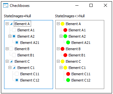
Checkboxes: Boolean;
The Checkboxes property determines whether component elements have checkboxes.
Available values:
True. Checkboxes are displayed for elements.
False. Default value. Checkboxes are not displayed for elements.
If the StateImages property is set for the component and Checkboxes = True, three first images from the StateImages collection are used to display element checkboxes state: the image with the 0 index for not selected, with the 1 index for selected and with the 2 index for checkboxes with indeterminate state.
If the SelectionMode = SingleSelected and CheckBoxes = True properties are set for the component, checkbox state is changed on pressing the SPACE key when the required node is focused. The OnChecking and OnChecked events are generated on checkbox state change.

See also: