Pads: INavigationBarPads;
The Pads property returns the collection of navigation bar tabs.
Executing the example requires a form with the NavigationBar component named NavigationBar1 on it and the ImageList component named ImageList1. At least two images are loaded to the ImageList1 component. The repository also contains forms with the following identifiers: F_BASE_PARAMS, F_ADDITION_PARAMS, F_TABLE, and F_DIAGRAM. These forms contain different groups of settings and will be connected to the tab bars of the NavigationBar1 component.
Class TESTForm: Form
NavigationBar1: NavigationBar;
ImageList1: ImageList;
Sub TESTFormOnCreate(Sender: Object; Args: IEventArgs);
Var
Pads: INavigationBarPads;
Pad: INavigationBarPad;
Begin
Pads := NavigationBar1.Pads;
NavigationBar1.BeginUpdate;
//First tab
Pad := New NavigationBarPad.Create;
Pads.Add(Pad);
Pad.Header.Title := Main;
Pad.Content.MetabaseObject := "F_BASE_PARAMS";
//Second tab
Pad := New NavigationBarPad.Create;
Pads.Add(Pad);
Pad.Header.Title := Additional;
Pad.Header.Content := NavigationBarHeaderContent.CheckBox;
Pad.Header.Value := True;
Pad.Content.MetabaseObject := "F_ADDITION_PARAMS";
//Third tab
Pad := New NavigationBarPad.Create;
Pads.Add(Pad);
Pad.Header.Title := Table;
Pad.Header.Content := NavigationBarHeaderContent.Custom;
Pad.Header.CustomContent := CreateButton(0);
Pad.Content.MetabaseObject := "F_TABLE";
//Fourth tab
Pad := New NavigationBarPad.Create;
Pads.Add(Pad);
Pad.Header.Title := Chart;
Pad.Header.Content := NavigationBarHeaderContent.Custom;
Pad.Header.CustomContent := CreateButton(1);
Pad.Content.MetabaseObject := "F_DIAGRAM";
//Active tab
NavigationBar1.ActivePad := Pads.Item(0);
//Component borders
NavigationBar1.Border := ControlBorderType.Left Or ControlBorderType.Right;
NavigationBar1.EndUpdate;
End Sub TESTFormOnCreate;
Function CreateButton(Index: Integer): IImageButton;
Var
Img: IImageButton;
Begin
Img := New ImageButton.Create;
Img.Parent := NavigationBar1;
Img.Enabled := False;
Img.DrawFocus := False;
Img.Images := ImageList1;
Img.NormalLook.ImageIndex := Index;
Img.Text := "";
Img.Height := 20;
Img.Width := 20;
Return Img;
End Function CreateButton;
End Class TESTForm;
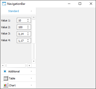
The NavigationBar1 tab collection is set up at the form startup. Four tabs are created in the collection, and the header and the panel are set up for each of them. The ImageButton components are displayed in the titles for the last two tabs. The first tab is active. Component borders are also changed.
An approximate form available for the form after configuration of the NavigationBar1 component:
See also: