To execute the example, connect the PP.js components library and the PP.css visual styles table. See below the Javascript code used to create the ToolBar component. The example requires the ui-icons_222222_256x240.png file that contains a collection of button icons.
<script type="text/javascript">
//Create the ImageList component containing a set of button images
var imageList = new PP.ImageList();
imageList.setSource("ui-icons_222222_256x240.png");
imageList.setIconHeight(16);
imageList.setIconWidth(16);
//Create the ToolBar component
var toolBar = new PP.Ui.ToolBar({
ParentNode: document.getElementById("toolB"),
ImageList: imageList,
});
//A button with an image
var imgbtn = new PP.Ui.ToolBarButton({
Parent: toolBar,
Content: "Cut",
ToolTip: "Cut",
ColumnIndex: 7,
RowIndex: 6,
IsFlat: true//Flat button
});
//Regular button
var simplebtn = new PP.Ui.ToolBarButton({
Parent: toolBar,
Content: "Copy",
ToolTip: "Copy",
IsFlat: false//Convex button
});
//Separator
var separator1 = new PP.Ui.ToolBarSeparator();
//Add buttons and a separator on the toolbar
toolBar.addItem(imgbtn);
toolBar.addItem(simplebtn);
toolBar.insertItem(separator1, 1);
</script>
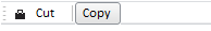
After executing the example, the HTML page will contain a toolbar with two buttons:
See also: