The Splitter component is a splitter used to adjust panels positions relative to each other, hide panels and resize them.
On hovering over the splitter the pointer turns to a double-headed arrow that can be used to resize panels. Panels can be resized if the Splitter.EnableResize property is set to true.
A splitter controls positions of two horizontally or vertically positioned panels.
The component is implemented by Splitter class.
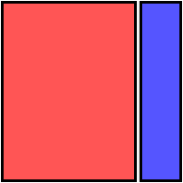
The Splitter component may look like follows:
Example of creating the Splitter component
| Constructor name | Brief description | |
 |
Splitter | The Splitter constructor creates an instance of the Splitter component. |
| Property name | Brief description | |
 |
EnableResize | The EnableResize property determines whether panels can be resized. |
|
FixPanel | The FixPanel property determines index of the panel, which is resized on resizing the entire component. |
|
IsVertical | The IsVertical property determines orientation of a component with splitter. |
|
MinPanelSize | The MinPanelSize property sets minimum size for panels. |
|
Orientation | The Orientation property determines layout option for the panel separated with the Splitter component. |
|
ResizeHtmlContent | The ResizeHtmlContent property determines whether the HTML component set in the Content property is resized. |
|
SplitterPosition | The SplitterPosition property sets position for a splitter. |
| Method name | Brief description | |
|
collapse | The collapse method collapses the left or right panel of the Splitter component. |
|
expand | The expand method expands the collapsed panel of the Splitter component. |
|
getCollapsed | The getCollapsed method returns index of the collapsed panel. |
|
getResizerSize | The getResizerSize method returns size of the area that is used to resize panels. |
|
getPanel | The getPanel method returns a panel by its index. |
| Event name | Brief description | |
 |
SplitterPositionChanged | The SplitterPositionChanged event occurs after splitter position changes. |
|
ValueChanged | The ValueChanged event occurs when splitter value changes. |
| Property name | Brief description | |
|
Anchors | The Anchors property determines position of the component placed within container. |
|
Animation | The Animation property determines component animation parameters. |
|
Bottom | The Bottom property determines a bottom margin if a component is placed inside LayoutPanel. |
|
Content | The Content property determines component contents. |
|
ContextMenu | The ContextMenu property determines a component's context menu. |
|
Data | The Data property is used to store any custom data. |
|
Enabled | The Enabled property determines whether a component can be used. |
|
Height | The Height property determines component height. |
|
IsRTL | The IsRTL property determines whether component elements are aligned to the right. |
|
IsVisible | The IsVisible property determines whether a component is displayed. |
|
Left | The Left property determines a left margin if a component is placed inside GridPanel. |
|
Opacity | The Opacity property determines component transparency. |
|
Parent | The Parent property determines a parent component of a control. |
|
ParentNode | The ParentNode property determines a parent DOM node. |
|
ResourceKey | The ResourceKey property determines a component resource key. |
|
Right | The Right property determines a right margin if a component is placed inside LayoutPanel. |
|
Rotate | The Rotate property determines a component rotation angle. |
|
ShowToolTip | The ShowToolTip property determines whether a tooltip of the component can be displayed. |
|
Style | The Style property determines a component style. |
|
TabIndex | The TabIndex property determines the order of the control element passing inside the container. |
|
Tag | The Tag property determines a JSON object associated with the component. |
|
ToolTip | The ToolTip property determines text of component tooltip. |
|
Top | The Top property determines a top margin if a component is placed inside GridPanel. |
|
Value | The Value property determines a component value. |
|
Width | The Width property determines component width. |
| Method name | Brief description | |
|
The addClass method adds a CSS class to the component. | |
|
addEventHandler | The addEventHandler method adds an event handler to a DOM node. |
|
The addStateClass method adds a CSS class to the component and removes the previous CSS class. | |
|
The addToNode method adds a component to the specified node. | |
|
bindEvents | The bindEvents method subscribes an element to all available events. |
|
The getAnchorFlags method returns JSON object that contains settings of the current component's position. | |
|
The getClass method returns the current CSS classes of the component. | |
|
The getCssStyle method returns style for the specified node. | |
|
The getDomNode method returns main DOM node of the component. | |
|
The getFocused method determines whether the component is focused. | |
|
getIsBinded | The getIsBinded method returns whether an element is subscribed to all DOM node events. |
|
The hide method hides a control. | |
|
The hideToolTip method clears tooltip timeout and hides the tooltip if it is shown. | |
|
refreshStyle | The refreshStyle method refreshes element CSS styles. |
|
The removeClass method removes CSS class from the component. | |
|
removeEventHandler | The removeEventHandler method removes event handler from DOM node. |
|
removeFromDOM | The removeFromDOM method removes node from the DOM structure. |
|
The removeStateClasses method removes CSS classes of the component. | |
|
The setDraggable method determines whether a component can be dragged on the HTML page. | |
|
The setFocus method sets the component focus. | |
|
The setIsHovered method sets up component displaying only on mouseover. | |
|
The setSize method establishes the sizes of the component. | |
|
The show method displays a control. | |
|
unBindEvents | The unBindEvents method unsubscribes an element from all standard events. |
|
The updatePosition method updates size and position when absolute positioning based on the current parameters is used. | |
|
The updateSize method updates the component size on changing the size of the container that contains the component. |
| Event name | Brief description | |
|
Drag | The Drag event occurs on clicking and holding the mouse button. |
|
DragEnd | The DragEnd event occurs when dragging the component finishes. |
|
DragStart | The DragStart event occurs when dragging the component starts. |
|
OnContextMenu | The OnContextMenu event occurs on calling context menu of the component. |
|
SizeChanged | The SizeChanged event occurs after the component is resized. |
|
SizeChanging | The SizeChanging event occurs during component resize. |
| Property name | Brief description | |
|
The Id property determines a repository object identifier. |
| Method name | Brief description | |
|
clone | The clone method creates an object copy. |
|
dispose | The dispose method deletes the component. |
|
getHashCode | The getHashCode method returns hash code of repository object. |
|
getId | The getId method returns repository object identifier. |
|
getSettings | The getSettings method returns repository object settings. |
|
getTypeName | The getTypeName method returns the name of the object type without the namespace, to which it belongs. |
|
isEqual | The isEqual method determines whether the specified object is equal to the current repository object. |
|
isLive | The isLive method determines validity of repository object. |
|
removeAllEvents | The removeAllEvents method removes all object event handlers by the specified context. |
|
setId | The setId method determines a repository object identifier. |
|
setSettings | The setSettings method determines repository object settings. |
|
defineProps | The defineProps method creates get and set methods from name array for the specified class. |
|
keys | The keys method returns array of methods and properties names for the specified object. |
See also: