PP.Ui.ToolTip(settings);
settings. The JSON object with the values of the component properties.
The ToolTip constructor creates an instance of the ToolTip class.
To execute the example, links to PP.js components library and to PP.css visual styles table must be connected in the HEAD tag of the HTML page. The tooltip is shown on hovering the cursor over text area located on the page:
<table style="height: 300px">
<tr>
<td style="vertical-align: top;">
<div id="example" onmouseout="toolTip.hide();" onclick="toolTip.hide();" onmouseover="toolTip.show(10, 35);" style="background-color: #CCC0DA; margin-left: 50px; margin-top: 10px; padding: 8px;">Move the mouse cursor to this area...
</div>
</td>
</tr>
</table>
<script type="text/javascript">
var toolTip = new PP.Ui.ToolTip({
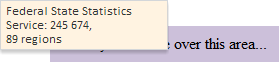
Content: "Rosstat: 245 674,<br/> 89 regions",
Width: 170});
</script>
The tooltip is shown when hovering the cursor over text area located on the HTML page after an example execution:
The tooltip is hidden when clicking on the text area.
See also: