ValueChanged: function (sender,args)
sender. Event source.
args. Event information.
The ValueChanged event occurs when a component value changes.
To execute the example, in the HEAD tag add links to PP.js component library and to PP.css visual styles. In the BODY tag add the following items:
<div id="example">
</div>
<div id="value">
</div>
<br />
Set Value to:
<div id="valuer">
</div>
<br />
Set Value Animated to:
<div id="animValuer">
</div>
</br>
<div id="button">
</div>
<div id="Minvalue" style="display: none; color: Blue;">
Minimal Value Is Reached</div>
<div id="Maxvalue" style="display: none; color: Red;">
Maximal Value Is Reached</div>
In the SCRIPT tag add the following code:
	//The ProgressBar component
	var PB = new PP.Ui.ProgressBar(
	{
	    ParentNode: document.getElementById("example"),
	    Width: 200,
	    //start value of component
	    Value: 20,
	    //component value change event
	    ValueChanged: function ()
	    {
	        //on changing value of the component for DOM node with the "value" identifier the following contents is set: "Value: <current value>"
	        document.getElementById("value").innerHTML = "Value: " + this.getValue();
	        //contents of DOM nodes with the Minvalue and Maxvalue identifiers
	        document.getElementById("Minvalue").style.display = "none";
	        document.getElementById("Maxvalue").style.display = "none";
	    },
	    //when the maximum value is reached (100), contents of DOM node with the Maxvalue identifier is displayed
	    MaxValueReached: function ()
	    {
	        document.getElementById("Maxvalue").style.display = "block"
	    },
	    //when the minimum value is reached (0), contents of DOM nod with the Minvalue identifier is displayed
	    MinValueReached: function ()
	    {
	        document.getElementById("Minvalue").style.display = "block"
	    }
	});
	//numeric editor for setting component value
	var valueMeter = new PP.Ui.NumberEdit(
	{
	    ParentNode: document.getElementById("valuer"),
                Width: 100,
	    Value: 20,
	    MinValue: 0,
	    MaxValue: 1000,
	    AfterChange: function ()
	    {
	        PB.setValue(this.getValue());
	    }
	});
	//numeric editor for setting the value, moving to which is done by means of animation
	var animValuer = new PP.Ui.NumberEdit(
	{
	    ParentNode: document.getElementById("animValuer"),
                Width: 100,
	    Value: 20,
	    MinValue: 0,
	    MaxValue: 1000
	});
	//button for animated value change
	var but = new PP.Ui.Button(
	{
	    ParentNode: document.getElementById("button"),
	    Click: function ()
	    {
	        PB.setValueAnimated(animValuer.getValue());
	        valueMeter.setValue(animValuer.getValue())
	    },
	    Content: "Animate To"
	});
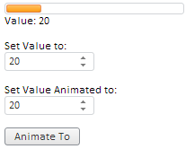
After executing the example the following items are placed in the page:
Changing the value in the Set Value to value editor: changes length of the orange bar that represents the ProgressBar component, and the value in the Value: box is also changed.
On setting a value in the Set Value Animated to value editor: and clicking the Animate To button, the ProgressBar value changes with animation, and the current value is set to the value editor Set Value to: and in the Value: box.
The following line appears if the value 100 is set for the ProgressBar component:
Maximal Value Is Reached
The following line appears if the value 0 is set for the ProgressBar component:
Minimal Value Is Reached
See also: