PP.Ui.Autocomplete(settings: Object)
settings. JSON object that contains values of component properties.
The Autocomplete constructor creates an instance of the Autocomplete component.
To execute the example, in the HEAD tag add links to the PP.js component library, the PP.css visual styles and a resources file (such as resources.en.js).
In the HEAD tag add the style which predefine highlighting color of matching characters in the tooltip for text input autocomplete.
<style>
    /* Predefine highlighting color of matching characters in the tooltip for text input autocomplete */
    .PPMenuItem .PPHighlightAutocomplete {
        background-color: rgb(111, 222, 333) !important;
    }
</style>
In the BODY tag add DIV items with the example and example1 identifiers. In the SCRIPT tag add the following code:
var autocomplete = new PP.Ui.Autocomplete({
    // Array of controls for which autocomplete is applied
    Targets: [{
        // Create a text string
        Control: textBox = new PP.Ui.TextBox({
            ParentNode: document.getElementById("example"),
            Width: 200,
            Id: "TB1"
        }),
        AlwaysShow: true,
        Active: true,
        MatchCase: true, // Perform autocomplete taking into account the case
        // Determine all suggestions to automplete the text input
        Suggestions: [{
            Text: "Monday"
        }, {
            Text: "Tuesday"
        }, {
            Text: "Wednesday"
        }, {
            Text: "Thursday"
        }, {
            Text: "Friday"
        }, {
            Text: "Saturday"
        }, {
            Text: "Sunday"
        }]
    }, {
        // Create value editor
        Control: number = new PP.Ui.NumberEdit({
            ParentNode: document.getElementById("example1"),
            Width: 100,
            Id: "NE1"
        }),
        AlwaysShow: true,
        Active: true,
        MatchCase: false, // Perform autocomplete without taking into account the case
        // Determine suggestions to automplete
        Suggestions: [{
            Text: "1990"
        }, {
            Text: "2000"
        }, {
            Text: "2010"
        }, ]
    }]
});
/* Set minimum number of characters
on which autocomplete tooltip is called */
autocomplete.setMinAutoFindSymbolsCount(1);
/* Enable highlighting of matching characters in the tooltip
to autocomplete the text input */
autocomplete.setEnableHighlight(true);
// Handle the event of autocomplete suggestion from the list using the UP or DOWN keys
autocomplete.SelectionChanged.add(function () {
    alert("SelectionChanged")
});
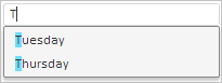
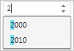
After executing the example the TextBox and NumberEdit components are placed on the page and autocomplete option is enabled for both components. On the first character input, the list of complete suggestions opens and the character is highlighted:
Text editor:
Value editor:
The SelectionChanged message is displayed on selecting autocomplete suggestions using the UP and DOWN keys.