To execute the example enable the hyperlinks to the PP.js libraries and the table of the PP.css visual styles. Below is a script used to place the NavigationBar component containing three panels on the HTML page.
// List - first panel contents
var LB = new PP.Ui.ListBox({
    Items: [{
        Content: "Currency"
    }, {
        Content: "Financial"
    }, {
        Content: "Short date format"
    }, {
        Content: "Long date format"
    }]
});
// Button - third panel contents
var btn = new PP.Ui.Button({
    Content: "Hide"
});
// Click event handler: the panel is collapsed on button click
btn.Click.add(function(sender, args) {
    item1.collapse();
});
// Navigator
var navigationBar = new PP.Ui.NavigationBar({
    // Identifier contained in the div tag
    ParentNode: document.getElementById("navigationBar1"),
    // Create and add the first panel to the navigator
    Items: [{
        Title: "List",
        Content: LB
    }],
    Width: 200, // Component width
    ShowBorders: true,
    IsAlwaysExpanded: false //All tabs are collapsed
});
// Create the second panel
var item0 = new PP.Ui.NavigationItem({
    Title: "Text",
    Content: "Text" // Panel contents
});
// Panel contents - Button component instance
var item1 = new PP.Ui.NavigationItem({
    Title: "Button",
    Content: btn
});
// Add the second and the third panels:
navigationBar.addItem(item0);
navigationBar.addItem(item1);
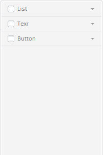
After executing the example the HTML page contains the NavigationBar component placed in the block with the navigationBar1 identifier, the component looks as follows:
In this example the upper panel is created and added to the navigator using the Items property in parameters of the NavigationBar constructor. Other panels are created using the NavigationItem constructor and added using the NavigationBar.addItem method.
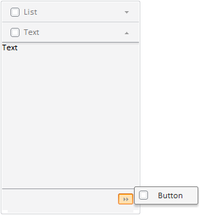
Clicking the upper tab named List opens the panel. Other tabs are shifted downward, and the bottom tab is hidden. A button becomes available, clicking which opens a menu that consists of the hidden panels' headings. To return to desired hidden panel, select appropriate menu item:
If the middle or bottom panels are expanded, the top tab is hidden:
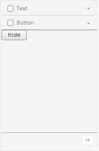
Panels may contain random objects that are set in the Content property. The contents of the upper panel in this example is instance of the ListBox, class, the contents of the middle panel is the Text string, the contents of the bottom panel is instance of the Button class, that is a button, clicking which the panel is collapsed.
The tabs contain titles of the panels that are set by the NavigationItem.Title property, controls (by default are instances of the CheckBox class) and arrows are directed down if the panel is closed, and directed up if the panel is opened.
NOTE. Controls are not shown in the tab if the NavigationItem.IsHeaderControlVisible property is set to False. It is also available to set custom controls, for example, the RadioButton, , ComboBoxButton, ComboBox, components, by the NavigationItem.HeaderControl property.
See also: