HeaderControl: Object
The HeaderControl property sets a control to be displayed in the tab heading.
By default an instance of the CheckBox component is set in the panel title. To display the specified control, the IsHeaderControlVisible property must be set to True.
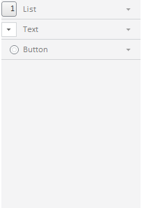
To execute the example enable the hyperlinks to the PP.js libraries and the table of the PP.css visual styles. See below Javascript code used to place the NavigationBar component consisting of three panels to the HTML page. Set controls for titles of each panel.
var ComboB = new PP.Ui.ComboBox({ //Create the ComboBox component
    ListBox: {
         Items:
        [{
            Content: "1"
        }, {
            Content: "2"
        }]
    },
  Width: 22
});
var Rb = new PP.Ui.RadioButton(); //Create the RadioButton component
var BTN = new PP.Ui.Button({ //Create the Button component
             Content: "1",
             Height: 22
});
var NB = new PP.Ui.NavigationBar({ //Create a navigator
    ParentNode: document.getElementById("NB1"),
           Items: //Top navigator panel
           [{
             Title: "List"
           }],
           Width: 200,
           IsAlwaysExpanded: False
});
var NI = new PP.Ui.NavigationItem({ //Middle panel
    Title: "Text"
});
var NI1 = new PP.Ui.NavigationItem({ //Bottom panel
    Title: "Button"
});
//Add middle and bottom panels to the navigator
NB.addItem(NI);
NB.addItem(NI1);
NB.getItem(0).setHeaderControl(BTN); //Set the Button control for
//the top panel
NB.getItem(1).setHeaderControl(ComboB); //Set the ComboBox control
//for the middle panel
NB.getItem(2).setHeaderControl(Rb); //Set the RadioButton control for the bottom panel
After executing the example navigator panel titles will contain standard controls (CheckBox) replaced with new ones:
See also: