Map charts enable the user to display additional information about territories.
On hovering the mouse over the chart the user can set up showing of the tooltip containing various information about the metric, to which it is linked (for example, the name of the region and the value of some indicator).
To show charts, open the metrics dimension. Map dimension elements with the following map parameters:
Values for building column charts. Select the Column radio button on the dimension tab and select the element, which values will be used to build column charts.
Values for building pie charts. Select the Pie radio button on the dimension tab and select the elements, which values will be used to build pie charts.
NOTE. Showing charts is not available in the Time Series Analysis tool.
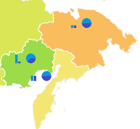
Example of the map with pie and column charts:
To set up:
General chart parameters, use the Pie Charts and Column Charts side panel tabs.
Chart tooltips, use the Tooltips side panel tab. All settings of chart tooltips are the same as settings of map tooltips.
Chart legend, use the Pie Chart Legend and Column Chart Legend side panel tabs.
See also: