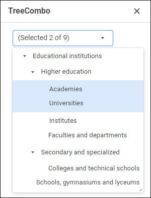
The TreeCombo component implements a combobox that displays tree-like structure of elements.
The component has different properties available in the design mode and in the web form execution mode.
text. Text displayed in the component.
name. Component name.
borderColor. Component border color.
color. Component background color.
coordinate. Coordinate of the top left corner of the component. Coordinates can be specified in pixels or percents relative to parent component sizes. The property is available if the position property is set to absolute.
enabled. Indicates whether the component is available for the user.
flexGrow. The property determines what proportion of container free space should be allocated for the component. If all components are set to 1, container free space is uniformly distributed between the components. If one of the components is set to 2, it occupies two times more free space, and so on. The property is available if the position property is set to relative.
font. Component text font options. If required, one can load custom fonts.
hint. Tooltip text.
nodes. The collection of nodes that can be selected in the component.
padding. Distance between component borders and component contents. Paddings can be specified in pixels or percents relative to component sizes.
popupMenu. The context menu displayed in the component. As a value, specify one of the PopupMenu components located on the form.
position. The method of component positioning on web form or inside container component. The property is set to absolute by default, the component has fixed position and size determined by the coordinate and size properties. If the property is set to relative, component position and sizes change depending on container component sizes. The coordinate property will be unavailable. Component position will be determined by the flexDirection, aligments, justifyContent properties of the parent component, and component sizes will change if the size property is set in percents.
selectionMode. Tree node selection mode.
showHint. Indicates whether a tooltip is displayed when the cursor is hovered over the component.
size. Component sizes. Sizes can be specified in pixels or percents relative to parent component sizes.
visible. Indicates whether the component is visible on running web form.
Properties:
BorderColor. Component border color.
Color. Component background color.
Enabled. Indicates whether the component is available for the user.
Nodes. Collection of tree nodes.
PopupMenu. The context menu displayed in the component. As a value, specify one of the PopupMenu components located on the form.
Selection. Collection of selected nodes.
Text. Text displayed in the component.
Visible. Indicates whether the component is available for the user.
Methods:
BeginUpdate. It locks update of component element tree.
EndUpdate. It resumes update of component element tree.
The component has the OnSelectionChange event that can track node selection change.
See also:
Creating Web Form and Components Layout