 button in the component area. The dropCalendar property determines whether a drop-down calendar is available.
The DateTimePicker component is used to enter and display date and time in a combined calendar.
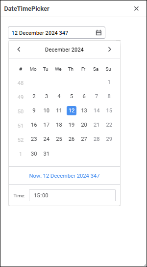
Date and time can be entered in the component editor or selected in the drop-down calendar. To open the calendar, click the button in the component area. The dropCalendar property determines whether a drop-down calendar is available.
The calendar supports dates and times within the range [14.09.1752 00:00:00, 18.12.3001 23:59:59]. To limit the range of entered values, use the minValue and maxValue properties. The current value that will be displayed on web form startup is specified in the value property. To reset the minimum, maximum, and current values set in the component in the design mode, put the cursor on the specified properties and press the DEL key.
During web form execution, one can determine calendar value using the Value property. The text displayed in the component and returned by the Text property depends on the format set in the format property. Format is set in the design mode can contain any text and special codes, which will be replaced with values of specific date and time components.
The component has different properties available in the design mode and in the web form execution mode.
name. Component name.
borderColor. Component border color.
color. Component background color.
coordinate. Coordinate of the top left corner of the component. Coordinates can be specified in pixels or percents relative to parent component sizes. The property is available if the position property is set to absolute.
dropCalendar. Indicates whether the component has a drop-down calendar.
enabled. Indicates whether the component is available for the user.
flexGrow. The property determines what proportion of container free space should be allocated for the component. If all components are set to 1, container free space is uniformly distributed between the components. If one of the components is set to 2, it occupies two times more free space, and so on. The property is available if the position property is set to relative.
firstDayOfWeek. The first day of week.
font. Component text font options. If required, one can load custom fonts.
format. Value format in the component. Format codes are described above.
hint. Tooltip text.
maxValue. Maximum value of the date that can be set in the component.
minValue. Minimum value of the date that can be set in the component.
padding. Distance between component borders and component contents. Paddings can be specified in pixels or percents relative to component sizes.
popupMenu. The context menu displayed in the component. As a value, specify one of the PopupMenu components located on the form.
position. The method of component positioning on web form or inside container component. The property is set to absolute by default, the component has fixed position and size determined by the coordinate and size properties. If the property is set to relative, component position and sizes change depending on container component sizes. The coordinate property will be unavailable. Component position will be determined by the flexDirection, aligments, justifyContent properties of the parent component, and component sizes will change if the size property is set in percents.
readOnly. Indicates whether the component can be read.
showHint. Indicates whether a tooltip is displayed when the cursor is hovered over the component.
size. Component sizes. Sizes can be specified in pixels or percents relative to parent component sizes.
value. The value displayed in the component on web form startup.
visible. Indicates whether the component is visible on running web form.
weekNumbers. Indicates whether week number is displayed in drop-down calendar.
BorderColor. Component border color.
Color. Component background color.
Enabled. Indicates whether the component is available for the user.
MaxValue. Maximum value that can be entered in the component.
MinValue. Minimum value that can be entered in the component.
PopupMenu. The context menu displayed in the component. As a value, specify one of the PopupMenu components located on the form.
Text. Text displayed in the component.
Valid. Indicates whether the date specified in the component is correct.
Value. Value displayed in the component.
Visible. Indicates whether the component is available for the user.
The component has the onValueChanged event that occurs on changing component value.
See also:

 Format codes