
 Set up columns
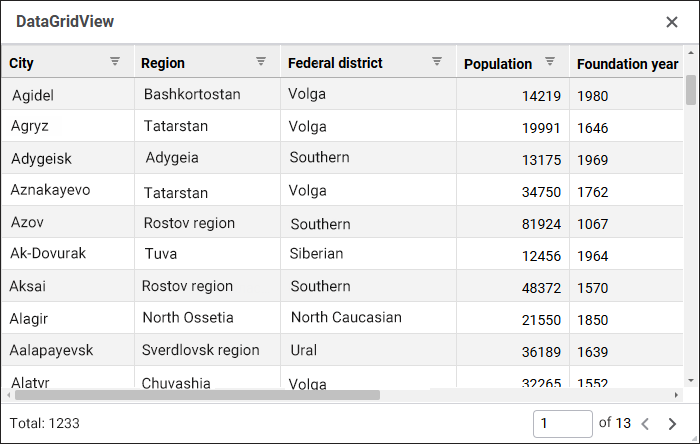
The DataGridView component is used to present data from relational repository data sources as a table.
The following repository objects can be used as data sources: Query, Table, View, External Table.
To provide the component work, determine the mobj property in the design mode or the IDataGridView.DataSet property in the web form execution mode. The list of tale columns will correspond with the list of fields in the selected data source. Column visibility and header and data display settings can be determined in the columns property.
The table uses the page mode of loading and displaying of data by default. It minimizes the query execution time and speeds up the work of the entire web form. To manage the work, use the allowPaging, recordsCount, recordsLimit, and showPaginationPanel properties.
In the tableStyle property one can select one of the alternating formatting styles for a table.
If a data source for the component is Query, take into account the following feature to ensure correct work of sorting: if the query contains keywords that are different from SELECT and FROM, such a query must be set up as a nested one. For example, rewrite the query SELECT * FROM TABLE_DATA LIMIT 5000 as follows: SELECT * FROM (SELECT * FROM TABLE_DATA LIMIT 5000) subquery.
The component has different properties available in the design mode and in the web form execution mode.
name. Component name.
allowPaging. Indicates whether data pagination is used.
borderColor. Component border color.
color. Component background color.
columns. Settings of displaying and formatting columns and their data.
coordinate. Coordinate of the top left corner of the component. Coordinates can be specified in pixels or percents relative to parent component sizes. The property is available if the position property is set to absolute.
enabled. Indicates whether the component is available for the user.
enableSort. Indicates whether table columns can be sorted.
flexGrow. The property determines what proportion of container free space should be allocated for the component. If all components are set to 1, container free space is uniformly distributed between the components. If one of the components is set to 2, it occupies two times more free space, and so on. The property is available if the position property is set to relative.
font. Component text font options. If required, one can load custom fonts.
hint. Tooltip text.
mobj. The composite property, which sets a component data source dictionary key.
padding. Distance between component borders and component contents. Paddings can be specified in pixels or percents relative to component sizes.
popupMenu. The context menu displayed in the component. As a value, specify one of the PopupMenu components located on the form.
position. The method of component positioning on web form or inside container component. The property is set to absolute by default, the component has fixed position and size determined by the coordinate and size properties. If the property is set to relative, component position and sizes change depending on container component sizes. The coordinate property will be unavailable. Component position will be determined by the flexDirection, aligments, justifyContent properties of the parent component, and component sizes will change if the size property is set in percents.
recordsCount. The number of records displayed on a single table page.
recordsLimit. The limit of records loaded from the data source. When the value is empty, all data source records can be loaded to the table.
showHint. Indicates whether a tooltip is displayed when the cursor is hovered over the component.
showPaginationPanel. Indicates whether the panel for page-by-page navigation by table records is displayed.
size. Component sizes. Sizes can be specified in pixels or percents relative to parent component sizes.
tableStyle. Alternate style used in the table.
visible. Indicates whether the component is visible on running web form.
BorderColor. Component border color.
Color. Component background color.
DataGridView. Component table view settings.
Enabled. Indicates whether the component is available for the user.
PopupMenu. The context menu displayed in the component. As a value, specify one of the PopupMenu components located on the form.
Text. Text displayed in the component.
Visible. Indicates whether the component is available for the user.
The component has the onSelectionChange event that occurs on table cell selection change.
See also:

 /
/ buttons or drag the column to the required position. To manage column visibility in the component, select or deselect the checkbox of the column.