The ImageButton component is a standard Button component with extended capabilities of appearance setup.
When a new component is inserted to a form, it looks like a standard button. To use icons with the text, in the Images property specify the ImageList (GlobalImageList) component that contains the icons collection. To do this, for each button mode specify index of a required icon in the ImageIndex property.
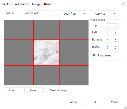
In addition, you can set a background image for each ImageButton component. To do this, in each button mode use the Background property. Accessing this property in the object inspector calls the background editor for the ImageButton component. This editor is also called when the Image Editor option is selected in the component's context menu:
In the editor window select the button state, for which the background image is set. Clicking the Load button displays the standard dialog box for selecting a file, which is used as a background image. The list of available images includes files of the following formats: *.bmp;*.jpg;*.jpeg;*.jpe;*.jfif;*.gif;*.png;*.tif;*.tiff. If the selected image is larger than the editor's window, the image is automatically zoomed.
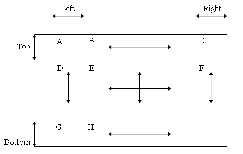
The Fix Area group can be used to set up image areas that will not be zoomed when displayed. To do this, background image is divided into 9 parts:
When an image is drawn, the parts A, C, G, I are not zoomed. The B and the H parts can be zoomed only horizontally. The D and the F parts can be zoomed only vertically. The E part can be fully zoomed.
The Show Areas checkbox controls displaying of red lines separating fixed image areas from zoomed areas. Fixed areas are displayed in the same way as in the source file. Other image areas are zoomed based on the ImageButton component sizes. The sizes of the fixed area are specified in pixels and depend on the sizes of the loaded image.
The Stretch Image checkbox enables the user to stretch the loaded image to the whole area of the edit dialog box.
The Copy From button enables the user to apply settings of another button mode to the current mode.
The Apply To button enables the user to apply settings of the current mode to another mode or for the rest of modes.
The background image with margins can be set up via the kernel using the GxRectangleTransformImage special class. Parameters of fixed margins are set in the Margins property.
The use of quick access buttons can be implemented in the button captions (the Text property) by selecting one of the caption characters and putting the & character before it. This character is not displayed in the button text, and the next character is underlined. As a result, the user can press ALT +<клавиша выделенного символа> the key of the selected character instead of clicking the button.
| Property name | Brief description | |
 |
Align | The Align property determines behavior of the component when its parent component is resized. |
|
Alignment | The Alignment property determines the position of the text inside of the component box. |
|
AllowAllUp | The AllowAllUp property determines whether all buttons in a group can be simultaneously "released". |
|
AllowDown | The AllowDown property determines whether the button remains pressed after the first time it has been pressed. |
|
AllowDrag | The AllowDrag property determines whether an object can be dragged from the component. |
|
AllowDrop | The AllowDrop property determines whether the component can accept a dragged object. |
|
Anchors | The Anchors property returns settings that determine the percentage of the size change for the current component when the parent component is resized. |
|
BorderStyle | The BorderStyle property determines a component border style. |
|
Brush | The Brush property determines the brush that is used to fill component area. |
|
CancelButton | The CancelButton property determines whether the OnClick event is handled when the ESC key is pressed. |
|
Center | The Center property determines whether the image is located in the center of the button. |
|
ClientHeight | The ClientHeight property is used to receive or specify the height of the component’s client area. |
|
ClientWidth | The ClientWidth property is used to receive or specify the width of the component’s client area. |
|
Color | The Color property determines a component background color. |
|
ComponentCount | The ComponentCount property returns the number of child components. |
|
Components | The Components property returns the child component. |
|
Cursor | The Cursor property determines the look of the cursor over the component. |
|
Data | The Data property is used to store any custom data. |
|
DefaultButton | The DefaultButton property determines that pressing the ENTER key is equivalent to clicking this button. |
|
DisabledLook | The DisabledLook property determines the appearance of the button (image and text color), which it takes when it is disabled. |
|
Down | The Down property determines the button state. |
|
DrawFocus | The DrawFocus property determines whether focus frame is displayed along the component border. |
|
Enabled | The Enabled property determines whether the component is available for the user. |
|
Focused | The Focused property returns True if the focus is set on the component. |
|
Font | The Font property determines the set of characteristics describing the font that is used to display text. |
|
GroupIndex | The GroupIndex property determines index of the group, which the component belongs to. |
|
Height | The Height property determines component height. |
|
HelpContext | The HelpContext property determines a unique index for the context help section for this component. |
|
Hint | The Hint property determines a component tooltip text. |
|
HoverLook | The HoverLook property determines the appearance of the button (image and text color), which it takes when the mouse cursor hovers over it. |
|
ImageLayout | The ImageLayout property determines the icon position relative to the component text. |
|
Images | The Images property determines the name of the ImageList component, which images will be used in the component. |
|
Layout | The Layout property determines vertical alignment of the text inside the component box. |
|
Left | The Left property determines the coordinate of the left border of the component. |
|
Margin | The Margin property determines the indent from the edge to the group of the component elements. |
|
Margins | The Margins property determines the coordinate of the component relative to the borders of the client area of the parent component. |
|
ModalResult | The ModalResult property determines the result returned after the button is clicked on the modal form on closing this form. |
|
Name | The Name property determines a component name. |
|
NormalLook | The NormalLook property determines the appearance of the image and text color of the button, which is in its normal state (released). |
|
Parent | The Parent property determines a parent component. |
|
ParentColor | The ParentColor property determines whether the component inherits the color of the parent component. |
|
ParentFont | The ParentFont property determines whether the component uses the font of the parent component. |
|
ParentShowHint | The ParentShowHint property determines whether a tooltip is displayed. |
|
PopupMenu | The PopupMenu property determines the context menu opened by clicking the component with the additional mouse button. |
|
PressedLook | The PressedLook property determines the appearance of the button (image and text color), which it takes when it is pressed. |
|
Proportional | The Proportional property determines whether the image in the component window retains proportions. |
|
Scrolls | The Scrolls property returns parameters of component's scrollbars. |
|
ShowHint | The ShowHint property enables and disables showing a component tooltip. |
|
Spacing | The Spacing property determines the spacing between the component icon and text. |
|
Stretch | The Stretch property determines whether the image is resized to fit the element window. |
|
TabOrder | The TabOrder property determines the component position in the tab order. |
|
TabStop | The TabStop property determines whether the component is focused when the TAB key is pressed. |
|
Tag | The Tag property is not used by the compiler. The user can change the value of the Tag property and use it as he wishes. |
|
Text | The Text property determines the row identifying a component for the user. |
|
Top | The Top property determines the coordinate of the top border of the component. |
|
TransparentBackground | The TransparentBackground property determines whether the button has transparent background. |
|
Trimming | The Trimming property determines text trimming mode. |
|
Visible | The Visible property determines visibility of the component during execution. |
|
Width | The Width property determines component width. |
|
WordWrap | The WordWarp property determines whether the words that exceed component length are wrapped to a new line. |
| Method name | Brief description | |
 |
BringToFront | The BringToFront method brings a component to front. |
|
ClientToScreen | The ClientToScreen method converts the coordinates of a point specified relative to the component coordinate system into screen coordinates. |
|
DoDragDrop | The DoDragDrop method enables to start dragging operation. |
|
GetImage | The GetImage method returns the image of the component with all the child components. |
|
ScreenToClient | The ScreenToClient method converts screen coordinates of a point into coordinates specified relative to the component coordinate system. |
|
SendToBack | The SendToBack method sends a component to back. |
|
SetFocus | The SetFocus method sets focus to this component. |
| Event name | Brief description | |
 |
OnBeginDrag | The OnBeginDrag event occurs for a component when the user starts to drag an object from the component. |
|
OnClick | The OnClick event occurs if the user clicks the component area. |
|
OnDblClick | The OnDblClick event occurs if the user double-clicks the component area. |
|
OnDragDrop | The OnDragDrop event occurs for the component if the user drops a dragged object over it. |
|
OnDragEnter | The OnDragEnter event occurs when a dragged object crosses the borders of this component. |
|
OnDragLeave | The OnDragLeave event occurs when a dragged object leaves the borders of this component. |
|
OnDragOver | The OnDragOver event occurs for the component when the user drags an object over it. |
|
OnEnter | The OnEnter event occurs when the component receives focus. |
|
OnExit | The OnExit event occurs when the component loses focus. |
|
OnHScroll | The OnHScroll event occurs when horizontal scrollbar slider changes its position. |
|
OnKeyDown | The OnKeyDown event occurs if the component is focused and a keyboard key is pressed. |
|
OnKeyPress | The OnKeyPress event occurs if the component is focused when the user presses a character key. |
|
OnKeyPreview | The OnKeyPreview event occurs prior to each event related to key pressing. |
|
OnKeyUp | The OnKeyUp event occurs if the component is focused and the user releases any button previously pressed. |
|
OnMouseDown | The OnMouseDown event occurs if the pointer is in component's area and a mouse key is pressed. |
|
OnMouseEnter | The OnMouseEnter event occurs when mouse cursor enters the component area. |
|
OnMouseHover | The OnMouseHover event occurs when mouse cursor is held in the component area. |
|
OnMouseLeave | The OnMouseLeave event occurs when mouse cursor leaves the component area. |
|
OnMouseMove | The OnMouseMove event occurs on moving the cursor over component. |
|
OnMouseUp | The OnMouseUp event occurs on releasing mouse button when the cursor is in component area. |
|
OnMouseWheel | The OnMouseWheel event occurs if the component is focused when the mouse wheel is rotated. |
|
OnVScroll | The OnVScroll event occurs when vertical scrollbar slider changes its position. |
See also: