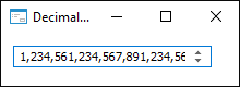
The DecimalEdit component is a single-line editor of high-precision real numbers.
The DecimalEdit component is identical to the FloatEdit component and is used to edit real numbers. Unlike FloatEdit, DecimalEdit enables the user to edit high-precision numbers up to 18 decimal places after the point. Precision is set in the Precision property. The step, by which the value is changed on pressing the UP or DOWN keys or buttons in the SPINUP/SPINDOWN component, is set in the StepSize property.
| Property name | Brief description | |
 |
Align | The Align property determines component alignment within its parent component. |
|
AllowDrag | The AllowDrag property determines whether an object can be dragged from the component. |
|
AllowDrop | The AllowDrop property determines whether the component can accept the dragged object. |
|
AllowEmpty | The AllowEmpty property determines whether the empty value can be in the component. |
|
Anchors | The Anchors property returns settings that determine the percentage of the size change for the current component when the parent component is resized. |
|
AutoSelect | The AutoSelect property determines whether the entire component text is selected when the component gets focused. |
|
BorderStyle | The BorderStyle property determines a component border style. |
|
Brush | The Brush property determines the brush that is used to fill component area. |
|
CanUndo | The CanUndo property returns True if it is possible to undo text changes in the component. |
|
CharacterCasing | The CharacterCasing property determines case of entered component characters. |
|
ClientHeight | The ClientHeight property determines the height of the client component's area. |
|
ClientWidth | The ClientWidth property determines the width of the client component's area. |
|
Color | The Color property determines a component background color. |
|
ComponentCount | The ComponentCount property returns the number of child components. |
|
Components | The Components property returns the child component. |
|
CorrectOnExit | The CorrectOnExit property determines whether value is automatically corrected when the component loses focus. |
|
Cursor | The Cursor property determines how the cursor looks like when it is hovered over the component. |
|
Data | The Data property is used to store any custom data. |
|
EditorReadOnly | The EditorReadOnly property determines whether component's text can be edited manually. |
|
Enabled | The Enabled property determines whether a component is available for the user. |
|
Focused | The Focused property returns True if the component gets focused. |
|
Font | The Font property determines the set of characteristics describing the font that is used to display text. |
|
Height | The Height property determines component height. |
|
HelpContext | The HelpContext property determines the unique index for a section of a context help for this component. |
|
HideSelection | The HideSelection property determines whether the component's selected text remains selected on moving the focus to the other component. |
|
Hint | The Hint property determines a component tooltip text. |
|
Left | The Left property determines the coordinate of the left border of the component. |
|
MaxLength | The MaxLength property determines the maximum length of entered text. |
|
MaxValue | The MaxValue property determines the maximum value of the number that can be set in the component. |
|
MinValue | The MinValue property determines the minimum value of the number that can be set in the component. |
|
Modified | The Modified property returns True if component text is changed. |
|
Name | The Name property determines a component name. |
|
Parent | The Parent property determines a parent component. |
|
ParentColor | The ParentColor property determines whether a component inherits the color of the parent component. |
|
ParentFont | The ParentFont property determines whether the component uses the font of the parent component. |
|
ParentShowHint | The ParentShowHint property determines whether a tooltip is displayed. |
|
PasswordChar | The PasswordChar property determines the character that substitutes actual characters entered by the user. |
|
PopupMenu | The PopupMenu property determines the context menu to be displayed on the right-click on the component. |
|
Precision | The Precision property determines the number of decimal places displayed after the point. |
|
ReadOnly | The ReadOnly property determines whether the user can change component text. |
|
Scrolls | The Scrolls property returns parameters of component's scrollbars. |
|
SelLength | The SelLength property determines the number of characters selected in the component text. |
|
SelStart | The SelStart property determines the cursor position, from which the selection of the component's text starts. |
|
SelText | The SelText property determines the text selected in the component. |
|
ShowHint | The ShowHint property enables and disables showing a component tooltip. |
|
StepSize | The StepSize property determines the value, by which the value entered in the edit box, is changed if the SpinUp and SpinDown keys are used to change the value. |
|
TabOrder | The TabOrder property determines the component position in the tab order. |
|
TabStop | The TabStop property determines whether the component is focused when the TAB key is pressed. |
|
Tag | The Tag property is not used by the compiler. The user can change the value of the Tag property and use it as he wishes. |
|
Text | The Text property determines the row identifying a component for the user. |
|
ThousandSeparator | The ThousandSeparator property determines whether value is displayed in the component using the thousands separator. |
|
Top | The Top property determines the coordinate of the top border of the component. |
|
TrailingZeros | The TrailingZeros property determines whether the zeros are displayed after the decimal point if Precision is greater than 0. |
|
Valid | The Valid property returns correctness of the real number entered in the edit box. |
|
Value | The Value property determines the current value entered in the edit box. |
|
Visible | The Visible property determines visibility of the component during execution. |
|
Width | The Width property determines component width. |
| Method name | Brief description | |
 |
Clear | The Clear method deletes the entire text contained in the component. |
|
ClearSelection | The ClearSelection method deletes the entire text that is selected in the component. |
|
ClearUndo | The ClearUndo method is used to fix changes of the Text property. |
|
ClientToScreen | The ClientToScreen method converts the coordinates of a point specified relative to the component coordinate system into screen coordinates. |
|
CopyToClipboard | The CopyToClipboard method copies selected data to the clipboard. |
|
CutToClipboard | The CutToClipboard method cuts selected data to the clipboard. |
|
DoDragDrop | The DoDragDrop method starts dragging operation. |
|
GetImage | The GetImage method returns the image of the component with all child components. |
|
PasteFromClipboard | The PasteFormClipboard method pastes data from the clipboard. |
|
ScreenToClient | The ScreenToClient method converts screen coordinates of a point into coordinates specified relative to the component coordinate system. |
|
SelectAll | The SelectAll method selects component text. |
|
SetFocus | The SetFocus method sets focus to this component. |
|
Undo | The Undo method cancels the last text change in the component. |
| Event name | Brief description | |
 |
OnBeginDrag | The OnBeginDrag event occurs for the component when the user starts to drag an object from the component. |
|
OnChange | The OnChange event occurs after changing the Text property. |
|
OnClick | The OnClick event occurs if the user clicks the component area. |
|
OnDblClick | The OnDblClick event occurs if the user double-clicks the component area. |
|
OnDragDrop | The OnDragDrop event occurs for the component if the user drops a dragged object over it. |
|
OnDragEnter | The OnDragEnter event occurs when a dragged object crosses the borders of this component. |
|
OnDragLeave | The OnDragLeave event occurs when a dragged object leaves the borders of this component. |
|
OnDragOver | The OnDragOver event occurs for the component when the user drags a dragged object over it. |
|
OnEnter | The OnEnter event occurs when the component receives focus. |
|
OnExit | The OnExit event occurs when the component loses focus. |
|
OnHScroll | The OnHScroll event occurs when horizontal scrollbar slider changes its position. |
|
OnKeyDown | The OnKeyDown event occurs if the component is focused and a keyboard key is pressed. |
|
OnKeyPress | The OnKeyPress event occurs if the component is focused when the user presses a character key. |
|
OnKeyPreview | The OnKeyPreview event occurs prior to each event requiring key pressing. |
|
OnKeyUp | The OnKeyUp event occurs if the component is focused and the user releases any key previously pressed. |
|
OnMouseDown | The OnMouseDown event occurs if the cursor is in the component area and a mouse button is pressed. |
|
OnMouseEnter | The OnMouseEnter event occurs when the mouse cursor enters the component area. |
|
OnMouseHover | The OnMouseHover event occurs when the mouse cursor is held in the component's area. |
|
OnMouseLeave | The OnMouseLeave event occurs when the mouse cursor leaves the component's area. |
|
OnMouseMove | The OnMouseMove event occurs when the mouse cursor is moved over the component. |
|
OnMouseUp | The OnMouseUp event occurs if the user releases mouse button when the cursor is in the component's area. |
|
OnMouseWheel | The OnMouseWheel event occurs if the component is focused when the user rotates mouse wheel. |
|
OnSpinDown | The OnSpinDown event occurs on pressing the SpinDown button in the edit box. |
|
OnSpinUp | The OnSpinUp event occurs on pressing the SpinUp button in the edit box. |
|
OnValueChange | The OnValueChange event occurs when the value is changed in the edit box. |
|
OnVScroll | The OnVScroll event occurs when vertical scrollbar slider changes its position. |
See also: