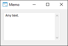
The Memo component is a multiline text editor.
The Memo component has the same functionality as most text editors, it includes the following hotkeys for quick editing:
| Shortcut key | Brief description |
| CTRL+C CTRL+INSERT |
Copy selected text to the clipboard. |
| CTRL+X SHIFT+DELETE |
Cut selected text to the clipboard. |
| CTRL+V SHIFT+INSERT |
Paste text from the clipboard. |
| CTRL+Z | Cancel the last editing command. |
| CTRL+RIGHT | Move the cursor to beginning of the next word. |
| CTRL+RIGHT | Move the cursor to beginning of the previous word. |
| CTRL+DOWN | Move the cursor to beginning of the next paragraph. |
| CTRL+UP | Move the cursor to beginning of the previous paragraph. |
| CTRL+SHIFT+arrow button | Select text fragment. |
| SHIFT+arrow button | Select text. |

| Property name | Brief description | |
 |
Align |
The Align property determines behavior of the component when its parent component is resized. |
 |
Alignment |
The Alignment property determines the alignment of the text label inside the component field. |
 |
AllowDrag |
The AllowDrag property determines whether an object can be dragged from the component. |
 |
AllowDrop |
The AllowDrop property determines whether the component can accept a dragged object. |
 |
Anchors |
The Anchors property returns settings that determine the percentage of the size change for the current component when the parent component is resized. |
 |
AutoSelect |
The AutoSelect property determines whether component text is selected when the component gets focused. |
 |
BorderStyle |
The BorderStyle property determines a component border style. |
 |
Brush |
The Brush property determines the brush that is used to fill component area. |
 |
CanUndo |
The CanUndo property returns True if it is possible to undo text changes in the component. |
 |
CharacterCasing |
The CharacterCasing property determines the case of the entered characters. |
 |
ClientHeight |
The ClientHeight property is used to receive or specify the height of the component’s client area. |
 |
ClientWidth |
The ClientWidth property is used to receive or specify the width of the component’s client area. |
 |
Color |
The Color property determines a component background color. |
 |
ComponentCount |
The ComponentCount property returns the number of child components. |
 |
Components |
The Components property returns the child component. |
 |
Cursor |
The Cursor property determines the look of the cursor over the component. |
 |
Data |
The Data property is used to store any custom data. |
 |
Enabled |
The Enabled property determines whether the component is available for the user. |
 |
Focused |
The Focused property returns True if the focus is set on the component. |
 |
Font |
The Font property determines the set of characteristics describing the font that is used to display text. |
 |
Height |
The Height property determines component height. |
 |
HelpContext |
The HelpContext property determines a unique index for the context help section for this component. |
 |
HideSelection |
The HideSelection property determines whether the selected component text remains the same when the focus moves to another component. |
 |
Hint |
The Hint property determines a component tooltip text. |
 |
Left |
The Left property determines the coordinate of the left border of the component. |
 |
Lines |
The Lines property determines the component lines collection. |
 |
MaxLength |
The MaxLength property determines the maximum length of the entered text. |
 |
Modified |
The Modified property returns True if the component text has been changed. |
 |
Name |
The Name property determines a component name. |
 |
Parent |
The Parent property determines a parent component. |
 |
ParentColor |
The ParentColor property determines whether the component inherits the color of the parent component. |
 |
ParentFont |
The ParentFont property determines whether the component uses the font of the parent component. |
 |
ParentShowHint |
The ParentShowHint property determines whether a tooltip is displayed. |
 |
PopupMenu |
The PopupMenu property determines the context menu opened by clicking the component with the additional mouse button. |
 |
Scrolls |
The Scrolls property returns parameters of component's scrollbars. |
 |
ReadOnly |
The ReadOnly property determines whether the user can change component text. |
 |
ScrollBars |
The ScrollBars property determines whether scrollbars are present in the component field. |
 |
SelLength |
The SelLength property determines the number of characters selected in the component text. |
 |
SelStart |
The SelStart property determines the cursor position, from which to start text selection in the component. |
 |
SelText |
The SelText property determines the text selected in the component. |
 |
ShowHint |
The ShowHint property enables and disables showing a component tooltip. |
 |
TabOrder |
The TabOrder property determines the component position in the tab order. |
 |
TabStop |
The TabStop property determines whether the component is focused when the TAB key is pressed. |
 |
Tag |
The Tag property is not used by the compiler. A user can change the value of the Tag property and use it as he wishes. |
 |
Text |
The Text property determines the row identifying a component for the user. |
 |
Top |
The Top property determines the coordinate of the top border of the component. |
 |
Visible |
The Visible property determines visibility of the component during execution. |
 |
WantReturns |
The WantReturns property determines whether a carriage return symbol can be inserted into the edited text. |
 |
WantTabs |
The WantTabs property determines whether a tab symbol can be inserted into the edited text. |
 |
Width |
The Width property determines component width. |
 |
WordWrap |
The WordWarp property determines whether the words that exceed component length are wrapped into a new line. |
| Method name | Brief description | |
 |
BringToFront |
The BringToFront method brings a component to front. |
 |
Clear |
The Clear method deletes all text in the component. |
 |
ClearSelection |
The ClearSelection method deletes all text selected in the component. |
 |
ClearUndo |
The ClearUndo method is used to fix the changes of the Text property. |
 |
ClientToScreen |
The ClientToScreen method converts the coordinates of a point specified relative to the component coordinate system into screen coordinates. |
 |
CopyToClipboard |
The CopyToClipboard method enables the user to copy selected data to the clipboard. |
 |
CutToClipboard |
The CutToClipboard method enables the user to cut selected data and place it to the clipboard. |
 |
DoDragDrop |
The DoDragDrop method enables to start dragging operation. |
 |
GetCharPos |
The GetCharPos method returns the number of cursor position in the line. |
 |
GetImage |
The GetImage method returns the image of the component with all the child components. |
 |
GetLinePos |
The GetLinePos method returns the number of the line where the cursor is currently located. |
 |
PasteFromClipboard |
The PasteFromClipboard method pastes data from the clipboard. |
 |
ScreenToClient |
The ScreenToClient method converts screen coordinates of a point into coordinates specified relative to the component coordinate system. |
 |
SelectAll |
The SelectAll method selects component text. |
 |
SetFocus |
The SetFocus method sets focus to this component. |
 |
SendToBack |
The SendToBack method sends a component to back. |
 |
Undo |
The Undo method undoes the last text change in the component. |
| Event name | Brief description | |
 |
OnBeginDrag |
The OnBeginDrag event occurs for a component when the user starts to drag an object from the component. |
 |
OnChange |
The OnChange event occurs after changing the Text property of the edited component. |
 |
OnClick |
The OnClick event occurs if the user clicks the component area. |
 |
OnDblClick |
The OnDblClick event occurs if the user double-clicks the component area. |
 |
OnDragDrop |
The OnDragDrop event occurs for the component if the user drops a dragged object over it. |
 |
OnDragEnter |
The OnDragEnter event occurs when a dragged object crosses the borders of this component. |
 |
OnDragLeave |
The OnDragLeave event occurs when a dragged object leaves the borders of this component. |
 |
OnDragOver |
The OnDragOver event occurs for the component when the user drags an object over it. |
 |
OnEnter |
The OnEnter event occurs when the component receives focus. |
 |
OnExit |
The OnExit event occurs when the component loses focus. |
 |
OnHScroll |
The OnHScroll event occurs when horizontal scrollbar slider changes its position. |
 |
OnKeyDown |
The OnKeyDown event occurs if the component is focused and a keyboard key is pressed. |
 |
OnKeyPress |
The OnKeyPress event occurs if the component is focused when the user presses a character key. |
 |
OnKeyPreview |
The OnKeyPreview event occurs prior to each event related to key pressing. |
 |
OnKeyUp |
The OnKeyUp event occurs if the component is focused and the user releases any button previously pressed. |
 |
OnMouseDown |
The OnMouseDown event occurs if the pointer is in component's area and a mouse key is pressed. |
 |
OnMouseEnter |
The OnMouseEnter event occurs when mouse cursor enters the component area. |
 |
OnMouseHover |
The OnMouseHover event occurs when mouse cursor is held in the component area. |
 |
OnMouseLeave |
The OnMouseLeave event occurs when mouse cursor leaves the component area. |
 |
OnMouseMove |
The OnMouseMove event occurs on moving the cursor over component. |
 |
OnMouseUp |
The OnMouseUp event occurs on releasing mouse button when the cursor is in component area. |
 |
OnMouseWheel |
The OnMouseWheel event occurs if the component is focused when the mouse wheel is rotated. |
 |
OnVScroll |
The OnVScroll event occurs when vertical scrollbar slider changes its position. |
See also: