Select the Items context menu item for the component placed on the form.
Click the  button of the Nodes property in the object inspector.
Double-click the Nodes property in the object inspector.
Nodes: ITreeListNodes;
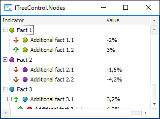
The Nodes property returns the collection of component elements.
Elements are added and their properties are edited in the Items Editor dialog box. To open the dialog box:
Select the Items context menu item for the component placed on the form.
Click the button of the Nodes property in the object inspector.
Double-click the Nodes property in the object inspector.
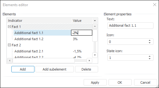
Each element can contain text, icon, and state icon. If the component contains more than one column, make single mouse button click on the intersection of the selected element and required column to edit the element value in another column. The value edit dialog box opens in a few seconds.
NOTE. Text in each column must not be longer than 5450 characters.
The ImageList (or GlobalImageList) component must be selected in the Images property for the component, to display the icons next to the name of elements. The index of the icon that is displayed near the element is selected in the Icon edit box of the element editor or in the ImageIndex property via application code.
The second icon that allows for displaying the additional state of the element (State icon) can also be added to each element. To do this, firstly, set the StateImages property for the component. The image index is determined in the State icon field or in the StateIndex property via application code.
See also: