 Work with timeline and animation
 Work with timeline and animation
NOTE. The feature is available if several elements are selected in the calendar dimension.
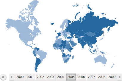
Timeline shows frequency of observation objects by specified metrics in the certain time period. Timeline tick marks are displayed as dates corresponding to the selected calendar dimension elements.
Example of the map with the timeline:

To display on the map the data on the certain date, click the corresponding timeline tick mark.
If all timeline tick marks do not fit into the map, the ![]() and
and ![]() buttons that are used to scroll the timeline are displayed.
buttons that are used to scroll the timeline are displayed.
On working with the timeline the animation is available:
To run animation. Click the ![]() button. During the animation the fill of the map and the height of territories are changed (if the map is in the 3D mode).
button. During the animation the fill of the map and the height of territories are changed (if the map is in the 3D mode).
To stop animation. Click the ![]() button.
button.
NOTE. This feature is available for all tools except for the Reports tool.
To change map scale:
Set focus on the map.
Point to the map with the mouse.
Scroll the mouse wheel up to zoom in and down to zoom out the map.
Map scale is changed. The scale of other elements will remain unchanged.
To restore the original scale:
In the desktop application. Click the ![]() Refresh button on the Map ribbon tab or press F5.
Refresh button on the Map ribbon tab or press F5.
In the web application. Use mouse wheel to restore original scale.
NOTE. This feature is available only in the desktop application for all tools except for the Reports tool.
Panning enables the user to move the map so that desired required objects are shown in the center of the map. If the map is zoomed in and does not fit into the screen, panning enables the user to move required map portion to visible part of the screen.
To pan a map:
Set focus on the map.
Hold down the SHIFT key and the right mouse button.
Drag the map to the required position.
Map position will be changed.
To restore initial position of the map, click the ![]() Refresh button on the Map ribbon tab or press F5.
Refresh button on the Map ribbon tab or press F5.
The map is filled by values of the element selected in metrics dimension. Available fill options:
Quick fill. The five-color fill is applied to the map. To select the color schema of the fill, use the Fill Patterns group on the Map ribbon tab.
Fill by custom parameters. All fill parameters are set by the user. To set up parameters, use the Color side panel tab.
NOTE. If the map is displayed in 3D mode, the fill is applied by values of the element of metrics dimension, which determines the color.
Tooltips are used to show additional information about map territories.
To show tooltips select the checkbox in the title of the Tooltips side panel tab. To set up tooltip text and format, use the same side panel tab.
By default tooltips are enabled.

 Set up labels of map territories
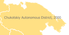
Territory labels are used to constantly show some additional information about map territories. For example:

To show territory labels, select the checkbox in the title of the Territory Labels side panel tab. To set up territory text and format, use the same side panel tab. Working with the Territory Labels tab is similar to working with the Tooltips tab.
By default territory labels are not shown.
To change the current map:
Click the ![]() Change Map button in the View group on the Map ribbon tab. The dialog box to select a map from repository opens.
Change Map button in the View group on the Map ribbon tab. The dialog box to select a map from repository opens.
Select the Change Map item in the map context menu. The dialog box to select a map from repository opens.
Use Fore language (only for the desktop application).
To use default map, click the bottom part of the ![]() Change Map button in the View group on the Map ribbon tab, and select the Return Default Map item.
Change Map button in the View group on the Map ribbon tab, and select the Return Default Map item.
To refresh the visualizer, click the ![]() Refresh button on the Map ribbon tab.
Refresh button on the Map ribbon tab.

 Display side panel tabs for setting up map
NOTE. The feature is available in all tools except for the Reports tool.
To display side panel tabs, which are used to set up the map, select the Settings/Map > Settings context menu item.
Use map styles to set up the map.
Depending on selected metrics, a map can have different legends:
Color legend.
Column chart legend.
Pie chart legend.
Height legend.
NOTE. Height legend is available if the 3D mode is enabled.
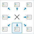
To show map legend, select legend position on the following side panel tab: Color Legend, Column Chart Legend, Pie Chart Legend or Height Legend:

To hide the legend, click the button of position selection ![]() .
.
TIP. To quickly show or hide the Color Legend, use the drop-down menu of the ![]() Legend button on the View tab of the Map ribbon tab.
Legend button on the View tab of the Map ribbon tab.
To set up:
Legend position. Use the drop-down menu of the ![]() Legend button in the View group on the Map ribbon tab.
Legend button in the View group on the Map ribbon tab.
NOTE. In the web application the Legend button is included in the Elements group on the Map ribbon tab.
Legend formatting. Use the Color Legend side panel tab.
For details see: Setting Up Legend.
Working with a 3D map is not available in the Time Series Analysis and Reports tools.
To set up 3D map:
Click the ![]() 3D button in the View group on the Map ribbon tab.
3D button in the View group on the Map ribbon tab.
NOTE. In the web application the 3D button is included in the Elements group on the Map ribbon tab.
Set up metrics dimension. Map dimension elements with the following map parameters:
Fill color. Select the Color radio button on the dimension tab and select the element, by which values the map will be colored.
Map elements height. Select the Height radio button on the dimension tab and select the element, by which values the height of elements of the map will be determined.
NOTE. In order 3D map is correctly displayed, the browser must support WebGL.
NOTE. The feature is available if the element, which determines the height of map elements, is set in the metrics dimension.
To set up map height calculation parameters, use the Height side panel tab, to set up height legend view parameters, use the Height Legend side panel tab.
To rotate a 3D map:
Click the map and hold down the left mouse button.On working with the desktop application, hold down the SHIFT key.
Move the mouse in the required direction.
The map will rotate along with the mouse.
See also: