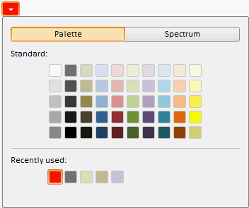
The ColorCombo component is a drop-down menu where the user selects color.
Color could be selected from the palette of predefined colors or from the color spectrum.
Selected color becomes the color for the dropdown menu button.
Implemented colors are displayed in the bottom part of the dropdown panel.
The component is implemented by the ColorCombo class.
The ColorCombo component looks as follows:

Example of Creating the ColorCombo Component
| Constructor name | Brief description | |
| ColorCombo | The ColorCombo constructor creates an instance of the ColorCombocomponent. |
| Property name | Brief description | |
| Color | The Color property sets the current color that is also the color of the button that invokes the drop-down menu. | |
| PresentedColors | The PresentedColors property sets a set of standard colors of the palette. |
| Method name | Brief description | |
| The getDropPanel method returns the drop-down panel. | ||
| The showDropPanel method expands the panel to select color. |
| Event name | Brief description | |
| ColorChange | The ColorChange event occurs on changing the color after closing the drop-down list. | |
| ColorChanged | The ColorChanged event occurs while changing the color. | |
| ValueChanged | The ValueChanged event occurs when a component value changes. |
| Property name | Brief description | |
| CloseOnContentClick | The CloseOnContentClick property determines whether a component panel can be closed on clicking the header. | |
| EnableEdit | The EnableEdit property sets the ability of input. | |
| IsDropHasCombosWidth | The IsDropHasCombosWidth property sets whether drop-down panel width does not depend on the input editor width. | |
| IsHint | The IsHint property determines whether a tooltip is displayed on the mouse hover on the button for opening of the drop-down panel. | |
| NoCreateEditors | The NoCreateEditors property determines whether the header is displayed as a simple text and not in the editors of the TextBox or MaskEdit components. | |
| OpenOnContentClick | The OpenOnContentClick property determines whether a component panel can be opened on clicking the header. | |
| OpenOnIconClick | The OpenOnIconClick property determines whether a component panel can be opened on clicking the header icon. | |
| OpenOnKeyDown | The OpenOnKeyDown property determines whether a drop-down panel can be opened on clicking a keyboard key. | |
| UseMask | The UseMask property sets whether the editor mask can be used. |
| Method name | Brief description | |
| applyNotValidCSS | The applyNotValidCSS method sets the style that determines highlighting invalid input value of the input editor. | |
| applyValidCSS | The applyValidCSS property sets the style that determines highlighting of valid input value of the input editor. | |
| getContentNode | The getContentNode method returns the DOM node of the input editor component. | |
| getDropPanel | The getDropPanel method returns the drop-down part of the component. | |
| getIconHeight | The getIconHeight method returns value of input editor icon height. | |
| getIconWidth | The getIconWidth method returns value of input editor icon width. | |
| getMaskEdit | The getMaskEdit method returns data input editor for data corresponding to a specific template. | |
| getTextBox | The getTextBox method returns text box of the input editor. | |
| setIconImageClass | The setIconImageClass method changes class name of the input editor component icon. | |
| showDropPanel | The showDropPanel method displays component's drop-down part. |
| Event name | Brief description | |
| TextChanged | The TextChanged event occurs on changing text in the editor. | |
| ValueChanged | The ValueChanged event occurs after changing input editor contents. |
| Property name | Brief description | |
| Anchors | The Anchors property determines position of the component placed within container. | |
| Animation | The Animation property sets animation parameters for component. | |
| Bottom | The Bottom property sets bottom offset on placing the component within the LayoutPanel. | |
| Content | The Content property sets the component contents. | |
| ContextMenu | The ContextMenu property sets the context menu for the component. | |
| Data | The Data property is used to store any custom data. | |
| DataContext | The DataContext property contains an object with data. | |
| Enabled | The Enabled property sets whether the component is enabled. | |
| Height | The Height property determines the component height. | |
| IsResizable | The IsResizable property determines whether the component can be resized. | |
| IsRTL | The lsRTL property sets right to left text direction. | |
| IsVisible | The IsVisible property determines whether the component is displayed. | |
| Left | The Left property sets left offset on placing the component within the GridPanel. | |
| Offset | The Offset property determines coordinates of root DOM node of a control. | |
| Opacity | The Opacity property determines component transparency. | |
| Parent | The Parent property determines a parent component of a control. | |
| ParentNode | The ParentNode property sets parent DOM node. | |
| ResourceKey | The ResourceKey property sets the resource key for the component. | |
| Right | The Right property sets right offset on placing the component within the LayoutPanel. | |
| Rotate | The Rotate property sets component rotation angle. | |
| ShowToolTip | The ShowToolTip property determines whether the tooltip of the component can be displayed. | |
| Style | The Style property sets component style. | |
| TabIndex | The TabIndex property sets the order of the control element passing inside the container. | |
| Tag | The Tag property sets JSON object associated with the component. | |
| ToolTip | The ToolTip property determines text of component tooltip. | |
| Top | The Top property sets top offset on placing the component within the GridPanel. | |
| Value | The Value property sets the value to the component. | |
| Width | The Width property sets the component width. |
| Method name | Brief description | |
| The addClass method adds a CSS class to the component. | ||
| addEvent | The addEvent method adds an event handler to a DOM node. | |
| addEventHandler | The addEventHandler method adds an event handler to a DOM node. | |
| addEvents | The addEvents method adds an array of event handlers to a DOM node. | |
| The addStateClass method adds a CSS class to the component and removes the previous CSS class. | ||
| addStyleBySelector | The addStyleBySelector method creates a block that contains a style with the specified CSS selector. | |
| The addToNode method adds a component to the specified node. | ||
| bindEvents | The bindEvents method subscribes an element to all available events. | |
| The clearStylesCache method clears cache of component styles. | ||
| The getAnchorFlags method returns JSON object that contains settings of the current component's position. | ||
| The getClass method returns the current CSS classes of the component. | ||
| The getCssStyle method returns style for the specified node. | ||
| The getDomNode method returns main DOM node of the component. | ||
| The getFocused method determines whether the component is focused. | ||
| getFunctionByName | The getFunctionByName method returns function by name. | |
| getIsBinded | The getIsBinded method returns whether an element is subscribed to all DOM node events. | |
| The hasClass method determines whether the specified CSS class is set for root DOM node of the control. | ||
| The hide method hides a control. | ||
| The hideToolTip method clears tooltip timeout and hides the tooltip if it is displayed. | ||
| The isResingNow method determines whether the component is being resized. | ||
| refreshBindingProperty | The refreshBindingProperty method refreshes the bound property by name. | |
| refreshItemsStyle | The refreshItemsStyle method refreshes CSS styles of child elements. | |
| refreshStyle | The refreshStyle method refreshes element CSS styles. | |
| The removeClass method removes CSS class from the component. | ||
| The removeEvent method removes event handler from DOM node. | ||
| removeEventHandler | The removeEventHandler method removes event handler from DOM node. | |
| removeFromDOM | The removeFromDOM method removes node from the DOM structure. | |
| The removeStateClasses method removes CSS classes of the component. | ||
| The setDraggable method determines whether it is possible to drag component on the HTML page. | ||
| The setFocus method sets the component focus. | ||
| The setIsHovered method displays the component as on hover. | ||
| The setIsPressed method displays the component as if clicked upon. | ||
| The setOpacityIE8 method sets component transparency value in Internet Explorer 8. | ||
| The setSize method establishes the sizes of the component. | ||
| The show method displays a control. | ||
| unBindEvents | The unBindEvents method unsubscribes an element from all standard events. | |
| The updatePosition method updates size and position when absolute positioning based on the current parameters is used. | ||
| The updateSize method updates the component size on changing the size of the container that contains the component. |
| Event name | Brief description | |
| Drag | The Drag event occurs on clicking and holding the left mouse button. | |
| DragEnd | The DragEnd event occurs when dragging the component finishes. | |
| DragStart | The DragStart event occurs when dragging the component starts. | |
| OnContextMenu | The OnContextMenu event occurs on calling context menu of the component. | |
| SizeChanged | The SizeChanged event occurs after the component is resized. | |
| SizeChanging | The SizeChanging event occurs during component resize. |
| Property name | Brief description | |
| The Id property determines a repository object identifier. |
| Method name | Brief description | |
| clone | The clone method creates an object copy. | |
| dispose | The dispose method deletes the component. | |
| getHashCode | The getHashCode method returns hash code of repository object. | |
| getSettings | The getSettings method returns repository object settings. | |
| getTypeName | The getTypeName method returns the name of the object type without the namespace, to which it belongs. | |
| isEqual | The isEqual method determines whether the specified object is equal to the current repository object. | |
| isLive | The isLive method determines validity of repository object. | |
| removeAllEvents | The removeAllEvents method removes all object event handlers by the specified context. | |
| setSettings | The setSettings method determines repository object settings. | |
| defineProps | The defineProps method creates get and set methods from name array for the specified class. | |
| keys | The keys method returns array of methods and properties names for the specified object. |
See also: