Namespace: PP.Exp.Ui;
DataSourceParamsPanel
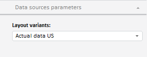
The DataSourceParamsPanel class implements the Data Sources Parameters tab used to set up data sources' parameters. This tab is included into express report properties panel.
The Data Sources Parameters tab implemented by the DataSourceParamsPanel class, may look as follows:

PP.initClass(PP.Exp.Ui.DataSourceParamsPanel, PP.Ui.MasterPanel, "DataSourceParamsPanel");
| Constructor name | Brief description | |
| DataSourceParamsPanel | The DataSourceParamsPanel constructor creates an instance of the DataSourceParamsPanel class. |
| Property name | Brief description | |
| DestsSectionVisible | The DestsSectionVisible property sets visibility for the Data Source Parameters tab on the express report property panel. |
| Method name | Brief description | |
| setSource | The setSource method sets a data source for the Data Source Parameters tab. |
| Property name | Brief description | |
| CanDisable | The CanDisable property determines whether a wizard panel can be deactivated. | |
| GroupName | The GroupName property sets a name for a group of wizard panels. |
| Method name | Brief description | |
| getContentDomNode | The getContentDomNode method returns the DOM node that contains a wizard panel. | |
| isVisible | The isVisible method returns if a wizard panel is visible. | |
| refresh | The refresh method refreshes wizard panel. |
| Property name | Brief description | |
| Caption | The Caption property sets and returns tab header. | |
| HeaderControl | The HeaderControl property sets a control to be displayed in a tab header. | |
| IsHeaderControlVisible | The IsHeaderControlVisible property determines whether a control is displayed in the tab header. | |
| Title | The Title property sets tab title. |
| Method name | Brief description | |
| addHeaderClass | The addHeaderClass method adds a CSS class to DOM node of tab. | |
| collapse | The collapse method collapses a panel. | |
| expand | The expand method expands a panel. | |
| getContentSize | The getContentSize method returns panel contents size. | |
| getHeightOfCDomNode | The getHeightOfCDomNode method returns height of tab DOM node. | |
| getIsCollapsed | The getIsCollapsed method returns whether a panel is collapsed. | |
| getIsRendered | The getIsRendered method returns whether a tab is rendered. | |
| getScrollBox | The getScrollBox method returns scrolling region of a tab. | |
| hideScrolls | The hideScrolls method hides scrollbars. | |
| showScrolls | The showScrolls method shows scrollbars. | |
| updateScrolls | The updateScrolls method refreshes scrollbars on tab scrolling. |
| Event name | Brief description | |
| Collapsing | The Collapsing event occurs on closing a tab. | |
| Disposing | The Disposing event occurs after deleting a tab. | |
| EnableChanged | The EnableChanged event occurs after changing tab availability. | |
| Expanding | The Expanding event occurs on expanding a tab. | |
| Toggled | The Toggled event occurs when expanding or collapsing a tab is completed. | |
| Toggling | The Toggling event occurs on expanding or collapsing a tab. | |
| VisibleChanged | The VisibleChanged event occurs after changing tab visibility. | |
| VisibleChanging | The VisibleChanging event occurs on changing tab visibility. |
| Property name | Brief description | |
| Anchors | The Anchors property determines position of the component placed within container. | |
| Animation | The Animation property sets animation parameters for component. | |
| Bottom | The Bottom property sets bottom offset on placing the component within the LayoutPanel. | |
| Content | The Content property sets the component contents. | |
| ContextMenu | The ContextMenu property sets the context menu for the component. | |
| Data | The Data property is used to store any custom data. | |
| DataContext | The DataContext property contains an object with data. | |
| Enabled | The Enabled property sets whether the component is enabled. | |
| Height | The Height property determines the component height. | |
| IsResizable | The IsResizable property determines whether the component can be resized. | |
| IsRTL | The lsRTL property sets right to left text direction. | |
| IsVisible | The IsVisible property determines whether the component is displayed. | |
| Left | The Left property sets left offset on placing the component within the GridPanel. | |
| Offset | The Offset property determines coordinates of root DOM node of a control. | |
| Opacity | The Opacity property determines component transparency. | |
| Parent | The Parent property determines a parent component of a control. | |
| ParentNode | The ParentNode property sets parent DOM node. | |
| ResourceKey | The ResourceKey property sets the resource key for the component. | |
| Right | The Right property sets right offset on placing the component within the LayoutPanel. | |
| Rotate | The Rotate property sets component rotation angle. | |
| ShowToolTip | The ShowToolTip property determines whether the tooltip of the component can be displayed. | |
| Style | The Style property sets component style. | |
| TabIndex | The TabIndex property sets the order of the control element passing inside the container. | |
| Tag | The Tag property sets JSON object associated with the component. | |
| ToolTip | The ToolTip property determines text of component tooltip. | |
| Top | The Top property sets top offset on placing the component within the GridPanel. | |
| Value | The Value property sets the value to the component. | |
| Width | The Width property sets the component width. |
| Method name | Brief description | |
| The addClass method adds a CSS class to the component. | ||
| addEvent | The addEvent method adds an event handler to a DOM node. | |
| addEventHandler | The addEventHandler method adds an event handler to a DOM node. | |
| addEvents | The addEvents method adds an array of event handlers to a DOM node. | |
| The addStateClass method adds a CSS class to the component and removes the previous CSS class. | ||
| addStyleBySelector | The addStyleBySelector method creates a block that contains a style with the specified CSS selector. | |
| The addToNode method adds a component to the specified node. | ||
| bindEvents | The bindEvents method subscribes an element to all available events. | |
| The clearStylesCache method clears cache of component styles. | ||
| The getAnchorFlags method returns JSON object that contains settings of the current component's position. | ||
| The getClass method returns the current CSS classes of the component. | ||
| The getCssStyle method returns style for the specified node. | ||
| The getDomNode method returns main DOM node of the component. | ||
| The getFocused method determines whether the component is focused. | ||
| getFunctionByName | The getFunctionByName method returns function by name. | |
| getIsBinded | The getIsBinded method returns whether an element is subscribed to all DOM node events. | |
| The hasClass method determines whether the specified CSS class is set for root DOM node of the control. | ||
| The hide method hides a control. | ||
| The hideToolTip method clears tooltip timeout and hides the tooltip if it is displayed. | ||
| The isResingNow method determines whether the component is being resized. | ||
| refreshBindingProperty | The refreshBindingProperty method refreshes the bound property by name. | |
| refreshItemsStyle | The refreshItemsStyle method refreshes CSS styles of child elements. | |
| refreshStyle | The refreshStyle method refreshes element CSS styles. | |
| The removeClass method removes CSS class from the component. | ||
| The removeEvent method removes event handler from DOM node. | ||
| removeEventHandler | The removeEventHandler method removes event handler from DOM node. | |
| removeFromDOM | The removeFromDOM method removes node from the DOM structure. | |
| The removeStateClasses method removes CSS classes of the component. | ||
| The setDraggable method determines whether it is possible to drag component on the HTML page. | ||
| The setFocus method sets the component focus. | ||
| The setIsHovered method displays the component as on hover. | ||
| The setIsPressed method displays the component as if clicked upon. | ||
| The setOpacityIE8 method sets component transparency value in Internet Explorer 8. | ||
| The setSize method establishes the sizes of the component. | ||
| The show method displays a control. | ||
| unBindEvents | The unBindEvents method unsubscribes an element from all standard events. | |
| The updatePosition method updates size and position when absolute positioning based on the current parameters is used. | ||
| The updateSize method updates the component size on changing the size of the container that contains the component. |
| Event name | Brief description | |
| Drag | The Drag event occurs on clicking and holding the left mouse button. | |
| DragEnd | The DragEnd event occurs when dragging the component finishes. | |
| DragStart | The DragStart event occurs when dragging the component starts. | |
| OnContextMenu | The OnContextMenu event occurs on calling context menu of the component. | |
| SizeChanged | The SizeChanged event occurs after the component is resized. | |
| SizeChanging | The SizeChanging event occurs during component resize. |
| Property name | Brief description | |
| The Id property determines a repository object identifier. |
| Method name | Brief description | |
| clone | The clone method creates an object copy. | |
| dispose | The dispose method deletes the component. | |
| getHashCode | The getHashCode method returns hash code of repository object. | |
| getSettings | The getSettings method returns repository object settings. | |
| getTypeName | The getTypeName method returns the name of the object type without the namespace, to which it belongs. | |
| isEqual | The isEqual method determines whether the specified object is equal to the current repository object. | |
| isLive | The isLive method determines validity of repository object. | |
| removeAllEvents | The removeAllEvents method removes all object event handlers by the specified context. | |
| setSettings | The setSettings method determines repository object settings. | |
| defineProps | The defineProps method creates get and set methods from name array for the specified class. | |
| keys | The keys method returns array of methods and properties names for the specified object. |
See also: