The NavigationBar component is a side panel used to navigate properties of the active component and to control properties.
The NavigationBar component includes several tabs. Clicking tab headers expands internal panels with arbitrary contents. The component does not allow opening several tabs at the same time. Opening a tab closes the previous tab.
The component is implemented by the NavigationBar class.
The role of container for side panel can be acted by the SlidePanel component.
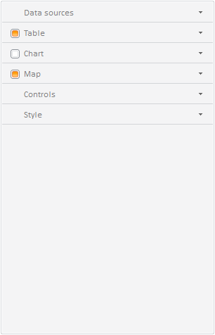
The component looks as follows:

It the figure above all tabs of the navigation bar are collapsed. Tab headers can contain such controls, as ComboBox, Button, CheckBox, RadioButton. By default the CheckBox control is set for tab headers. This control is visible, but it can be hidden using the IsHeaderControlVisible property.
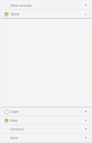
On opening a tab its internal panel is expanded and the tabs below are shifted downward:

If the navigation bar does not have enough space to expand an inner panel, the tabs are hidden starting from the lowermost tab, and a button with a drop-down menu named button appears.
For more detailed component description please refer to the page Example of Creating the NavigationBar Component.
| Constructor name | Brief description | |
| NavigationBar | The NavigationBar constructor creates an instance of the NavigationBar component. |
| Property name | Brief description | |
| IsAlwaysExpanded | The IsAlwaysExpanded property determines whether the user can hide an opened tab without expanding other tabs. | |
| Items | The Items property sets a list of panels included into the component. |
| Method name | Brief description | |
| addItem | The addItem property adds a tab with drop-down panel to the navigator. | |
| beginUpdate | The beginUpdate method disables rerendering of the property panel until the endUpdate method is called. | |
| endUpdate | The endUpdate method enables properties panel rerendering and refreshes it. | |
| getActiveItem | The getActiveItem method returns the active panel tab. | |
| getContentAutoFit | The getContentAutoFit method returns whether contents autofit is used in the properties panel. | |
| getExpandedAreaHeight | The getExpandedAreaHeight method returns the height of properties panel expanded area. | |
| getItem | The getItem method returns child element of the navigation bar by the specified index. | |
| getItemByPoint | The getItemByPoint method returns properties panel tab by the specified coordinates. | |
| getLayoutItems | The getLayoutItems method returns an array of properties panel elements. | |
| getMaxAreaHeight | The getMaxAreaHeight method returns the maximum height of properties panel. | |
| getMinAreaHeight | The getMinAreaHeight method returns the minimum height of properties panel. | |
| insertItem | The insertItem method adds an element to the properties panel by index or element. | |
| isAnimation | The isAnimation method returns whether animation is played in the properties panel. | |
| isUpdating | The isUpdating method determines whether the properties panel is being updated. | |
| removeItem | The removeItem method removes the specified tab. | |
| removeItemByIndex | The removeItemByIndex method removes a tab by its index. | |
| stopAnimation | The stopAnimation method stops animation in the properties panel. |
| Event name | Brief description | |
| Collapsed | The Collapsed event occurs after collapsing panel tabs. | |
| Expanded | The Expanded event occurs after expanding a panel tab. | |
| SelectableSelected | The SelectableSelected event occurs on the mouse click on the property panel. |
| Property name | Brief description | |
| Anchors | The Anchors property determines position of the component placed within container. | |
| Animation | The Animation property sets animation parameters for component. | |
| Bottom | The Bottom property sets bottom offset on placing the component within the LayoutPanel. | |
| Content | The Content property sets the component contents. | |
| ContextMenu | The ContextMenu property sets the context menu for the component. | |
| Data | The Data property is used to store any custom data. | |
| DataContext | The DataContext property contains an object with data. | |
| Enabled | The Enabled property sets whether the component is enabled. | |
| Height | The Height property determines the component height. | |
| IsResizable | The IsResizable property determines whether the component can be resized. | |
| IsRTL | The lsRTL property sets right to left text direction. | |
| IsVisible | The IsVisible property determines whether the component is displayed. | |
| Left | The Left property sets left offset on placing the component within the GridPanel. | |
| Offset | The Offset property determines coordinates of root DOM node of a control. | |
| Opacity | The Opacity property determines component transparency. | |
| Parent | The Parent property determines a parent component of a control. | |
| ParentNode | The ParentNode property sets parent DOM node. | |
| ResourceKey | The ResourceKey property sets the resource key for the component. | |
| Right | The Right property sets right offset on placing the component within the LayoutPanel. | |
| Rotate | The Rotate property sets component rotation angle. | |
| ShowToolTip | The ShowToolTip property determines whether the tooltip of the component can be displayed. | |
| Style | The Style property sets component style. | |
| TabIndex | The TabIndex property sets the order of the control element passing inside the container. | |
| Tag | The Tag property sets JSON object associated with the component. | |
| ToolTip | The ToolTip property determines text of component tooltip. | |
| Top | The Top property sets top offset on placing the component within the GridPanel. | |
| Value | The Value property sets the value to the component. | |
| Width | The Width property sets the component width. |
| Method name | Brief description | |
| The addClass method adds a CSS class to the component. | ||
| addEvent | The addEvent method adds an event handler to a DOM node. | |
| addEventHandler | The addEventHandler method adds an event handler to a DOM node. | |
| addEvents | The addEvents method adds an array of event handlers to a DOM node. | |
| The addStateClass method adds a CSS class to the component and removes the previous CSS class. | ||
| addStyleBySelector | The addStyleBySelector method creates a block that contains a style with the specified CSS selector. | |
| The addToNode method adds a component to the specified node. | ||
| bindEvents | The bindEvents method subscribes an element to all available events. | |
| The clearStylesCache method clears cache of component styles. | ||
| The getAnchorFlags method returns JSON object that contains settings of the current component's position. | ||
| The getClass method returns the current CSS classes of the component. | ||
| The getCssStyle method returns style for the specified node. | ||
| The getDomNode method returns main DOM node of the component. | ||
| The getFocused method determines whether the component is focused. | ||
| getFunctionByName | The getFunctionByName method returns function by name. | |
| getIsBinded | The getIsBinded method returns whether an element is subscribed to all DOM node events. | |
| The hasClass method determines whether the specified CSS class is set for root DOM node of the control. | ||
| The hide method hides a control. | ||
| The hideToolTip method clears tooltip timeout and hides the tooltip if it is displayed. | ||
| The isResingNow method determines whether the component is being resized. | ||
| refreshBindingProperty | The refreshBindingProperty method refreshes the bound property by name. | |
| refreshItemsStyle | The refreshItemsStyle method refreshes CSS styles of child elements. | |
| refreshStyle | The refreshStyle method refreshes element CSS styles. | |
| The removeClass method removes CSS class from the component. | ||
| The removeEvent method removes event handler from DOM node. | ||
| removeEventHandler | The removeEventHandler method removes event handler from DOM node. | |
| removeFromDOM | The removeFromDOM method removes node from the DOM structure. | |
| The removeStateClasses method removes CSS classes of the component. | ||
| The setDraggable method determines whether it is possible to drag component on the HTML page. | ||
| The setFocus method sets the component focus. | ||
| The setIsHovered method displays the component as on hover. | ||
| The setIsPressed method displays the component as if clicked upon. | ||
| The setOpacityIE8 method sets component transparency value in Internet Explorer 8. | ||
| The setSize method establishes the sizes of the component. | ||
| The show method displays a control. | ||
| unBindEvents | The unBindEvents method unsubscribes an element from all standard events. | |
| The updatePosition method updates size and position when absolute positioning based on the current parameters is used. | ||
| The updateSize method updates the component size on changing the size of the container that contains the component. |
| Event name | Brief description | |
| Drag | The Drag event occurs on clicking and holding the left mouse button. | |
| DragEnd | The DragEnd event occurs when dragging the component finishes. | |
| DragStart | The DragStart event occurs when dragging the component starts. | |
| OnContextMenu | The OnContextMenu event occurs on calling context menu of the component. | |
| SizeChanged | The SizeChanged event occurs after the component is resized. | |
| SizeChanging | The SizeChanging event occurs during component resize. |
| Property name | Brief description | |
| The Id property determines a repository object identifier. |
| Method name | Brief description | |
| clone | The clone method creates an object copy. | |
| dispose | The dispose method deletes the component. | |
| getHashCode | The getHashCode method returns hash code of repository object. | |
| getSettings | The getSettings method returns repository object settings. | |
| getTypeName | The getTypeName method returns the name of the object type without the namespace, to which it belongs. | |
| isEqual | The isEqual method determines whether the specified object is equal to the current repository object. | |
| isLive | The isLive method determines validity of repository object. | |
| removeAllEvents | The removeAllEvents method removes all object event handlers by the specified context. | |
| setSettings | The setSettings method determines repository object settings. | |
| defineProps | The defineProps method creates get and set methods from name array for the specified class. | |
| keys | The keys method returns array of methods and properties names for the specified object. |
See also: