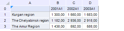
Consider an example of data located in the Indicators report sheet as a chart data source:
To add a chart on report sheet:
Select the B1:D3 cell range.
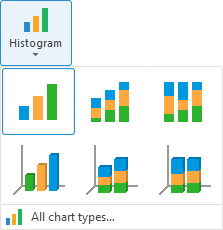
Select chart type using the Histogram button in the Charts group of the Insert ribbon tab:
The Source Data dialog box opens after selecting the chart type.
Define chart parameters:
Report sheet: Indicators.
Data area range: B1:D3.
Row name range: A1:A3.
Range of series points' names: B0:D0.
Series in rows: Yes (checkbox is selected).
Modify ranges automatically: Yes (checkbox is selected).
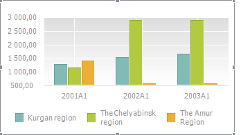
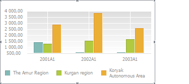
Click the OK button. A chart that looks as follows appears on the report sheet:
When several ranges (a compound region) are used to create a chart, series are represented in the same order as these ranges have been selected.
In the following image, a non-adjacent range is used to build a chart. The order of selection is denoted by numbers:
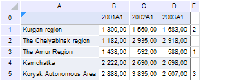
When the chart is created, row names ranges are also specified in the same order the data has been selected:

The chart looks as follows:
See also: