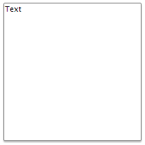
To execute the example, the HTML page must contain links to PP.js, PP.Ext.js script files and to PP.css styles file, in the <body> tag of the HTML document of the <div> item with the panel identifier. In the onload event of the <body> tag it is necessary to add the call of the createShadowDropPanel() function Create and show drop-down panel with shadow:
function createShadowDropPanel() {
    // Create a panel with shadow
    shadowDropPanel = new PP.Ui.DropPanel({
        // Set parent item
        ParentNode: document.getElementById("panel"),
        // Set panel width
        Width: 200,
        // Set panel height
        Height: 200,
        // Set maximum panel height
        MaxDropDownHeight: 500,
        // Set maximum panel width
        MaxDropDownWidth: 500,
        // Set minimum panel height
        MinDropDownHeight: 100,
        // Set minimum panel width
        MinDropDownWidth: 100,
        // Set panel contents
        Content: "Text"
    });
    // Show panel
    shadowDropPanel.show(10, 10);
}
As a result drop-down panel with shadow is displayed:

See also: