
 Contents of the tabSheetJSON.js file
CellEditorRendered: PP.Delegate | function (sender, args)
sender. Event source.
args. Event information.
The CellEditorRendered event is fired after rendering the editor used to enter value into a cell.
The editor is rendered on double click on a table cell that has appropriate settings defined for it.
To execute the example, add links to the files PP.css, PP.js and PP.TabSheet.js. The tabSheetJSON.js file containing table data source settings must be available.
Contents of the tabSheetJSON.js file
Add a table to the page, for all cells of this table set up showing value selection editor on double click:
    //Connect script with data source settings
    PP.ScriptManager.loadScripts(["tabSheetJSON.js"], tbsht);
    function tbsht() {
        if (!data)
            return false;
        if (!PP.Ui.ExamplePrognozSyncDataSource) {
            PP.Ui.ExamplePrognozSyncDataSource = function (clear) {
                this.MeasuresLoaded = new PP.Delegate();
                this.RangeLoaded = new PP.Delegate();
            };
            //Initialization of table data class source
            PP.initClass(PP.Ui.ExamplePrognozSyncDataSource, PP.Object, "PP.Ui.ExamplePrognozSyncDataSource", [PP.Ui.ITabSheetDataSource]);
            var esdsProto = PP.Ui.ExamplePrognozSyncDataSource.prototype;
            esdsProto.getIsAsync = function () {
                return false;
            };
            esdsProto.loadMeasures = function () {
                this.MeasuresLoaded.fire(this, {
                    Data: data
                });
            };
            esdsProto.loadRanges = function (rangeArray) {
                this.RangeLoaded.fire(this, {
                    Data: data,
                    Ranges: rangeArray
                });
            };
            esdsProto = null;
        }
        //Create an instance of the PP.Ui.ExamplePrognozSyncDataSource class
        dataSource = new PP.Ui.ExamplePrognozSyncDataSource();
        //Button to call cell editor
        button1 = new PP.Ui.ToolBarButton({
            Width: 70,
            Height: 20,
            Content: "Select"
        });
        component = new PP.Ui.TabSheet({
            ParentNode: container,
            DataSource: dataSource,
            IsEditable: true,
            Width: 400,
            Height: 250,
            //Button used to call cell editor
            SelectionControl: {
                Control: button1,
                Position: PP.Ui.TSSelControlPos.TopLeft,
                Width: 50,
                Height: 50
            },
            CellEditorRendered: function (sender, args) {
                alert("Select a value")
            }
        });
    };
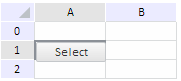
After executing the example the TabSheet component is placed on the page. This component will consist of 3 rows and 2 columns. On clicking a table cell the Select button appears:
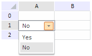
On double click on the button (if the example uses no button, on double click on a table cell), the "Select a Value" message appears in the screen, and value selection combo box opens:
See also: