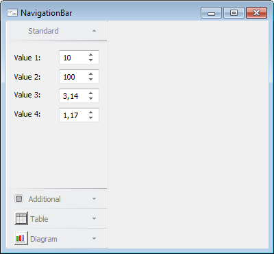
The NavigationBar component is used to create a navigation bar.
A navigation bar is created from vertically arranged tabs. Each tab consists of a title and a controls panel. The tab is activated on clicking its title. If required, each tab can be hidden.
Use software to create a collection of tabs for setting up the component. To create a tab, create an instance of the NavigationBarPad class and include it in the Pads collection of the NavigationBar component. For each tab set up a title (the INavigationBarPad.Header property) and a panel (the INavigationBarPad.Content property). A title can include text and a control. The panel associated with the title is a frame for the form with controls. The form identifier is specified in the INavigationBarPanel.MetabaseObject property.
| Property name | Brief description | |
 |
ActivePad | The ActivePad property determines an active component tab. |
|
Align | The Align property determines behavior of the component when its parent component is resized. |
|
AllowDrag | The AllowDrag property determines whether an object can be dragged from the component. |
|
AllowDrop | The AllowDrop property determines whether the component can accept a dragged object. |
|
Anchors | The Anchors property returns settings that determine the percentage of the size change for the current component when the parent component is resized. |
|
Border | The Border property determines the borders to be rendered for the component. |
|
Brush | The Brush property determines the brush that is used to fill component area. |
|
ClientHeight | The ClientHeight property is used to receive or specify the height of the component’s client area. |
|
ClientWidth | The ClientWidth property is used to receive or specify the width of the component’s client area. |
|
Color | The Color property determines a component background color. |
|
ComponentCount | The ComponentCount property returns the number of child components. |
|
Components | The Components property returns the child component. |
|
Cursor | The Cursor property determines the look of the cursor over the component. |
|
Data | The Data property is used to store any custom data. |
|
Enabled | The Enabled property determines whether the component is available for the user. |
|
Focused | The Focused property returns True if the focus is set on the component. |
|
Font | The Font property determines the set of characteristics describing the font that is used to display text. |
|
Height | The Height property determines component height. |
|
HelpContext | The HelpContext property determines a unique index for the context help section for this component. |
|
Hint | The Hint property determines a component tooltip text. |
|
Left | The Left property determines the coordinate of the left border of the component. |
|
Name | The Name property determines a component name. |
|
Pads | The Pads property returns the collection of tabs of the navigation bar. |
|
Parent | The Parent property determines a parent component. |
|
ParentColor | The ParentColor property determines whether the component inherits the color of the parent component. |
|
ParentFont | The ParentFont property determines whether the component uses the font of the parent component. |
|
ParentShowHint | The ParentShowHint property determines whether a tooltip is displayed. |
|
PopupMenu | The PopupMenu property determines the context menu to be displayed on right-click on the component. |
|
ShowHint | The ShowHint property enables and disables showing a component tooltip. |
|
TabOrder | The TabOrder property determines the component position in the tab order. |
|
TabStop | The TabStop property determines whether the component is focused when the Tab key is pressed. |
|
Tag | The Tag property is not used by the compiler. The user can change the value of the Tag property and use it as he wishes. |
|
Text | The Text property determines the row identifying a component for the user. |
|
Top | The Top property determines the coordinate of the top border of the component. |
|
Visible | The Visible property determines visibility of the component during execution. |
|
Width | The Width property determines component width. |
| Method name | Brief description | |
 |
BeginUpdate | The BeginUpdate method prohibits component rerendering. |
|
BringToFront | The BringToFront method brings a component to front. |
|
ClientToScreen | The ClientToScreen method converts the coordinates of a point specified relative to the component coordinate system into screen coordinates. |
|
DoDragDrop | The DoDragDrop method enables the user to start dragging operation. |
|
EndUpdate | The EndUpdate method resumes component rerendering. |
|
GetImage | The GetImage method returns the image of the component with all the child components. |
|
ScreenToClient | The ScreenToClient method converts screen coordinates of a point into coordinates specified relative to the component coordinate system. |
|
SendToBack | The SendToBack method sends a component to back. |
|
SetFocus | The SetFocus method sets focus to this component. |
| Event name | Brief description | |
 |
OnActivePadChanged | The OnActivePadChanged event occurs after changing the active tab of the navigation bar. |
|
OnActivePadChanging | The OnActivePadChanging event occurs before changing the active tab of the navigation bar. |
|
OnPadValueChanged | The OnPadValueChanged event occurs on changing selection of the checkbox displayed in the tab title. |
See also: