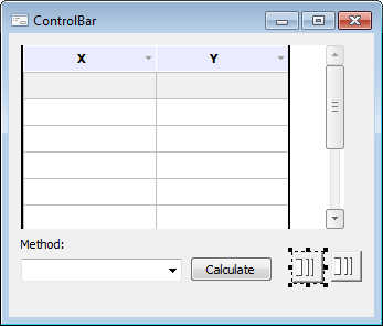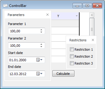
The ControlBar component is non-visual and is used to create popup panels on a form.
As a panel, the form is displayed, which is specified in the MetabaseObject property of the ControlBar component.
The popup panel can have one of the three states. Docked - the panel is always displayed on the form, the panel menu is displayed, all main form components are moved. Floating - the panel is displayed as a separate window. Working with a floating panel is executed in the same way as with the similar floating windows in various platform tools. Hidden - the form displays a tab, on hovering over which the panel expands on top of all form components. The panel remains expanded while one of the panel's components is focused. Panel components are not focused but mouse cursor is in the panel area. The direction of panel expanding depends on its position.
If in the form used as a popup panel the Icon base property is changed, when the panel is displayed as hidden, this icon is displayed on the tab near the panel name.
The form design mode:

The form after startup:


| Property name | Brief description | |
| AllowDocking | The AllowDocking property determines whether the popup panel can be docked. | |
| AllowFloat | The AllowFloat property determines whether the popup panel can be floating. | |
| AutoHide | The AutoHide property determines whether the popup panel can be hidden. | |
| ComponentCount | The ComponentCount property returns the number of child components. | |
| Components | The Components property returns the child component. | |
| Data | The Data property is used to store any custom data. | |
| DockEdge | The DockEdge property returns the settings, which determine the sides of the parent window, to which the popup panel can be docked at the form runtime. | |
| DockPosition | The DockPosition property determines the edge of the parent window, to which the popup panel will be docked. | |
| Floating | The Floating property returns True if the panel is floating. | |
| Form | The Form property returns the parent form for this popup panel. | |
| Height | The Height property determines vertical size of the popup panel in pixels. | |
| Hidden | The Hidden property determines the state of the panel. | |
| Id | The Id property determines the unique identifier of the popup panel. | |
| Left | The Left property determines a coordinate of the left border of the popup panel. | |
| MetabaseObject | The MetabaseObject property determines an identifier of the form, which is displayed in the popup panel. | |
| Name | The Name property determines a component name. | |
| Tag | The Tag property is not used by the compiler. The user can change the value of the Tag property and use it as he wishes. | |
| Text | The Text property determines the title text for the pop-up panel, or the text displayed on the tab if the panel is hidden. | |
| Top | The Top property determines a coordinate of the top border of the popup panel. | |
| Visible | The Visible property determines whether the component is displayed when a form is executed. | |
| Width | The Width property determines horizontal size of the popup panel in pixels. |
| Method name | Brief description | |
| DockIn | The DockIn method groups popup panels. | |
| DockOf | The DockOf method docks this panel to the panel in the input parameter. | |
| Float | The Float method changes panel state to floating. | |
| IsDocked | The IsDocked method checks if this popup panel is in the same group as the panel in the input parameter. | |
| PutParentForm | The PutParentForm method sets the parent form for the popup panel. |
See also: