Count: Integer;
The Count property determines the number of speedometer arrows formatting styles.
One formatting style of speedometer scales arrows exists in the component by default. If more than one arrow is used for the scale, it is possible to set up its own formatting for each arrow. To do this, specify the number of formatting styles that are created in this property. The formatting style of the first arrow is used for all arrows, for which the individual formatting style was not created.
Executing the example requires a form with the Button1 button and the SpeedometerBox component named SpeedometerBox1.
Sub Button1OnClick(Sender: Object; Args: IMouseEventArgs);
Var
s: ISpeedometer;
v: ISpeedometerView;
Arrows: ISpeedometerArrows;
ArrowsViews: ISpeedometerArrowViews;
ScaleView: ISpeedometerScaleView;
ArrowView, ArrowView1: ISpeedometerArrowView;
Begin
s := SpeedometerBox1.Speedometer;
v := s.View;
s.BeginUpdate;
Arrows := s.Scales.Item(0).Arrows;
Arrows.Count := 2;
Arrows.Item(0).Value := 50;
Arrows.Item(0).Value := 125;
ScaleView := v.ScaleViews.Item(0);
ArrowsViews := ScaleView.ArrowViews;
ArrowsViews.Count := 2;
ArrowView := ArrowsViews.Item(0);
ArrowView1 := ArrowsViews.Item(1);
//The first arrow
ArrowView.Length := 0.8;
ArrowView.Shape := SpeedometerArrowShapes.Triangle;
ArrowView.Width := 0.15;
//The second arrow
ArrowView1.Length := 0.5;
ArrowView1.Shape := SpeedometerArrowShapes.Linear;
ArrowView1.Width := 0.06;
s.EndUpdate;
End Sub Button1OnClick;
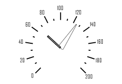
After executing the example, on clicking the button, scale arrows formatting of the speedometer displayed in the SpeedometerBox1 component is changed. Two arrows are created for the scale. Each arrow has its own design.

See also: