Operating system requirements: iOS 5.0 or later.
Mobile device: iPad.
This example displays working with a container with two data views. After starting the example the following operations are executed:
A dimension panel container is set as the first data view.
A table is set as the second data view.
The first data view is collapsed.
Text, top and bottom arrows are displayed on the separator of two data views.
Separator width, its left and right border indents are determined.
Executing the example requires to place the following code in the body of the executeExample method of the ViewController class (see the Displaying of Express Report section):
// Get express report controller
MAExpressAnalysisReportViewController *contr = (MAExpressAnalysisReportViewController *)m_controller;
// Create a container with separator
SplitViewController *splitController = [SplitViewController new];
// Load view
[splitController loadView];
// Get dimension panel container
PanelViewController *panelViewCtrl = [contr panelViewController];
// Get separator of two data views
MASeparatorView *separatorView = [panelViewCtrl separatorView];
// Set text for separator of two data views
[[separatorView titleLabel] setText: @"Prognoz"];
// Specify that dimension panel container is not displayed
[separatorView setPanelVisible: NO];
// Hide first controller view
[splitController setFirstViewVisible: [separatorView isPanelVisible]];
NSLog(@"Predefined separator width: %f", [separatorView preferredWidth]);
NSLog(@"Left separator border indent: %f", [separatorView leftBorder]);
NSLog(@"Right separator border indent: %f", [separatorView rightBorder]);
// Set dimension panel container as the first data view
[splitController setPanelViewController: panelViewCtrl];
// Create a table to be displayed as the second data view
UITableViewController *table = [UITableViewController new];
// Set the second data view
[[splitController splitView] setSecondView: [table view]];
// Display controller with separator
[self showViewControllerInNavigationController: splitController];
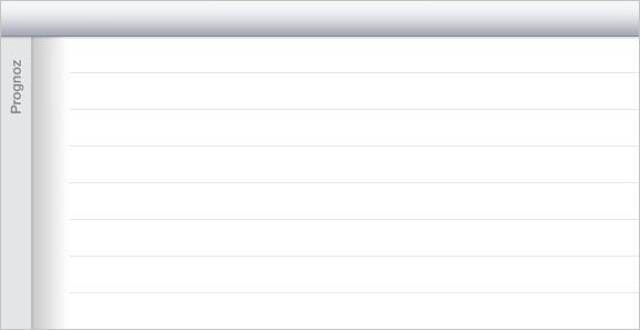
After executing the example the container divided into two data views - dimension container and table - is displayed. The first data view - dimension panel container - is collapsed. The text "Prognoz" is set for the separator of both data views:

The development environment console displays predefined separator width and its left and right border indents:
Predefined separator width: 84.000000
Separator left border indent: 0.000000
Separator right border indent: 39.000000
Then specify that the dimension panel container is visible, and display top and bottom arrows on the data view separator by adding the following code fragment to the example:
// Specify that dimension panel container is displayed
[separatorView setPanelVisible: YES];
// Display top arrow
[separatorView setUpArrowVisible: YES];
// Display bottom arrow
[separatorView setDownArrowVisible: YES];
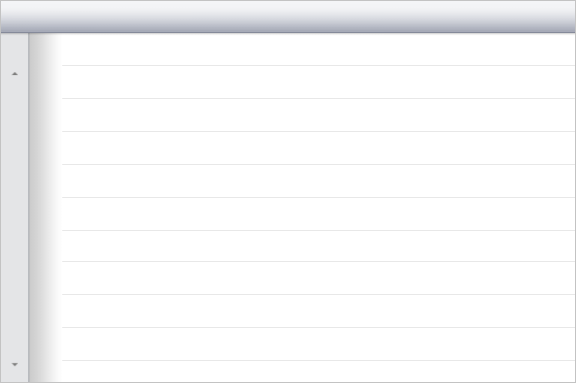
After executing the example the data view separator text is hidden, the top and bottom arrows are displayed instead:

See also: