Connect the PP.js components library and PP.css visual styles table. Executing the example requires that the HTML page contains two <div> tags with the DP1 and btn1 identifiers. Further the Javascript code with the help of which the drop-down panel is located on the HTML page is given:
var DP = new PP.Ui.DropPanel({
    ParentNode: document.getElementById("DP1"),
    Width: 200,
    Height: 300,
    MaxDropDownHeight: 500,
    MaxDropDownWidth: 500,
    MinDropDownHeight: 100,
    MinDropDownWidth: 100,
    EnableResizeLeft: false,
    EnableResizeTop: false,
    Content: "Text",
    EnableRestoreFocus: true
});
function ShowPanel()
{
    DP.show(10, 30);
}
var btn = new PP.Ui.Button({ParentNode: document.getElementById("btn1"),
    Click: ShowPanel,
    Content: "Open"})
</script>
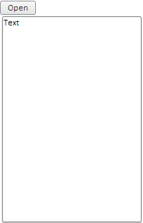
After executing the example, clicking the Open button on the HTML page opens the following panel:

A panel can be resized with the mouse. To do this, grab panel border and drag it; the cursor will look as a two-headed arrow. The maximum and minimum component's height and width are set by means of the DropPanel.MaxDropDownHeight, DropPanel.MaxDropDownWidth, DropPanel.MinDropDownHeight and DropPanel.MinDropDownWidth properties.
In the example only sizes of panel right and bottom edges can be changed, as the DropPanel.EnableResizeLeft and DropPanel.EnableResizeTop properties are set to false.
When opened, the panel is located in ten pixels from the left page edge and in thirty pixels from the top edge as it is set in the parameters of the DropPanel.show method.
See also: