To execute the example, in the HEAD tag add links to PP.js component library, to PP.css visual styles , and a resources file (such as resources.en.js). Seebelow the JavaScript code given to create the BorderCombo component. The item with the bc1 identifier must be available in the DIV tag.
var IMAGE_PATH = "../../../../../build/img/"; // Path to the folder with images
// Determine the path to root folder containing resources files
PP.resourceManager.setRootResourcesFolder("../../../../../resources/");
// Determine current regional settings
PP.setCurrentCulture(PP.Cultures.ru);
var borderCombo = new PP.Ui.BorderCombo(        {
    ParentNode: document.getElementById("bc1"),
    // Display panel to line width change
    BorderWidthVisible: true,
    // Set line width value
    LineWidth: 4,
    // Display panel to chose border type
    BorderTypeOnlt: true,
    // Open tab to chose line type
    Mode: 1,
    // Determine that line types which are supported by the SVG technology are available
    TypesMode: "SVG",
    // Display new value of the line width after its change
    LineWidthChanged: function(sender, args) {
        console.log(args.LineWidth)
    },
    // Set a handler of the item value change event
    ValueChanged: function(sender, args) {
        console.log("Property is changed: " + args.PropertyName);
    }
});
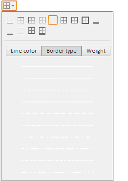
After executing the example, the HTML page contains the BorderCombo component that looks as follows:
The Border Type tab is active. The Width tab is shown (by default it is hidden). The value editor of the Width tab is set to four:
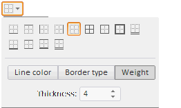
On changing the value in the value editor, the new value is displayed in the console.
On changing any property the console displays information about change:
The property is changed: LineWidth
A panel for border type selection is available (above), by default it is hidden.
See also: