getItemsList (position: PP.LTRB);
position. Tabs position in the component - the PP.LTRBenumeration item.
The getItemsList method returns the list of tabs from the drop-down component panel.
A button that opens drop-down panel becomes available when the component does not have enough space for all tabs. The button looks as follows:
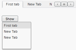
Clicking the button opens the panel that contains the list of tab headings. Clicking a list element opens respective tab.
To execute the example, connect the PP.js components library and the PP.css visual styles table. Create the TabControl component. Add a button clicking which opens the panel. Set the list of tabs as the panel contents.
//Create the TabControl component:
    var tabcontrol = new PP.Ui.TabControl({
            //Identifier for the div tag
            ParentNode: document.getElementById("tabcont1"),
            Width: 250,
            Height: 50,
            //Path to the folder with images:
            ImagePath: "img"
        });
//Add the tab in the TabControl component:
    tabcontrol.addItem(new PP.TabItem({ Position: PP.LTRB.Top, Caption: "First tab"}));
//Variable which contains list of tabs from drop-down panel of the component:
    var contForPan = tabcontrol.getItemsList(PP.LTRB.Top);
//Create drop-down panel:
    var droppanel = new PP.DropPanel({
            Width: 100,
            Height: 100,
            //Panel contents is a list of tabs:
            Content: contForPan
        });
//Create button to call drop-down panel:
    var button = new PP.Button({
            //Identifier for the div tag
            ParentNode: document.getElementById("btn"),
            Content: "Show"
        });
    button.Click.add(function(sender, args) {
            droppanel.show();
        });
After executing the example the HTML page will contain the TabControl component and the button labeled Show. New tabs can be added using the tab with the sign +. Clicking the button opens the list of tab headings. Clicking the list items expands corresponding tabs.
NOTE. The empty panel opens on clicking the button.
See also: