The GradientSlider component is the Slider component with a gradient fill.
The GradientSlider component is implemented by the GradientSlider class.
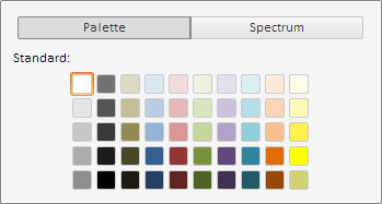
Clicking the component slider opens a menu where the user can select desired color.
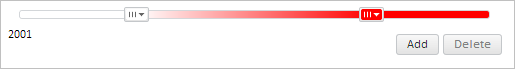
The GradientSlider component looks as follows:
The slider color selection menu looks as follows:
Example of Creating the GradientSlider Component.
| Constructor name | Brief description | |
 |
GradientSlider | The GradientSlider constructor creates an instance of the GradientSlider component. |
| Property name | Brief description | |
 |
ShowButtons | The ShowButtons property determines whether buttons for adding and removing the sliders for selecting color are displayed. |
| Method name | Brief description | |
|
getColorByValue | The getColorByValue method returns color of the slider for selecting color by the specified value. |
| Event name | Brief description | |
 |
AddClick | The AddClick event occurs on clicking the button for adding a slider for selecting color. |
|
ItemColorChanged | The ItemColorChanged event occurs on changing the color of slider for selecting color. |
|
RemoveClick | The RemoveClick event occurs on clicking the button for removing slider for selecting color. |
| Property name | Brief description | |
|
AttachToTicks | The AttachToTicks property determines whether sliders are bound to tick marks of the Slider component. |
|
CanCross | The CanCross property determines whether sliders of the Slider component can intersect with each other. |
|
CreateOnClick | The CreateOnClick property determines whether new sliders are moved on the left mouse click on the Slider component. |
|
ItemTickIndex | The ItemTickIndex property determines index of the tick mark, next to which the slider of the Slider component is located. |
|
Items | The Items property sets an array of sliders of the Slider component. |
|
LastActiveItem | The LastActiveItem property determines the last used slider of the Slider component. |
|
MaxItemsCount | The MaxItemsCount property determines the minimum number of sliders of the Slider component. |
|
MaxValue | The MaxValue property determines the maximum value of sliders of the Slider component. |
|
MinValue | The MinValue property determines the minimum value of sliders of the Slider component. |
|
MoveOnClick | The MoveOnClick property determines whether sliders are moved on the left mouse click on the Slider component. |
|
Orientation | The Orientation property determines orientation of the Slider component. |
|
ShowLabels | The ShowLabels property determines whether labels are shown in the component. |
|
Ticks | The Ticks property sets an array of tick marks of the Slider component. |
| Method name | Brief description | |
|
addItem | The addItem method adds a new slider to the Slider component. |
|
addTick | The addTick method adds a new tick mark to the Slider component. |
|
beginUpdate | The beginUpdate method prevents the Slider component from refreshing. |
|
endUpdate | The endUpdate method allows for the Slider component to be refreshed. |
|
fillAxis | The fillAxis method colors axis of the Slider component with the specified brush color. |
|
getItemById | The getItemById method returns slider of the Slider component by the specified identifier. |
|
getItemByIndex | The getItemByIndex method returns slider of the Slider component by the specified index. |
|
getMinItemsCount | The getMinItemsCount method returns the minimum available number of sliders in the Slider component. |
|
getSortedItems | The getSortedItems method returns the sorted array of sliders of the Slider component. |
|
getTickByIndex | The getTickByIndex method returns tick mark of the Slider component by the specified index. |
|
removeItemById | The removeItemById method removes slider of the Slider component with the specified identifier. |
|
removeItemByIndex | The removeItemByIndex method removes slider of the Slider component with the specified index. |
|
removeItems | The removeItems method removes all sliders of the Slider component. |
|
removeTickByIndex | The removeTickByIndex method removes tick mark of the Slider component by the specified index. |
|
removeTicks | The removeTicks method removes all tick marks of the Slider component. |
|
update | The update method refreshes the Slider component. |
| Property name | Brief description | |
|
Anchors | The Anchors property determines position of the component placed within container. |
|
Animation | The Animation property sets animation parameters for component. |
|
Bottom | The Bottom property sets bottom offset on placing the component within the LayoutPanel. |
|
Content | The Content property sets the component contents. |
|
ContextMenu | The ContextMenu property sets the context menu for the component. |
|
Data | The Data property is used to store any custom data. |
|
DataContext | The DataContext property contains an object with data. |
|
Enabled | The Enabled property sets whether the component is enabled. |
|
Height | The Height property determines the component height. |
|
IsResizable | The IsResizable property determines whether the component can be resized. |
|
IsRTL | The lsRTL property sets right to left text direction. |
|
IsVisible | The IsVisible property determines whether the component is displayed. |
|
Left | The Left property sets left offset on placing the component within the GridPanel. |
|
Offset | The Offset property determines coordinates of root DOM node of a control. |
|
Opacity | The Opacity property determines component transparency. |
|
Parent | The Parent property determines a parent component of a control. |
|
ParentNode | The ParentNode property sets parent DOM node. |
|
ResourceKey | The ResourceKey property sets the resource key for the component. |
|
Right | The Right property sets right offset on placing the component within the LayoutPanel. |
|
Rotate | The Rotate property sets component rotation angle. |
|
ShowToolTip | The ShowToolTip property determines whether the tooltip of the component can be displayed. |
|
Style | The Style property sets component style. |
|
TabIndex | The TabIndex property sets the order of the control element passing inside the container. |
|
Tag | The Tag property sets JSON object associated with the component. |
|
ToolTip | The ToolTip property determines text of component tooltip. |
|
Top | The Top property sets top offset on placing the component within the GridPanel. |
|
Value | The Value property sets the value to the component. |
|
Width | The Width property sets the component width. |
| Method name | Brief description | |
|
The addClass method adds a CSS class to the component. | |
|
addEvent | The addEvent method adds an event handler to a DOM node. |
|
addEventHandler | The addEventHandler method adds an event handler to a DOM node. |
|
addEvents | The addEvents method adds an array of event handlers to a DOM node. |
|
The addStateClass method adds a CSS class to the component and removes the previous CSS class. | |
|
addStyleBySelector | The addStyleBySelector method creates a block that contains a style with the specified CSS selector. |
|
The addToNode method adds a component to the specified node. | |
|
bindEvents | The bindEvents method subscribes an element to all available events. |
|
The clearStylesCache method clears cache of component styles. | |
|
The getAnchorFlags method returns JSON object that contains settings of the current component's position. | |
|
The getClass method returns the current CSS classes of the component. | |
|
The getCssStyle method returns style for the specified node. | |
|
The getDomNode method returns main DOM node of the component. | |
|
The getFocused method determines whether the component is focused. | |
|
getFunctionByName | The getFunctionByName method returns function by name. |
|
getIsBinded | The getIsBinded method returns whether an element is subscribed to all DOM node events. |
|
The hasClass method determines whether the specified CSS class is set for root DOM node of the control. | |
|
The hide method hides a control. | |
|
The hideToolTip method clears tooltip timeout and hides the tooltip if it is displayed. | |
|
The isResingNow method determines whether the component is being resized. | |
|
refreshBindingProperty | The refreshBindingProperty method refreshes the bound property by name. |
|
refreshItemsStyle | The refreshItemsStyle method refreshes CSS styles of child elements. |
|
refreshStyle | The refreshStyle method refreshes element CSS styles. |
|
The removeClass method removes CSS class from the component. | |
|
The removeEvent method removes event handler from DOM node. | |
|
removeEventHandler | The removeEventHandler method removes event handler from DOM node. |
|
removeFromDOM | The removeFromDOM method removes node from the DOM structure. |
|
The removeStateClasses method removes CSS classes of the component. | |
|
The setDraggable method determines whether it is possible to drag component on the HTML page. | |
|
The setFocus method sets the component focus. | |
|
The setIsHovered method displays the component as on hover. | |
|
The setIsPressed method displays the component as if clicked upon. | |
|
The setOpacityIE8 method sets component transparency value in Internet Explorer 8. | |
|
The setSize method establishes the sizes of the component. | |
|
The show method displays a control. | |
|
unBindEvents | The unBindEvents method unsubscribes an element from all standard events. |
|
The updatePosition method updates size and position when absolute positioning based on the current parameters is used. | |
|
The updateSize method updates the component size on changing the size of the container that contains the component. |
| Event name | Brief description | |
|
Drag | The Drag event occurs on clicking and holding the left mouse button. |
|
DragEnd | The DragEnd event occurs when dragging the component finishes. |
|
DragStart | The DragStart event occurs when dragging the component starts. |
|
OnContextMenu | The OnContextMenu event occurs on calling context menu of the component. |
|
SizeChanged | The SizeChanged event occurs after the component is resized. |
|
SizeChanging | The SizeChanging event occurs during component resize. |
| Property name | Brief description | |
|
Data | The Data property associates a random object with this component. |
|
Id | The Id property sets component identifier. |
|
Settings | The Settings property sets the component parameters. |
| Method name | Brief description | |
|
clone | The clone method creates a copy of object. It is not implemented in PP.Ui.Control. |
|
dispose | The dispose method deletes the component. |
|
getTypeName | The getTypeName method returns the name of the object type without the namespace, to which it belongs. |
See also: