The FontComboBox component is represented by the drop-down list to select font.
The component is implemented by the FontComboBox class.
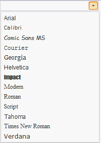
The component looks as follows:
Example of Creating the FontComboBox Component
| Constructor name | Brief description | |
 |
FontComboBox | The FontComboBox constructor creates an instance of the FontComboBox component. |
| Property name | Brief description | |
 |
AutoFind | The AutoFind property determines whether autosearch is available. |
|
SelectedIndex | The SelectedIndex property determines index of the selected list element. |
| Method name | Brief description | |
|
clearSelection | The clearSelection method removes selection from elements of the ComboBox component. |
|
filterByText | The filterByText method filters elements by string. |
|
getListBox | The getListBox method returns the ListBox component. |
| Property name | Brief description | |
|
CloseOnContentClick | The CloseOnContentClick property determines whether a component panel can be closed on clicking the header. |
|
EnableEdit | The EnableEdit property sets the ability of input. |
|
IsDropHasCombosWidth | The IsDropHasCombosWidth property sets whether drop-down panel width does not depend on the input editor width. |
|
IsHint | The IsHint property determines whether a tooltip is displayed on the mouse hover on the button for opening of the drop-down panel. |
|
NoCreateEditors | The NoCreateEditors property determines whether the header is displayed as a simple text and not in the editors of the TextBox or MaskEdit components. |
|
OpenOnContentClick | The OpenOnContentClick property determines whether a component panel can be opened on clicking the header. |
|
OpenOnIconClick | The OpenOnIconClick property determines whether a component panel can be opened on clicking the header icon. |
|
OpenOnKeyDown | The OpenOnKeyDown property determines whether a drop-down panel can be opened on clicking a keyboard key. |
|
UseMask | The UseMask property sets whether the editor mask can be used. |
| Method name | Brief description | |
|
applyNotValidCSS | The applyNotValidCSS method sets the style that determines highlighting invalid input value of the input editor. |
|
applyValidCSS | The applyValidCSS property sets the style that determines highlighting of valid input value of the input editor. |
|
getContentNode | The getContentNode method returns the DOM node of the input editor component. |
|
getDropPanel | The getDropPanel method returns the drop-down part of the component. |
|
getIconHeight | The getIconHeight method returns value of input editor icon height. |
|
getIconWidth | The getIconWidth method returns value of input editor icon width. |
|
getMaskEdit | The getMaskEdit method returns data input editor for data corresponding to a specific template. |
|
getTextBox | The getTextBox method returns text box of the input editor. |
|
setIconImageClass | The setIconImageClass method changes class name of the input editor component icon. |
|
showDropPanel | The showDropPanel method displays component's drop-down part. |
| Event name | Brief description | |
 |
TextChanged | The TextChanged event occurs on changing text in the editor. |
|
ValueChanged | The ValueChanged event occurs after changing input editor contents. |
| Property name | Brief description | |
|
Anchors | The Anchors property determines position of the component placed within container. |
|
Animation | The Animation property sets animation parameters for component. |
|
Bottom | The Bottom property sets bottom offset on placing the component within the LayoutPanel. |
|
Content | The Content property sets the component contents. |
|
ContextMenu | The ContextMenu property sets the context menu for the component. |
|
Data | The Data property is used to store any custom data. |
|
DataContext | The DataContext property contains an object with data. |
|
Enabled | The Enabled property sets whether the component is enabled. |
|
Height | The Height property determines the component height. |
|
IsResizable | The IsResizable property determines whether the component can be resized. |
|
IsRTL | The lsRTL property sets right to left text direction. |
|
IsVisible | The IsVisible property determines whether the component is displayed. |
|
Left | The Left property sets left offset on placing the component within the GridPanel. |
|
Offset | The Offset property determines coordinates of root DOM node of a control. |
|
Opacity | The Opacity property determines component transparency. |
|
Parent | The Parent property determines a parent component of a control. |
|
ParentNode | The ParentNode property sets parent DOM node. |
|
ResourceKey | The ResourceKey property sets the resource key for the component. |
|
Right | The Right property sets right offset on placing the component within the LayoutPanel. |
|
Rotate | The Rotate property sets component rotation angle. |
|
ShowToolTip | The ShowToolTip property determines whether the tooltip of the component can be displayed. |
|
Style | The Style property sets component style. |
|
TabIndex | The TabIndex property sets the order of the control element passing inside the container. |
|
Tag | The Tag property sets JSON object associated with the component. |
|
ToolTip | The ToolTip property determines text of component tooltip. |
|
Top | The Top property sets top offset on placing the component within the GridPanel. |
|
Value | The Value property sets the value to the component. |
|
Width | The Width property sets the component width. |
| Method name | Brief description | |
|
The addClass method adds a CSS class to the component. | |
|
addEvent | The addEvent method adds an event handler to a DOM node. |
|
addEventHandler | The addEventHandler method adds an event handler to a DOM node. |
|
addEvents | The addEvents method adds an array of event handlers to a DOM node. |
|
The addStateClass method adds a CSS class to the component and removes the previous CSS class. | |
|
addStyleBySelector | The addStyleBySelector method creates a block that contains a style with the specified CSS selector. |
|
The addToNode method adds a component to the specified node. | |
|
bindEvents | The bindEvents method subscribes an element to all available events. |
|
The clearStylesCache method clears cache of component styles. | |
|
The getAnchorFlags method returns JSON object that contains settings of the current component's position. | |
|
The getClass method returns the current CSS classes of the component. | |
|
The getCssStyle method returns style for the specified node. | |
|
The getDomNode method returns main DOM node of the component. | |
|
The getFocused method determines whether the component is focused. | |
|
getFunctionByName | The getFunctionByName method returns function by name. |
|
getIsBinded | The getIsBinded method returns whether an element is subscribed to all DOM node events. |
|
The hasClass method determines whether the specified CSS class is set for root DOM node of the control. | |
|
The hide method hides a control. | |
|
The hideToolTip method clears tooltip timeout and hides the tooltip if it is displayed. | |
|
The isResingNow method determines whether the component is being resized. | |
|
refreshBindingProperty | The refreshBindingProperty method refreshes the bound property by name. |
|
refreshItemsStyle | The refreshItemsStyle method refreshes CSS styles of child elements. |
|
refreshStyle | The refreshStyle method refreshes element CSS styles. |
|
The removeClass method removes CSS class from the component. | |
|
The removeEvent method removes event handler from DOM node. | |
|
removeEventHandler | The removeEventHandler method removes event handler from DOM node. |
|
removeFromDOM | The removeFromDOM method removes node from the DOM structure. |
|
The removeStateClasses method removes CSS classes of the component. | |
|
The setDraggable method determines whether it is possible to drag component on the HTML page. | |
|
The setFocus method sets the component focus. | |
|
The setIsHovered method displays the component as on hover. | |
|
The setIsPressed method displays the component as if clicked upon. | |
|
The setOpacityIE8 method sets component transparency value in Internet Explorer 8. | |
|
The setSize method establishes the sizes of the component. | |
|
The show method displays a control. | |
|
unBindEvents | The unBindEvents method unsubscribes an element from all standard events. |
|
The updatePosition method updates size and position when absolute positioning based on the current parameters is used. | |
|
The updateSize method updates the component size on changing the size of the container that contains the component. |
| Event name | Brief description | |
|
Drag | The Drag event occurs on clicking and holding the left mouse button. |
|
DragEnd | The DragEnd event occurs when dragging the component finishes. |
|
DragStart | The DragStart event occurs when dragging the component starts. |
|
OnContextMenu | The OnContextMenu event occurs on calling context menu of the component. |
|
SizeChanged | The SizeChanged event occurs after the component is resized. |
|
SizeChanging | The SizeChanging event occurs during component resize. |
| Property name | Brief description | |
|
Data | The Data property associates a random object with this component. |
|
Id | The Id property sets component identifier. |
|
Settings | The Settings property sets the component parameters. |
| Method name | Brief description | |
|
clone | The clone method creates a copy of object. It is not implemented in PP.Ui.Control. |
|
dispose | The dispose method deletes the component. |
|
getTypeName | The getTypeName method returns the name of the object type without the namespace, to which it belongs. |
See also: