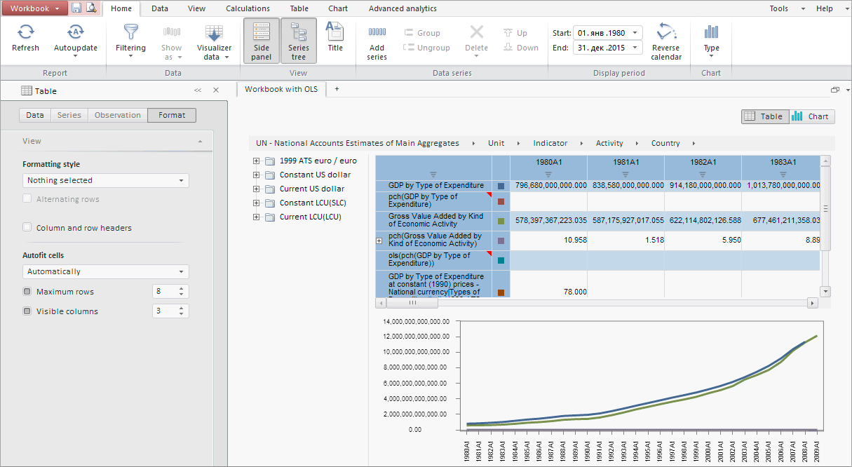
The WorkbookBox component shows workbook.
The component is implemented by the class WorkbookBox.
It is shown as the main application window that includes the following elements:
Main menu. Includes main commands used to work with a time series database.
Ribbon. Contains buttons used to work with view area.
Side panel. This panel is used to work with data of time series database.
Workbook. It is the main functional area of time series database, used to work with time series.
This component looks as follows:

The example of creating the WorkbookBox component is given on the Example of Creating the WorkbookBox».
| Constructor name | Brief description | |
| WorkbookBox | The WorkbookBox constructor creates an instance of the WorkbookBox class. |
| Event name | Brief description | |
| Saved | The Saved event occurs after saving a report at the server. |
| Property name | Brief description | |
| PropertyBarVisible | The PropertyBarVisible property determines side panel visibility. | |
| Source | The Source property sets the workbook, which data is displayed in the component. | |
| ViewMode | The ViewMode property determines the checkbox value in the view mode. |
| Method name | Brief description | |
| cultureChanged | The cultureChanged method processes culture change events. | |
| getDataView | The getDataView method returns a component that is used to display workbook data. | |
| getPropertyBarView | The getRibbonView method returns the Workbook Properties Panel component. | |
| getRibbonView | The getRibbonView method returns the workbook ribbon. | |
| refresh | The refresh method refreshes the component according to metadata. | |
| refreshAll | The refreshAll method refreshes the entire component. | |
| refreshHeader | The refreshHeader method refreshes text and picture in the header of the properties panel. |
| Event name | Brief description | |
| NeedRevisions | The NeedRevisions event occurs on request of revisions. | |
| PropertyChanged | The PropertyChanged event occurs on changing properties in the ribbon or properties panel. | |
| RequestMetadata | The RequestMetadata event occurs after metadata request. |
| Property name | Brief description | |
| Anchors | The Anchors property determines position of the component placed within container. | |
| Animation | The Animation property sets animation parameters for component. | |
| Bottom | The Bottom property sets bottom offset on placing the component within the LayoutPanel. | |
| Content | The Content property sets the component contents. | |
| ContextMenu | The ContextMenu property sets the context menu for the component. | |
| Data | The Data property is used to store any custom data. | |
| DataContext | The DataContext property contains an object with data. | |
| Enabled | The Enabled property sets whether the component is enabled. | |
| Height | The Height property determines the component height. | |
| IsResizable | The IsResizable property determines whether the component can be resized. | |
| IsRTL | The lsRTL property sets right to left text direction. | |
| IsVisible | The IsVisible property determines whether the component is displayed. | |
| Left | The Left property sets left offset on placing the component within the GridPanel. | |
| Offset | The Offset property determines coordinates of root DOM node of a control. | |
| Opacity | The Opacity property determines component transparency. | |
| Parent | The Parent property determines a parent component of a control. | |
| ParentNode | The ParentNode property sets parent DOM node. | |
| ResourceKey | The ResourceKey property sets the resource key for the component. | |
| Right | The Right property sets right offset on placing the component within the LayoutPanel. | |
| Rotate | The Rotate property sets component rotation angle. | |
| ShowToolTip | The ShowToolTip property determines whether the tooltip of the component can be displayed. | |
| Style | The Style property sets component style. | |
| TabIndex | The TabIndex property sets the order of the control element passing inside the container. | |
| Tag | The Tag property sets JSON object associated with the component. | |
| ToolTip | The ToolTip property determines text of component tooltip. | |
| Top | The Top property sets top offset on placing the component within the GridPanel. | |
| Value | The Value property sets the value to the component. | |
| Width | The Width property sets the component width. |
| Method name | Brief description | |
| The addClass method adds a CSS class to the component. | ||
| addEvent | The addEvent method adds an event handler to a DOM node. | |
| addEventHandler | The addEventHandler method adds an event handler to a DOM node. | |
| addEvents | The addEvents method adds an array of event handlers to a DOM node. | |
| The addStateClass method adds a CSS class to the component and removes the previous CSS class. | ||
| addStyleBySelector | The addStyleBySelector method creates a block that contains a style with the specified CSS selector. | |
| The addToNode method adds a component to the specified node. | ||
| bindEvents | The bindEvents method subscribes an element to all available events. | |
| The clearStylesCache method clears cache of component styles. | ||
| The getAnchorFlags method returns JSON object that contains settings of the current component's position. | ||
| The getClass method returns the current CSS classes of the component. | ||
| The getCssStyle method returns style for the specified node. | ||
| The getDomNode method returns main DOM node of the component. | ||
| The getFocused method determines whether the component is focused. | ||
| getFunctionByName | The getFunctionByName method returns function by name. | |
| getIsBinded | The getIsBinded method returns whether an element is subscribed to all DOM node events. | |
| The hasClass method determines whether the specified CSS class is set for root DOM node of the control. | ||
| The hide method hides a control. | ||
| The hideToolTip method clears tooltip timeout and hides the tooltip if it is displayed. | ||
| The isResingNow method determines whether the component is being resized. | ||
| refreshBindingProperty | The refreshBindingProperty method refreshes the bound property by name. | |
| refreshItemsStyle | The refreshItemsStyle method refreshes CSS styles of child elements. | |
| refreshStyle | The refreshStyle method refreshes element CSS styles. | |
| The removeClass method removes CSS class from the component. | ||
| The removeEvent method removes event handler from DOM node. | ||
| removeEventHandler | The removeEventHandler method removes event handler from DOM node. | |
| removeFromDOM | The removeFromDOM method removes node from the DOM structure. | |
| The removeStateClasses method removes CSS classes of the component. | ||
| The setDraggable method determines whether it is possible to drag component on the HTML page. | ||
| The setFocus method sets the component focus. | ||
| The setIsHovered method displays the component as on hover. | ||
| The setIsPressed method displays the component as if clicked upon. | ||
| The setOpacityIE8 method sets component transparency value in Internet Explorer 8. | ||
| The setSize method establishes the sizes of the component. | ||
| The show method displays a control. | ||
| unBindEvents | The unBindEvents method unsubscribes an element from all standard events. | |
| The updatePosition method updates size and position when absolute positioning based on the current parameters is used. | ||
| The updateSize method updates the component size on changing the size of the container that contains the component. |
| Event name | Brief description | |
| Drag | The Drag event occurs on clicking and holding the left mouse button. | |
| DragEnd | The DragEnd event occurs when dragging the component finishes. | |
| DragStart | The DragStart event occurs when dragging the component starts. | |
| OnContextMenu | The OnContextMenu event occurs on calling context menu of the component. | |
| SizeChanged | The SizeChanged event occurs after the component is resized. | |
| SizeChanging | The SizeChanging event occurs during component resize. |
| Property name | Brief description | |
| Data | The Data property associates a random object with this component. | |
| Id | The Id property sets component identifier. | |
| Settings | The Settings property sets the component parameters. |
| Method name | Brief description | |
| clone | The clone method creates a copy of object. It is not implemented in PP.Ui.Control. | |
| dispose | The dispose method deletes the component. | |
| getTypeName | The getTypeName method returns the name of the object type without the namespace, to which it belongs. |
See also: