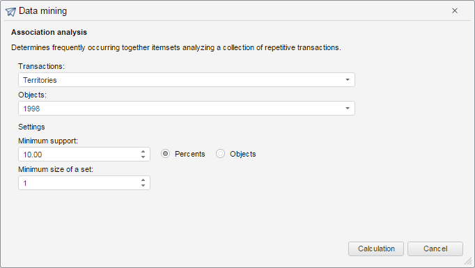
The DataMiningMaster component is a data mining wizard.
The component is implemented by the DataMiningMaster class.
Wizard steps are implemented by the DMSettingsStep class.
The wizard uses the DataMiningService service in its implementation.
Appearance depends on the selected method, for example: AssociationRulesView
The component may look as follows:

Example of Creating the DataMiningMaster Component.
| Constructor name | Brief description | |
| DataMiningMaster | The DataMiningMaster constructor creates an instance of the DataMiningMaster class. |
| Event name | Brief description | |
| OnGetDataMiningResult | The OnGetDataMiningResult event occurs after getting data mining result. |
| Method name | Brief description | |
| addStep | The addStep method adds a step to the wizard. | |
| getWizardSettings | The getWizardSettings method returns the object that contains wizard settings. | |
| removeStep | The removeStep method removes step from the wizard. |
| Event name | Brief description | |
| CancelButtonClicked | The CancelButtonClicked event occurs on clicking the Cancel button. | |
| Closed | The Closed event occurs on closing the wizard. | |
| CompleteButtonClicked | The CompleteButtonClicked event occurs on clicking the Complete button. |
| Property name | Brief description | |
| Caption | The Caption property sets a window title. | |
| CaptionIcon | The CaptionIcon property determines the path to window title image. | |
| DragContentView | The DragContentView property determines whether window is displayed on moving. | |
| EnableMove | The EnableMove property determines whether window can be moved. |
| Method name | Brief description | |
| expand | The expand method expands the window. | |
| getCloseButton | The getCloseButton method returns the button that closes the window. | |
| getExpandButton | The getExpandButton method returns the button that expands the window. | |
| getIsExpanded | The getIsExpanded method returns whether the window is expanded. | |
| showDialog | The showDialog method displays a dialog box. |
| Event name | Brief description | |
| Expanded | The Expanded event occurs after window expanding. | |
| Expanding | The Expanding event occurs on window expanding. | |
| Moved | The Moved event occurs after window moving. | |
| Moving | The Moving event occurs on window moving. |
| Property name | Brief description | |
| The EnableResize property determines whether the component can be resized. | ||
| The EnableResizeBottom property determines whether the component height can be changed by dragging its bottom border with the mouse cursor. | ||
| The EnableResizeLeft property determines whether the component width can be changed by dragging its left border with the mouse cursor. | ||
| The EnableResizeRight property determines whether the component width can be changed by dragging its right border with the mouse cursor. | ||
| The EnableResizeTop property determines whether the component height can be changed by dragging its top border with the mouse cursor. | ||
| The EnableRestoreFocus property determines whether focus can be restored on closing the panel. | ||
| The MinDropDownHeight property sets minimum height for a drop-down panel. | ||
| The MaxDropDownWidth property sets maximum width for a drop-down panel. | ||
| The MinDropDownHeight property sets minimum height for a drop-down panel. | ||
| The MinDropDownWidth property sets minimum width for a drop-down panel. |
| Method name | Brief description | |
| The getDroppedDown returns whether the panel is expanded. | ||
| The isVisibleArea method determines whether the visible area includes the drop-down part. | ||
| The setPosition method sets the position of the drop-down panel. | ||
| The show method expands the panel. |
| Event name | Brief description | |
| The Closed event occurs after closing the component. | ||
| The FrameDown event occurs on clicking outside of the panel. | ||
| The Opened event occurs after opening the component. | ||
| The Opening event occurs before opening the component. | ||
| The OutOfPanelDown event occurs on click outside the panel area if the panel is displayed without the support frame. | ||
| The SizeChanged event occurs after resizing the component. | ||
| The SizeChanging event occurs before resizing the component. |
| Property name | Brief description | |
| Anchors | The Anchors property determines position of the component placed within container. | |
| Animation | The Animation property sets animation parameters for component. | |
| Bottom | The Bottom property sets bottom offset on placing the component within the LayoutPanel. | |
| Content | The Content property sets the component contents. | |
| ContextMenu | The ContextMenu property sets the context menu for the component. | |
| Data | The Data property is used to store any custom data. | |
| DataContext | The DataContext property contains an object with data. | |
| Enabled | The Enabled property sets whether the component is enabled. | |
| Height | The Height property determines the component height. | |
| IsResizable | The IsResizable property determines whether the component can be resized. | |
| IsRTL | The lsRTL property sets right to left text direction. | |
| IsVisible | The IsVisible property determines whether the component is displayed. | |
| Left | The Left property sets left offset on placing the component within the GridPanel. | |
| Offset | The Offset property determines coordinates of root DOM node of a control. | |
| Opacity | The Opacity property determines component transparency. | |
| Parent | The Parent property determines a parent component of a control. | |
| ParentNode | The ParentNode property sets parent DOM node. | |
| ResourceKey | The ResourceKey property sets the resource key for the component. | |
| Right | The Right property sets right offset on placing the component within the LayoutPanel. | |
| Rotate | The Rotate property sets component rotation angle. | |
| ShowToolTip | The ShowToolTip property determines whether the tooltip of the component can be displayed. | |
| Style | The Style property sets component style. | |
| TabIndex | The TabIndex property sets the order of the control element passing inside the container. | |
| Tag | The Tag property sets JSON object associated with the component. | |
| ToolTip | The ToolTip property determines text of component tooltip. | |
| Top | The Top property sets top offset on placing the component within the GridPanel. | |
| Value | The Value property sets the value to the component. | |
| Width | The Width property sets the component width. |
| Method name | Brief description | |
| The addClass method adds a CSS class to the component. | ||
| addEvent | The addEvent method adds an event handler to a DOM node. | |
| addEventHandler | The addEventHandler method adds an event handler to a DOM node. | |
| addEvents | The addEvents method adds an array of event handlers to a DOM node. | |
| The addStateClass method adds a CSS class to the component and removes the previous CSS class. | ||
| addStyleBySelector | The addStyleBySelector method creates a block that contains a style with the specified CSS selector. | |
| The addToNode method adds a component to the specified node. | ||
| bindEvents | The bindEvents method subscribes an element to all available events. | |
| The clearStylesCache method clears cache of component styles. | ||
| The getAnchorFlags method returns JSON object that contains settings of the current component's position. | ||
| The getClass method returns the current CSS classes of the component. | ||
| The getCssStyle method returns style for the specified node. | ||
| The getDomNode method returns main DOM node of the component. | ||
| The getFocused method determines whether the component is focused. | ||
| getFunctionByName | The getFunctionByName method returns function by name. | |
| getIsBinded | The getIsBinded method returns whether an element is subscribed to all DOM node events. | |
| The hasClass method determines whether the specified CSS class is set for root DOM node of the control. | ||
| The hide method hides a control. | ||
| The hideToolTip method clears tooltip timeout and hides the tooltip if it is displayed. | ||
| The isResingNow method determines whether the component is being resized. | ||
| refreshBindingProperty | The refreshBindingProperty method refreshes the bound property by name. | |
| refreshItemsStyle | The refreshItemsStyle method refreshes CSS styles of child elements. | |
| refreshStyle | The refreshStyle method refreshes element CSS styles. | |
| The removeClass method removes CSS class from the component. | ||
| The removeEvent method removes event handler from DOM node. | ||
| removeEventHandler | The removeEventHandler method removes event handler from DOM node. | |
| removeFromDOM | The removeFromDOM method removes node from the DOM structure. | |
| The removeStateClasses method removes CSS classes of the component. | ||
| The setDraggable method determines whether it is possible to drag component on the HTML page. | ||
| The setFocus method sets the component focus. | ||
| The setIsHovered method displays the component as on hover. | ||
| The setIsPressed method displays the component as if clicked upon. | ||
| The setOpacityIE8 method sets component transparency value in Internet Explorer 8. | ||
| The setSize method establishes the sizes of the component. | ||
| The show method displays a control. | ||
| unBindEvents | The unBindEvents method unsubscribes an element from all standard events. | |
| The updatePosition method updates size and position when absolute positioning based on the current parameters is used. | ||
| The updateSize method updates the component size on changing the size of the container that contains the component. |
| Event name | Brief description | |
| Drag | The Drag event occurs on clicking and holding the left mouse button. | |
| DragEnd | The DragEnd event occurs when dragging the component finishes. | |
| DragStart | The DragStart event occurs when dragging the component starts. | |
| OnContextMenu | The OnContextMenu event occurs on calling context menu of the component. | |
| SizeChanged | The SizeChanged event occurs after the component is resized. | |
| SizeChanging | The SizeChanging event occurs during component resize. |
| Property name | Brief description | |
| Data | The Data property associates a random object with this component. | |
| Id | The Id property sets component identifier. | |
| Settings | The Settings property sets the component parameters. |
| Method name | Brief description | |
| clone | The clone method creates a copy of object. It is not implemented in PP.Ui.Control. | |
| dispose | The dispose method deletes the component. | |
| getTypeName | The getTypeName method returns the name of the object type without the namespace, to which it belongs. |
See also: