The LongListBox component is a grouped list.
The component is implemented by the LongListBox class.
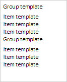
The component looks as follows:
The example of creating a grouped list is described on the Example of Creating the LongListBox Component page.
| Constructor name | Brief description | |
 |
LongListBox | The LongListBox constructor creates an instance of the LongListBox component. |
| Property name | Brief description | |
 |
Groups | The Groups property contains an array of settings of groups of elements. |
|
GroupsHeight | The GroupsHeight property contains title height of list groups. |
|
GroupsTemplate | The GroupsTemplate property contains a template for list groups titles. |
|
ItemsHeight | The ItemsHeight property contains height of list elements. |
|
ItemsTemplate | The ItemsTemplate property contains a template for list elements. |
| Method name | Brief description | |
|
addGroups | The addGroups method adds an array of groups to the current groups. |
|
calcItemsContainerHeight | The calcItemsContainerHeight method returns component container height. |
|
beginUpdate | The beginUpdate method disables rerendering of the list until the endUpdate method is called. |
|
endUpdate | The endUpdate method enables list rerendering and refreshes it. |
|
getItems | The getItems method returns loaded elements of the grouped list. |
|
getMultiSelect | The getMultiSelect returns whether multiple selection of grouped list elements is available. |
|
getScrollBar | The getScrollBar method returns vertical scrollbar of the grouped list. |
|
getVisibleItems | The getVisibleItems method returns array of visible elements of grouped list. |
|
isAllLoaded | The isAllLoaded method determines whether all list elements are loaded. |
|
setChildProps | The setChildProps method determines settings for grouped list elements. |
| Property name | Brief description | |
|
Anchors | The Anchors property determines position of the component placed within container. |
|
Animation | The Animation property sets animation parameters for component. |
|
Bottom | The Bottom property sets bottom offset on placing the component within the LayoutPanel. |
|
Content | The Content property sets the component contents. |
|
ContextMenu | The ContextMenu property sets the context menu for the component. |
|
Data | The Data property is used to store any custom data. |
|
DataContext | The DataContext property contains an object with data. |
|
Enabled | The Enabled property sets whether the component is enabled. |
|
Height | The Height property determines the component height. |
|
IsResizable | The IsResizable property determines whether the component can be resized. |
|
IsRTL | The lsRTL property sets right to left text direction. |
|
IsVisible | The IsVisible property determines whether the component is displayed. |
|
Left | The Left property sets left offset on placing the component within the GridPanel. |
|
Offset | The Offset property determines coordinates of root DOM node of a control. |
|
Opacity | The Opacity property determines component transparency. |
|
Parent | The Parent property determines a parent component of a control. |
|
ParentNode | The ParentNode property sets parent DOM node. |
|
ResourceKey | The ResourceKey property sets the resource key for the component. |
|
Right | The Right property sets right offset on placing the component within the LayoutPanel. |
|
Rotate | The Rotate property sets component rotation angle. |
|
ShowToolTip | The ShowToolTip property determines whether the tooltip of the component can be displayed. |
|
Style | The Style property sets component style. |
|
TabIndex | The TabIndex property sets the order of the control element passing inside the container. |
|
Tag | The Tag property sets JSON object associated with the component. |
|
ToolTip | The ToolTip property determines text of component tooltip. |
|
Top | The Top property sets top offset on placing the component within the GridPanel. |
|
Value | The Value property sets the value to the component. |
|
Width | The Width property sets the component width. |
| Method name | Brief description | |
|
addItem | The addItem method adds a new element to list. |
|
beginUpdate | The beginUpdate method determines whether the list is updated. |
|
clear | The clear method removes all elements from the list. |
|
clearSelection | The clearSelection method is used to reset selection. |
|
endUpdate | The endUpdate method removes whether the list is updated. |
|
filterByText | The filterByText method filters list elements by string. |
|
getActiveItem | The getActiveItem method returns the selected list element. |
|
getItemByPoint | The getItemByPoint method returns list element by the specified coordinates. |
|
getLastItemClick | The getLastItemClick method returns the last selected list element. |
|
getLayoutItems | The getLayoutItems method returns an array of list elements. |
|
getScrollBox | The getScrollBox method returns scrolling region of elements list. |
|
getSelectedItems | The getSelectedItems method returns array of selected list elements. |
|
insertItem | The insertItem method adds an element to the position of the elements list set by the index parameter. |
|
removeItem | The removeItem method removes the element of the list by the specified index. |
|
scrollToItem | The scrollToItem method scrolls the list up to the item element. |
|
scrollToSelected | The scrollToSelected method scrolls the list up to the selected list element. |
|
selectItemById | The selectItemById method selects the element with the specified Id identifier. |
|
setSelectedFocus | The setSelectedFocus method sets focus on the element index. |
| Event name | Brief description | |
 |
Drag | The Drag event occurs on clicking and holding the left mouse button. |
|
DragEnd | The DragEnd event occurs when dragging the component finishes. |
|
DragStart | The DragStart event occurs when dragging the component starts. |
|
OnContextMenu | The OnContextMenu event occurs on calling context menu of the component. |
|
SizeChanged | The SizeChanged event occurs after the component is resized. |
|
SizeChanging | The SizeChanging event occurs during component resize. |
| Property name | Brief description | |
|
Data | The Data property associates a random object with this component. |
|
Id | The Id property sets component identifier. |
|
Settings | The Settings property sets the component parameters. |
| Method name | Brief description | |
|
clone | The clone method creates a copy of object. It is not implemented in PP.Ui.Control. |
|
dispose | The dispose method deletes the component. |
|
getTypeName | The getTypeName method returns the name of the object type without the namespace, to which it belongs. |
See also: