The BubbleChart component is a bubble chart.
The BubbleChart component is implemented by the BubbleChart class.
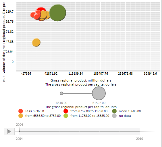
The BubbleChart component may look like follows:
Example of creating the BubbleChart component
| Constructor name | Overview | |
 |
BubbleChart | The BubbleChart constructor creates an instance of the BubbleChart class. |
| Property name | Brief description | |
 |
BubbleStyle | The BubbleStyle property determines style of bubble chart bubbles. |
|
ChartArea | The ChartArea property determines bubble chart plot area. |
|
ColorVisual | The ColorVisual property determines fill colors for bubble chart bubbles. |
|
DataSource | The DataSource property determines a data source for bubble chart. |
|
HistoryBubbleStyle | The HistoryBubbleStyle property sets style for displaying bubbles of bubble chart history. |
|
HistoryMode | The HistoryMode property determines a mode of displaying history for the selected bubble chart bubble. |
|
InactiveItemsOpacity | The InactiveItemsOpacity property contains transparency coefficient for inactive bubble chart bubbles. |
|
NoDataVisualType | The NoDataVisualType property determines the type, with which the no data element is displayed. |
|
OffsetX | The OffsetX property determines bubble offset from the left border of bubble chart plot area. |
|
OffsetY | The OffsetY property determines bubble offset from the top border of bubble chart plot area. |
|
Palette | The Palette property sets a color scale for a bubble chart. |
|
RVisual | The RVisual property contains settings for mapping series values with size of the bubble chart bubbles that correspond to this data. |
|
Series | The Series property determines data series for a bubble chart. |
|
ShowBubbleHistory | The ShowBubbleHistory property determines whether history is displayed for bubble chart bubbles. |
|
ShowBubbleHistoryLabels | The ShowBubbleHistoryLabels property determines whether labels are displayed in the values history for bubble chart bubbles. |
|
ShowBubblesWithNoData | The ShowBubblesWithNoData property determines whether bubble chart bubbles with no data are displayed. |
|
ShowHistoryBubbleTooltip | The ShowHistoryBubbleTooltip property determines whether values history bubbles are displayed when element tooltips are displayed. |
|
ShowHistoryMode | The ShowHistoryMode property determines display mode for values history of bubble chart bubbles. |
|
ShowHistoryPreviousStepsOnly | The ShowHistoryPreviousStepsOnly property determines display mode for only previous values history bubbles. |
|
ToolTipDelay | The ToolTipDelay property determines a delay before a tooltip is displayed. |
|
UseBubbleColorForHistoryLines | The UseBubbleColorForHistoryLines property determines whether values history bubble colors are used on rendering lines between them. |
|
UseBubbleFillForTooltip | The UseBubbleFillForTooltip property determines whether color of bubble chart bubbles is used to fill tooltips. |
|
UseInactiveItemsOpacity | The UseInactiveItemsOpacity property determines whether transparent fill is enabled for inactive bubble chart bubbles. |
|
XVisual | The XVisual property contains settings to map series values with X axis in the bubble chart. |
|
YVisual | The YVisual property contains settings to map bubble chart Y axis series values. |
| Method name | Brief description | |
|
applyColorScheme | The applyColorScheme method applies a bubble chart color scheme. |
|
getInstance | The getInstance method returns the current bubble chart instance. |
|
getLegend | The getLegend property returns the legend that describes bubble chart value intervals. |
|
getMapping | The getMapping method returns settings to map coordinates in the specified axis for bubble chart elements. |
|
getMappingMax | The getMappingMax method returns maximum value for the specified bubble chart axis. |
|
getMappingMin | The getMappingMin method returns minimum value for the specified bubble chart axis. |
|
getSizeLegend | The getSizeLegend method returns the legend that describes sizes of bubble chart bubbles. |
|
getState | The getState method returns bubble chart settings. |
|
hoverItems | The hoverItems method sets highlighting for the specified bubble chart bubbles. |
|
isLoaded | The isLoaded method returns whether a bubble chart is loaded. |
|
rebuildAll | The rebuildAll method rebuilds all elements of bubble chart. |
|
refreshView | The refreshView method refreshes bubble chart settings. |
|
requestRenderFrame | The requestRenderFrame method calls asynchronous rerendering of bubble chart bubbles. |
|
selectItems | The selectItems method sets highlighting for the specified bubble chart bubbles. |
| Event name | Brief description | |
 |
CaptionClick | The CaptionClick event occurs on clicking a bubble chart caption and bubble chart elements' captions. |
|
ItemHovered | The ItemHovered event occurs on hovering the mouse over a chart bubble. |
|
Refreshed | The Refreshed event occurs after applying changed bubble chart settings. |
| Property name | Brief description | |
|
Anchors | The Anchors property determines position of the component placed within container. |
|
Animation | The Animation property sets animation parameters for component. |
|
Bottom | The Bottom property sets bottom offset on placing the component within the LayoutPanel. |
|
Content | The Content property sets the component contents. |
|
ContextMenu | The ContextMenu property sets the context menu for the component. |
|
Data | The Data property is used to store any custom data. |
|
DataContext | The DataContext property contains an object with data. |
|
Enabled | The Enabled property sets whether the component is enabled. |
|
Height | The Height property determines the component height. |
|
IsResizable | The IsResizable property determines whether the component can be resized. |
|
IsRTL | The lsRTL property sets right to left text direction. |
|
IsVisible | The IsVisible property determines whether the component is displayed. |
|
Left | The Left property sets left offset on placing the component within the GridPanel. |
|
Offset | The Offset property determines coordinates of root DOM node of a control. |
|
Opacity | The Opacity property determines component transparency. |
|
Parent | The Parent property determines a parent component of a control. |
|
ParentNode | The ParentNode property sets parent DOM node. |
|
ResourceKey | The ResourceKey property sets the resource key for the component. |
|
Right | The Right property sets right offset on placing the component within the LayoutPanel. |
|
Rotate | The Rotate property sets component rotation angle. |
|
ShowToolTip | The ShowToolTip property determines whether the tooltip of the component can be displayed. |
|
Style | The Style property sets component style. |
|
TabIndex | The TabIndex property sets the order of the control element passing inside the container. |
|
Tag | The Tag property sets JSON object associated with the component. |
|
ToolTip | The ToolTip property determines text of component tooltip. |
|
Top | The Top property sets top offset on placing the component within the GridPanel. |
|
Value | The Value property sets the value to the component. |
|
Width | The Width property sets the component width. |
| Method name | Brief description | |
|
The addClass method adds a CSS class to the component. | |
|
addEvent | The addEvent method adds an event handler to a DOM node. |
|
addEventHandler | The addEventHandler method adds an event handler to a DOM node. |
|
addEvents | The addEvents method adds an array of event handlers to a DOM node. |
|
The addStateClass method adds a CSS class to the component and removes the previous CSS class. | |
|
addStyleBySelector | The addStyleBySelector method creates a block that contains a style with the specified CSS selector. |
|
The addToNode method adds a component to the specified node. | |
|
bindEvents | The bindEvents method subscribes an element to all available events. |
|
The clearStylesCache method clears cache of component styles. | |
|
The getAnchorFlags method returns JSON object that contains settings of the current component's position. | |
|
The getClass method returns the current CSS classes of the component. | |
|
The getCssStyle method returns style for the specified node. | |
|
The getDomNode method returns main DOM node of the component. | |
|
The getFocused method determines whether the component is focused. | |
|
getFunctionByName | The getFunctionByName method returns function by name. |
|
getIsBinded | The getIsBinded method returns whether an element is subscribed to all DOM node events. |
|
The hasClass method determines whether the specified CSS class is set for root DOM node of the control. | |
|
The hide method hides a control. | |
|
The hideToolTip method clears tooltip timeout and hides the tooltip if it is displayed. | |
|
The isResingNow method determines whether the component is being resized. | |
|
refreshBindingProperty | The refreshBindingProperty method refreshes the bound property by name. |
|
refreshItemsStyle | The refreshItemsStyle method refreshes CSS styles of child elements. |
|
refreshStyle | The refreshStyle method refreshes element CSS styles. |
|
The removeClass method removes CSS class from the component. | |
|
The removeEvent method removes event handler from DOM node. | |
|
removeEventHandler | The removeEventHandler method removes event handler from DOM node. |
|
removeFromDOM | The removeFromDOM method removes node from the DOM structure. |
|
The removeStateClasses method removes CSS classes of the component. | |
|
The setDraggable method determines whether it is possible to drag component on the HTML page. | |
|
The setFocus method sets the component focus. | |
|
The setIsHovered method displays the component as on hover. | |
|
The setIsPressed method displays the component as if clicked upon. | |
|
The setOpacityIE8 method sets component transparency value in Internet Explorer 8. | |
|
The setSize method establishes the sizes of the component. | |
|
The show method displays a control. | |
|
unBindEvents | The unBindEvents method unsubscribes an element from all standard events. |
|
The updatePosition method updates size and position when absolute positioning based on the current parameters is used. | |
|
The updateSize method updates the component size on changing the size of the container that contains the component. |
| Event name | Brief description | |
|
Drag | The Drag event occurs on clicking and holding the left mouse button. |
|
DragEnd | The DragEnd event occurs when dragging the component finishes. |
|
DragStart | The DragStart event occurs when dragging the component starts. |
|
OnContextMenu | The OnContextMenu event occurs on calling context menu of the component. |
|
SizeChanged | The SizeChanged event occurs after the component is resized. |
|
SizeChanging | The SizeChanging event occurs during component resize. |
| Property name | Brief description | |
|
Data | The Data property associates a random object with this component. |
|
Id | The Id property sets component identifier. |
|
Settings | The Settings property sets the component parameters. |
| Method name | Brief description | |
|
clone | The clone method creates a copy of object. It is not implemented in PP.Ui.Control. |
|
dispose | The dispose method deletes the component. |
|
getTypeName | The getTypeName method returns the name of the object type without the namespace, to which it belongs. |
See also: