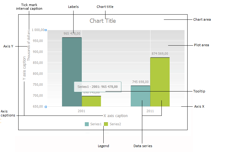
Charts are various forms of visual presentation of table data used for their visualization:

A chart consists of a set of components. Each of these components has a specific set of parameters:
Chart area includes all chart components.
Axes are used to arrange data in a chart.
Plot area contains chart data series.
Data series contain a set of values that are used to plot a chart.
Chart corridors show part of the plot area located between two series of line chart.
Trend lines show data trends.
Captions contain names of other chart components.
Data labels contain information on series or single data points.
Tooltips show information on data series point when pointing on it with the cursor.
Legend contains names and data markers on a chart.
To work with a chart component, select it.
To select a chart component, in the Dashboards tool:
Click the component with the main mouse button.
Select the Chart > Select Element item in the chart area's context menu.
To select a chart component in the Analytical Queries (OLAP), Time Series Analysis tools:
Click the chart component with the main mouse button.
Select the Select Element item in the chart area's context menu.
To select a chart component in the Reports tool:
Activate the chart by clicking it with the main mouse button.
Select the component. To do this:
Click on it with the main mouse button.
Select the Select Element item in the chart area's context menu and select the element.
Go to the Chart ribbon tab and select the required chart element in the drop-down list in the Current Section group. Contents of the menu match the popup menu that appears after selecting the Select Element item in the chart's context menu.
After selecting the Select Element item, use the drop-down list to select the required element:
After the required chart component has been chosen, it is selected in the chart plot area.
See also: