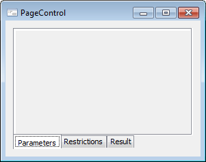
The PageControl component is a multi-page panel, which enables the user to save the application window space by positioning pages of various contents on the same place (on top of each other).
To select a page, click on the corresponding tab or press CTRL+TAB (next page), CTRL+SHIFT+TAB (previous page).
The simplest way of working with pages is to right-click the component and select required context menu item: Add Page to create a new page, or Delete Page to delete the current page. Each created page is the object of the PageControlSheet class.
| Property name | Brief description | |
 |
ActiveSheet | The ActiveSheet property determines a component active page. |
|
Align | The Align property determines behavior of the component when its parent component is resized. |
|
AllowDrag | The AllowDrag property determines whether an object can be dragged from the component. |
|
AllowDrop | The AllowDrop property determines whether the component can accept a dragged object. |
|
Anchors | The Anchors property returns settings that determine the percentage of the size change for the current component when the parent component is resized. |
|
Brush | The Brush property determines the brush that is used to fill component area. |
|
ClientHeight | The ClientHeight property is used to receive or specify the height of the component’s client area. |
|
ClientWidth | The ClientWidth property is used to receive or specify the width of the component’s client area. |
|
Color | The Color property determines a component background color. |
|
ComponentCount | The ComponentCount property returns the number of child components. |
|
Components | The Components property returns the child component. |
|
Cursor | The Cursor property determines the look of the cursor over the component. |
|
Data | The Data property is used to store any custom data. |
|
Enabled | The Enabled property determines whether the component is available for the user. |
|
Focused | The Focused property returns True if the focus is set on the component. |
|
Font | The Font property determines the set of characteristics describing the font that is used to display text. |
|
Height | The Height property determines component height. |
|
HelpContext | The HelpContext property determines a unique index for the context help section for this component. |
|
Hint | The Hint property determines a component tooltip text. |
|
HotTrack | The HotTrack property determines whether the tab label changes color on mouseover. |
|
Images | The Images property determines a name of the ImageList component, which images are used in the component. |
|
Left | The Left property determines the coordinate of the left border of the component. |
|
MultiLine | The MultiLine property determines whether the tabs for the component pages are placed in multiple rows if they do not fit into a single row. |
|
Name | The Name property determines a component name. |
|
Pages | The Pages property returns the component pages collection. |
|
Parent | The Parent property determines a parent component. |
|
ParentColor | The ParentColor property determines whether the component inherits the color of the parent component. |
|
ParentFont | The ParentFont property determines whether the component uses the font of the parent component. |
|
ParentShowHint | The ParentShowHint property determines whether a tooltip is displayed. |
|
PopupMenu | The PopupMenu property determines the context menu to be displayed on right-click on the component. |
|
RaggedRight | The RaggetRighd property determines whether the width of component tabs can be changed to align them by the component right edge. |
|
ScrollOpposite | The ScrollOpposite property determines the way to move tabs when they are arranged in multiple rows. |
|
Scrolls | The Scrolls property returns parameters of component's scrollbars. |
|
ShowHint | The ShowHint property enables and disables showing a component tooltip. |
| Style | The Style property determines the appearance of component tabs. | |
|
TabOrder | The TabOrder property determines the component position in the tab order. |
|
TabPosition | The TabPosition property determines the position of component tabs. |
|
TabStop | The TabStop property determines whether the component is focused when the TAB key is pressed. |
|
Tag | The Tag property is not used by the compiler. The user can change the value of the Tag property and use it as he wishes. |
|
Text | The Text property determines the row identifying a component for the user. |
|
Top | The Top property determines the coordinate of the top border of the component. |
|
Visible | The Visible property determines visibility of the component during execution. |
|
Width | The Width property determines component width. |
| Method name | Brief description | |
 |
BringToFront | The BringToFront method brings a component to front. |
|
ClientToScreen | The ClientToScreen method converts the coordinates of a point specified relative to the component coordinate system into screen coordinates. |
|
DoDragDrop | The DoDragDrop method enables to start dragging operation. |
|
GetImage | The GetImage method returns the image of the component with all the child components. |
|
ScreenToClient | The ScreenToClient method converts screen coordinates of a point into coordinates specified relative to the component coordinate system. |
|
SendToBack | The SendToBack method sends a component to back. |
|
SetFocus | The SetFocus method sets focus to this component. |
| Event name | Brief description | |
 |
OnBeginDrag | The OnBeginDrag event occurs for a component when the user starts to drag an object from the component. |
|
OnChange | The OnChange event occurs after another tab has been selected. |
|
OnChanging | The OnChanging event occurs on moving from one tab to another. |
|
OnClick | The OnClick event occurs if the user clicks the component area with the main mouse button. |
|
OnDblClick | The OnDblClick event occurs if the user double-clicks a component area with the mouse button. |
|
OnDragDrop | The OnDragDrop event occurs for the component if the user drops a dragged object over it. |
|
OnDragEnter | The OnDragEnter event occurs when a dragged object crosses the borders of this component. |
|
OnDragLeave | The OnDragLeave event occurs when a dragged object leaves the borders of this component. |
|
OnDragOver | The OnDragOver event occurs for the component when the user drags an object over it. |
|
OnEnter | The OnEnter event occurs when the component receives focus. |
|
OnExit | The OnExit event occurs when the component loses focus. |
|
OnHScroll | The OnHScroll event occurs when horizontal scrollbar slider changes its position. |
|
OnKeyDown | The OnKeyDown event occurs if the component is focused and the keyboard key is pressed. |
|
OnKeyPress | The OnKeyPress event occurs if the component is focused when the user presses a character key. |
|
OnKeyPreview | The OnKeyPreview event occurs prior to each event related to key pressing. |
|
OnKeyUp | The OnKeyUp event occurs if the component is focused and the user releases any button previously pressed. |
|
OnMouseDown | The OnMouseDown event occurs if the pointer is in component's area and a mouse key is pressed. |
|
OnMouseEnter | The OnMouseEnter event occurs when mouse cursor enters the component area. |
|
OnMouseHover | The OnMouseHover event occurs when mouse cursor is held in the component area. |
|
OnMouseLeave | The OnMouseLeave event occurs when mouse cursor leaves the component area. |
|
OnMouseMove | The OnMouseMove event occurs on moving the cursor over component. |
|
OnMouseUp | The OnMouseUp event occurs on releasing mouse button when the cursor is in component area. |
|
OnMouseWheel | The OnMouseWheel event occurs if the component is focused when the mouse wheel is rotated. |
|
OnVScroll | The OnVScroll event occurs when vertical scrollbar slider changes its position. |
See also: